Python 官方文档:入门教程 => 点击学习
目录1 数据预处理1.1 股票历史数据csv文件读取1.2 关键数据——在csv文件中选择性提取“列”1.3 数据类型转换1.4 数据按列提取并累加性存入列表2 pyecharts实现数据可视化2.1 导入库2.2
投资有风险,选择需谨慎。 股票交易数据分析可直观股市走向,对于如何把握股票行情,快速解读股票交易数据有不可替代的作用!
import pandas as pd
import csv
df = pd.read_csv("/home/kesci/input/maotai4154/maotai.csv")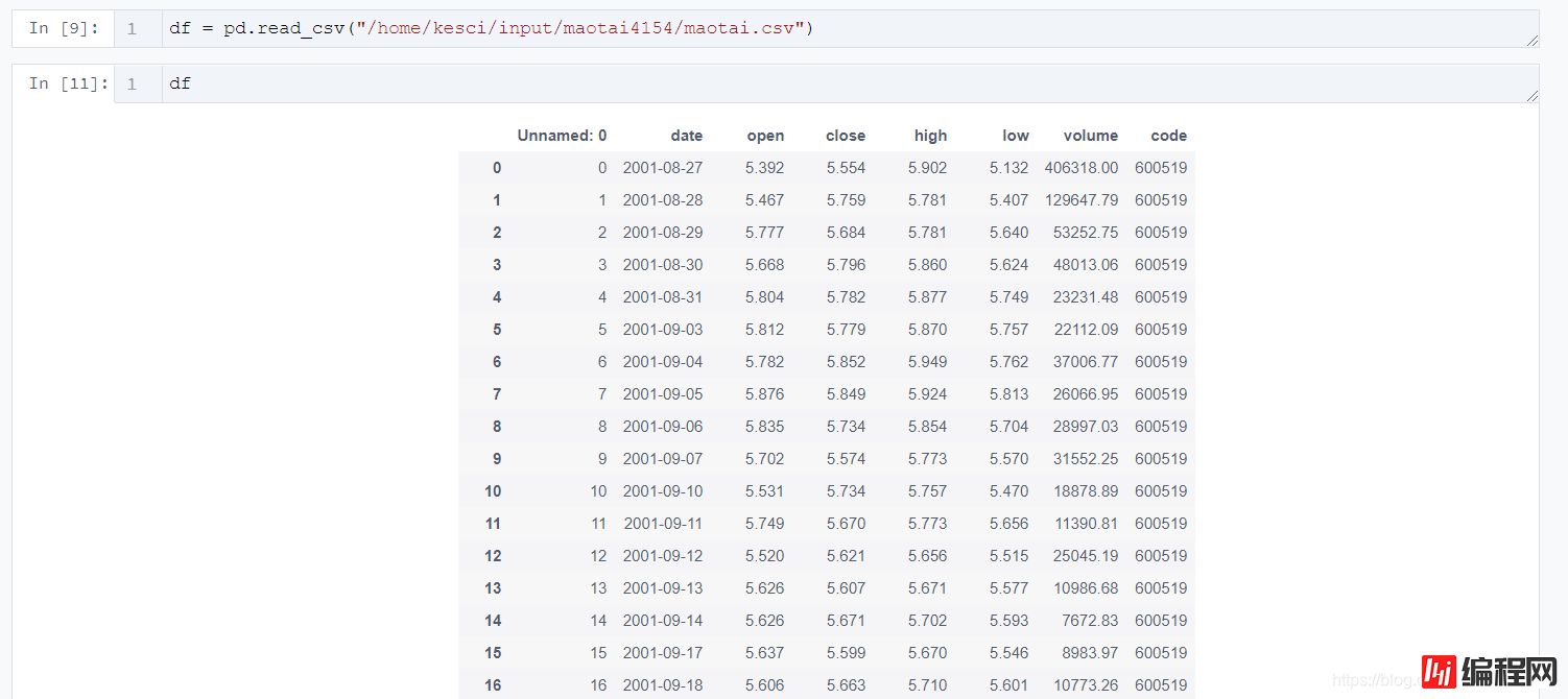
df_high_low = df[['date','high','low']]
df_high_low_array = np.array(df_high_low)
df_high_low_list =df_high_low_array.tolist()
price_dates, heigh_prices, low_prices = [], [], []
for content in zip(df_high_low_list):
price_date = content[0][0]
heigh_price = content[0][1]
low_price = content[0][2]
price_dates.append(price_date)
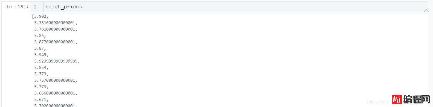
heigh_prices.append(heigh_price)
low_prices.append(low_price)

import pyecharts.options as opts
from pyecharts.charts import Line
Line(init_opts=opts.InitOpts(width="1200px", height="600px"))
    .add_yaxis(
        series_name="最低价",
        y_axis=low_prices,
        markpoint_opts=opts.MarkPointOpts(
            data=[opts.MarkPointItem(value=-2, name="周最低", x=1, y=-1.5)]
        ),
        markline_opts=opts.MarkLineOpts(
            data=[
                opts.MarkLineItem(type_="average", name="平均值"),
                opts.MarkLineItem(symbol="none", x="90%", y="max"),
                opts.MarkLineItem(symbol="circle", type_="max", name="最高点"),
            ]
        ),
    )
tooltip_opts=opts.TooltipOpts(trigger="axis"),
toolbox_opts=opts.ToolboxOpts(is_show=True),
xaxis_opts=opts.AxisOpts(type_="cateGory", boundary_gap=True)
.render("HTML名字填这里.html")![]()
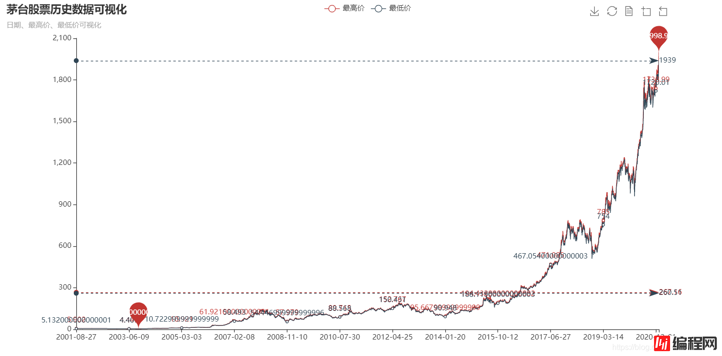
import pyecharts.options as opts
from pyecharts.charts import Line

(
    Line(init_opts=opts.InitOpts(width="1200px", height="600px"))
    .add_xaxis(xaxis_data=price_dates)
    .add_yaxis(
        series_name="最高价",
        y_axis=heigh_prices,
        markpoint_opts=opts.MarkPointOpts(
            data=[
                opts.MarkPointItem(type_="max", name="最大值"),
                opts.MarkPointItem(type_="min", name="最小值"),
            ]
        ),
        markline_opts=opts.MarkLineOpts(
            data=[opts.MarkLineItem(type_="average", name="平均值")]
        ),
    )
    .add_yaxis(
        series_name="最低价",
        y_axis=low_prices,
        markpoint_opts=opts.MarkPointOpts(
            data=[opts.MarkPointItem(value=-2, name="周最低", x=1, y=-1.5)]
        ),
        markline_opts=opts.MarkLineOpts(
            data=[
                opts.MarkLineItem(type_="average", name="平均值"),
                opts.MarkLineItem(symbol="none", x="90%", y="max"),
                opts.MarkLineItem(symbol="circle", type_="max", name="最高点"),
            ]
        ),
    )
    .set_global_opts(
        title_opts=opts.TitleOpts(title="茅台股票历史数据可视化", subtitle="日期、最高价、最低价可视化"),
        tooltip_opts=opts.TooltipOpts(trigger="axis"),
        toolbox_opts=opts.ToolboxOpts(is_show=True),
        xaxis_opts=opts.AxisOpts(type_="category", boundary_gap=True),
    )
    .render("everyDayPrice_change_line_chart2.html")
)![]()

到此这篇关于python实现股票历史数据可视化分析案例的文章就介绍到这了,更多相关Python股票数据可视化内容请搜索编程网以前的文章或继续浏览下面的相关文章希望大家以后多多支持编程网!
--结束END--
本文标题: python实现股票历史数据可视化分析案例
本文链接: https://www.lsjlt.com/news/11259.html(转载时请注明来源链接)
有问题或投稿请发送至: 邮箱/279061341@qq.com QQ/279061341
下载Word文档到电脑,方便收藏和打印~
2024-03-01
2024-03-01
2024-03-01
2024-02-29
2024-02-29
2024-02-29
2024-02-29
2024-02-29
2024-02-29
2024-02-29
回答
回答
回答
回答
回答
回答
回答
回答
回答
回答


官方手机版

微信公众号

商务合作


0