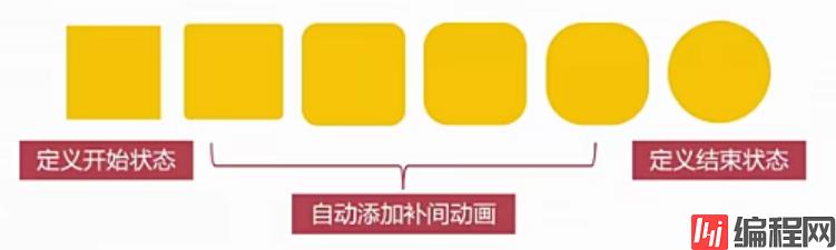
transition过渡: 四个小属性 属性 意义
| 属性 | 意义 |
|---|---|
| transition-property | 哪些属性要过渡 |
| transition-duration | 动画时间 |
| transition-timing-function | 动画变化曲线(缓动效果) |
| transition-delay | 延迟时间 |
<!DOCTYPE html>
<html lang="en">
<head>
    <meta charset="UTF-8">
    <meta Http-equiv="X-UA-Compatible" content="IE=edge">
    <meta name="viewport" content="width=device-width, initial-scale=1.0">
    <title>动画过渡</title>
    <style>
        .box {
            width: 200px;
            height: 200px;
            background-color: black;
            transition: width 5s linear 0s;
        }
        .box:hover {
            width: 500px;
        }
    </style>
</head>
<body>
    <div class="box">

    </div>
</body>
</html>
就是需要过渡的的加属性值transition,第一个值为变化的属性
<!DOCTYPE html>
<html lang="en">
<head>
    <meta charset="UTF-8">
    <meta http-equiv="X-UA-Compatible" content="IE=edge">
    <meta name="viewport" content="width=device-width, initial-scale=1.0">
    <title>动画过渡</title>
    <style>
        .box {
            width: 200px;
            height: 200px;
            background-color: black;
            transition: width 5s linear 0s;
        }
        .box:hover {
            width: 500px;
        }

        .box1{
            width: 200px;
            height: 200px;
            background-color: blue;
            transition: all 5s linear 0s;
        }
        .box1:hover {
            width: 400px;
            height: 200px;
            background-color: greenyellow;
            border-radius: 50%;
        }
    </style>
</head>
<body>
    <div class="box"></div>
    <div class="box1"></div>
</body>
</html>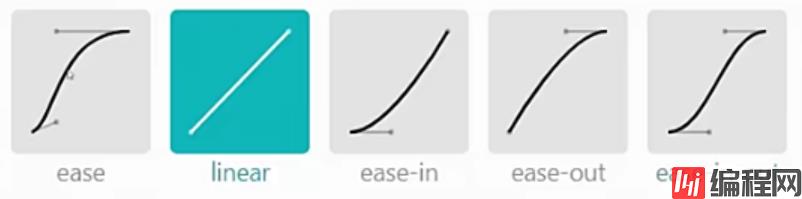
transition-timing-function:ease;
<!DOCTYPE html>
<html lang="en">
<head>
    <meta charset="UTF-8">
    <meta http-equiv="X-UA-Compatible" content="IE=edge">
    <meta name="viewport" content="width=device-width, initial-scale=1.0">
    <title>动画过渡</title>
    <style>
        * {
            margin: 0;
            padding: 0;
        }
        .box1 {
            border:1px solid black;
        }
        .box1 p{
            width: 50px;
            height: 50px;
            background-color: blue;
            position: relative;
            left: 0;
            margin-bottom: 10px;
            transition: left 5s linear 0s;
        }
        .box1 p:nth-child(2) {
            transition-timing-function: ease;
        }
        .box1 p:nth-child(3) {
            transition-timing-function: ease-in;
        }
        .box1 p:nth-child(4) {
            transition-timing-function: ease-out;
        }
        .box1 p:nth-child(5) {
            transition-timing-function: ease-in-out;
        }
        .box1:hover p {
            left: 100px;

        }
    </style>
</head>
<body>
    <div class="box1">
        <p></p>
        <p></p>
        <p></p>
        <p></p>
        <p></p>
    </div>
</body>
</html>

到此这篇关于CSS3使用过度动画和缓动效果案例讲解的文章就介绍到这了,更多相关CSS3使用过度动画和缓动效果内容请搜索编程网以前的文章或继续浏览下面的相关文章希望大家以后多多支持编程网!
--结束END--
本文标题: CSS3使用过度动画和缓动效果案例讲解
本文链接: https://www.lsjlt.com/news/131199.html(转载时请注明来源链接)
有问题或投稿请发送至: 邮箱/279061341@qq.com QQ/279061341
下载Word文档到电脑,方便收藏和打印~
2024-03-01
2024-03-01
2024-02-29
2024-02-29
2024-02-29
2024-02-29
2024-02-29
2024-02-29
2024-02-29
2024-02-29
回答
回答
回答
回答
回答
回答
回答
回答
回答
回答


官方手机版

微信公众号

商务合作


0