Python 官方文档:入门教程 => 点击学习
目录1.安装方法2.用好官网的例子最简单的应用-折线图添加注释的方法柱状图-Bar Label折线图之CSD前言: Matplotlib 通常与 NumPy、pandas 一起使用,
前言:
Matplotlib 通常与 NumPy、pandas 一起使用,是数据分析中不可或缺的重要工具之一。
Matplotlib 是 python 中类似 MATLAB 的绘图工具,如果您熟悉 MATLAB,那么可以很快的熟悉它。Matplotlib 提供了一套面向对象绘图的 api,它可以轻松地配合 Python GUI 工具包(比如 PyQt,WxPython、Tkinter)在应用程序中嵌入图形。与此同时,它也支持以脚本的形式在 Python、IPython shell、Jupyter Notebook 以及 WEB 应用的服务器中使用。
官网地址:
https://matplotlib.org/
可以看看docs

官网就相当详细了,可以直接参考官网。
pip安装:
pip3 install matplotlib -i Https://pypi.tuna.tsinghua.edu.cn/simpleconda安装:
conda install matplotlib测试是否成功:
import numpy as np
from matplotlib import pyplot as plt

x = np.arange(1,11)
y =  2  * x +  5
plt.title("Matplotlib demo")
plt.xlabel("x axis caption")
plt.ylabel("y axis caption")
plt.plot(x,y)
plt.show()
成功出现下图就可以动手改造了。

fig, ax = plt.subplots()  # Create a figure containing a single axes.
ax.plot([1, 2, 3, 4], [1, 4, 2, 3]);  # Plot some data on the axes.
fig, ax = plt.subplots(figsize=(5, 2.7))

t = np.arange(0.0, 5.0, 0.01)
s = np.cos(2 * np.pi * t)
line, = ax.plot(t, s, lw=2)

ax.annotate('local max', xy=(2, 1), xytext=(3, 1.5),
            arrowprops=dict(facecolor='black', shrink=0.05))

ax.set_ylim(-2, 2);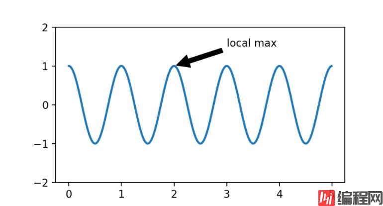
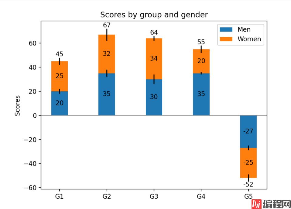
import matplotlib.pyplot as plt
import numpy as np
N = 5
menMeans = (20, 35, 30, 35, -27)
womenMeans = (25, 32, 34, 20, -25)
menStd = (2, 3, 4, 1, 2)
womenStd = (3, 5, 2, 3, 3)
ind = np.arange(N)    # the x locations for the groups
width = 0.35       # the width of the bars: can also be len(x) sequence
fig, ax = plt.subplots()
p1 = ax.bar(ind, menMeans, width, yerr=menStd, label='Men')
p2 = ax.bar(ind, womenMeans, width,
            bottom=menMeans, yerr=womenStd, label='Women')
ax.axhline(0, color='grey', linewidth=0.8)
ax.set_ylabel('Scores')
ax.set_title('Scores by group and gender')
ax.set_xticks(ind, labels=['G1', 'G2', 'G3', 'G4', 'G5'])
ax.legend()
# Label with label_type 'center' instead of the default 'edge'
ax.bar_label(p1, label_type='center')
ax.bar_label(p2, label_type='center')
ax.bar_label(p2)
plt.show()
正常run会出现下图:
计算两个信号的交叉谱密度Compute the cross spectral density of two signals
import numpy as np
import matplotlib.pyplot as plt


fig, (ax1, ax2) = plt.subplots(2, 1)
# make a little extra space between the subplots
fig.subplots_adjust(hspace=0.5)

dt = 0.01
t = np.arange(0, 30, dt)

# Fixing random state for reproducibility
np.random.seed(19680801)


nse1 = np.random.randn(len(t))                 # white noise 1
nse2 = np.random.randn(len(t))                 # white noise 2
r = np.exp(-t / 0.05)

cnse1 = np.convolve(nse1, r, mode='same') * dt   # colored noise 1
cnse2 = np.convolve(nse2, r, mode='same') * dt   # colored noise 2

# two signals with a coherent part and a random part
s1 = 0.01 * np.sin(2 * np.pi * 10 * t) + cnse1
s2 = 0.01 * np.sin(2 * np.pi * 10 * t) + cnse2

ax1.plot(t, s1, t, s2)
ax1.set_xlim(0, 5)
ax1.set_xlabel('time')
ax1.set_ylabel('s1 and s2')
ax1.grid(True)

cxy, f = ax2.csd(s1, s2, 256, 1. / dt)
ax2.set_ylabel('CSD (db)')
plt.show()
到此这篇关于python必备库Matplotlib画图神器的文章就介绍到这了,更多相关Matplotlib画图神器内容请搜索编程网以前的文章或继续浏览下面的相关文章希望大家以后多多支持编程网!
--结束END--
本文标题: python必备库Matplotlib画图神器
本文链接: https://www.lsjlt.com/news/142646.html(转载时请注明来源链接)
有问题或投稿请发送至: 邮箱/279061341@qq.com QQ/279061341
下载Word文档到电脑,方便收藏和打印~
2024-03-01
2024-03-01
2024-03-01
2024-02-29
2024-02-29
2024-02-29
2024-02-29
2024-02-29
2024-02-29
2024-02-29
回答
回答
回答
回答
回答
回答
回答
回答
回答
回答


官方手机版

微信公众号

商务合作


0