Python 官方文档:入门教程 => 点击学习
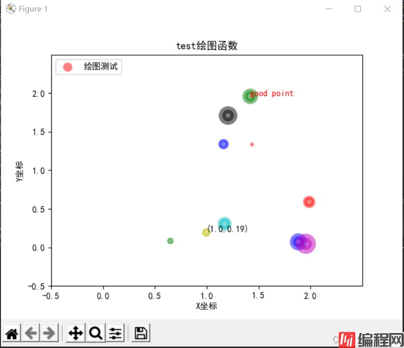
少废话,直接上代码 import matplotlib.pyplot as plt import numpy as np # 1. 首先是导入包,创建数据 n = 10
少废话,直接上代码
import matplotlib.pyplot as plt
import numpy as np
# 1. 首先是导入包,创建数据
n = 10
x = np.random.rand(n) * 2# 随机产生10个0~2之间的x坐标
y = np.random.rand(n) * 2# 随机产生10个0~2之间的y坐标
# 2.创建一张figure
fig = plt.figure(1)
# 3. 设置颜色 color 值【可选参数,即可填可不填】,方式有几种
# colors = np.random.rand(n) # 随机产生10个0~1之间的颜色值,或者
colors = ['r', 'g', 'y', 'b', 'r', 'c', 'g', 'b', 'k', 'm']  # 可设置随机数取
# 4. 设置点的面积大小 area 值 【可选参数】
area = 20*np.arange(1, n+1)
# 5. 设置点的边界线宽度 【可选参数】
widths = np.arange(n)# 0-9的数字
# 6. 正式绘制散点图:scatter
plt.scatter(x, y, s=area, c=colors, linewidths=widths, alpha=0.5, marker='o')
# 7. 设置轴标签:xlabel、ylabel
#设置X轴标签
plt.xlabel('X坐标')
#设置Y轴标签
plt.ylabel('Y坐标')
# 8. 设置图标题:title
plt.title('test绘图函数')
# 9. 设置轴的上下限显示值:xlim、ylim
# 设置横轴的上下限值
plt.xlim(-0.5, 2.5)
# 设置纵轴的上下限值
plt.ylim(-0.5, 2.5)
# 10. 设置轴的刻度值:xticks、yticks
# 设置横轴精准刻度
plt.xticks(np.arange(np.min(x)-0.2, np.max(x)+0.2, step=0.3))
# 设置纵轴精准刻度
plt.yticks(np.arange(np.min(y)-0.2, np.max(y)+0.2, step=0.3))
# 也可按照xlim和ylim来设置
# 设置横轴精准刻度
plt.xticks(np.arange(-0.5, 2.5, step=0.5))
# 设置纵轴精准刻度
plt.yticks(np.arange(-0.5, 2.5, step=0.5))

# 11. 在图中某些点上(位置)显示标签:annotate
# plt.annotate("(" + str(round(x[2], 2)) + ", " + str(round(y[2], 2)) + ")", xy=(x[2], y[2]), fontsize=10, xycoords='data')# 或者
plt.annotate("({0},{1})".fORMat(round(x[2],2), round(y[2],2)), xy=(x[2], y[2]), fontsize=10, xycoords='data')
# xycoords='data' 以data值为基准
# 设置字体大小为 10
# 12. 在图中某些位置显示文本:text
plt.text(round(x[6],2), round(y[6],2), "Good point", fontdict={'size': 10, 'color': 'red'})  # fontdict设置文本字体
# Add text to the axes.
# 13. 设置显示中文
plt.rcParams['font.sans-serif']=['SimHei'] #用来正常显示中文标签
plt.rcParams['axes.unicode_minus']=False #用来正常显示负号
# 14. 设置legend,【注意,'绘图测试':一定要是可迭代格式,例如元组或者列表,要不然只会显示第一个字符,也就是legend会显示不全】
plt.legend(['绘图测试'], loc=2, fontsize=10)
# plt.legend(['绘图测试'], loc='upper left', markerscale = 0.5, fontsize = 10) #这个也可
# markerscale:The relative size of legend markers compared with the originally drawn ones.
# 15. 保存图片 savefig
plt.savefig('test_xx.png', dpi=200, bbox_inches='tight', transparent=False)
# dpi: The resolution in dots per inch,设置分辨率,用于改变清晰度
# If *True*, the axes patches will all be transparent
# 16. 显示图片 show
plt.show()
scatter主要参数:
def scatter(self, x, y, s=None, c=None, marker=None, cmap=None, norm=None,
                vmin=None, vmax=None, alpha=None, linewidths=None,
                verts=None, edgecolors=None,
                **kwargs):
        """
        A scatter plot of *y* vs *x* with varying marker size and/or color.
        Parameters
        ----------
        x, y : array_like, shape (n, )
            The data positions.
        s : Scalar or array_like, shape (n, ), optional
            The marker size in points**2.
            Default is ``rcParams['lines.markersize'] ** 2``.
        c : color, sequence, or sequence of color, optional, default: 'b'
            The marker color. Possible values:
            - A single color format string.
            - A sequence of color specifications of length n.
            - A sequence of n numbers to be mapped to colors using *cmap* and
              *norm*.
            - A 2-D array in which the rows are RGB or RGBA.
            Note that *c* should not be a single numeric RGB or RGBA sequence
            because that is indistinguishable from an array of values to be
            colormapped. If you want to specify the same RGB or RGBA value for
            all points, use a 2-D array with a single row.
        marker : `~matplotlib.markers.MarkerStyle`, optional, default: 'o'
            The marker style. *marker* can be either an instance of the class
            or the text shorthand for a particular marker.
            See `~matplotlib.markers` for more information marker styles.
        cmap : `~matplotlib.colors.Colormap`, optional, default: None
            A `.Colormap` instance or reGIStered colormap name. *cmap* is only
            used if *c* is an array of floats. If ``None``, defaults to rc
            ``image.cmap``.
        alpha : scalar, optional, default: None
            The alpha blending value, between 0 (transparent) and 1 (opaque).
        linewidths : scalar or array_like, optional, default: None
            The linewidth of the marker edges. Note: The default *edgecolors*
            is 'face'. You may want to change this as well.
If *None*, defaults to rcParams ``lines.linewidth``.设置legend,【注意,'绘图测试’:一定要是可迭代格式,例如元组或者列表,要不然只会显示第一个字符,也就是legend会显示不全】
plt.legend(['绘图测试'], loc=2, fontsize = 10)
# plt.legend(['绘图测试'], loc='upper left', markerscale = 0.5, fontsize = 10) #这个也可
#  markerscale:The relative size of legend markers compared with the originally drawn ones.
其参数loc对应为:

运行结果:
补充
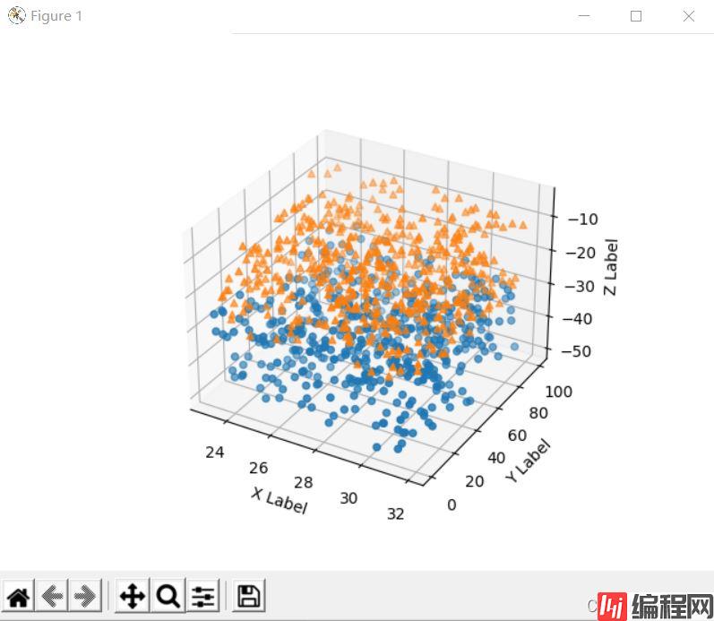
除了二维的散点图,python还能绘制三维的散点图,下面的示例代码
import matplotlib.pyplot as plt
from mpl_toolkits.mplot3D import Axes3D
import numpy as np

# 随机种子
np.random.seed(1)


def randrange(n, vmin, vmax):
    '''
    使数据分布均匀(vmin, vmax).
    '''
    return (vmax - vmin)*np.random.rand(n) + vmin

fig = plt.figure()
ax = fig.add_subplot(111, projection='3d')  # 可进行多图绘制

n = 500

# 对于每一组样式和范围设置,在由x在[23,32]、y在[0,100]、
# z在[zlow,zhigh]中定义的框中绘制n个随机点
for m, zlow, zhigh in [('o', -50, -25), ('^', -30, -5)]:
    xs = randrange(n, 23, 32)
    ys = randrange(n, 0, 100)
    zs = randrange(n, zlow, zhigh)
    ax.scatter(xs, ys, zs, marker=m)  # 绘图

# X、Y、Z的标签
ax.set_xlabel('X Label')
ax.set_ylabel('Y Label')
ax.set_zlabel('Z Label')

plt.show()
输出结果:
到此这篇关于Python绘制散点图的教程详解的文章就介绍到这了,更多相关Python散点图内容请搜索编程网以前的文章或继续浏览下面的相关文章希望大家以后多多支持编程网!
--结束END--
本文标题: Python绘制散点图的教程详解
本文链接: https://www.lsjlt.com/news/142735.html(转载时请注明来源链接)
有问题或投稿请发送至: 邮箱/279061341@qq.com QQ/279061341
下载Word文档到电脑,方便收藏和打印~
2024-03-01
2024-03-01
2024-03-01
2024-02-29
2024-02-29
2024-02-29
2024-02-29
2024-02-29
2024-02-29
2024-02-29
回答
回答
回答
回答
回答
回答
回答
回答
回答
回答


官方手机版

微信公众号

商务合作


0