使用highchart图表框架实现一个自定义的类似下图的图表,供大家参考,具体内容如下 1. 原理 实际上就是4个饼图叠起来(可以这么理解),中间一个完整的圆和三个大小不一的圆圈
使用highchart图表框架实现一个自定义的类似下图的图表,供大家参考,具体内容如下
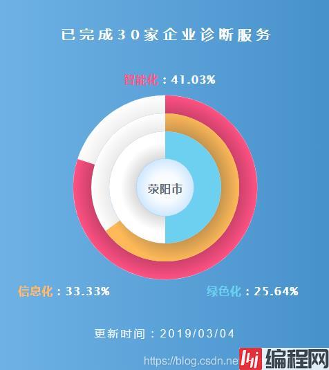
实际上就是4个饼图叠起来(可以这么理解),中间一个完整的圆和三个大小不一的圆圈
使用的是highchart中的Highstock
图表类型是solidgauge
因为饼图不支持阴影效果(可能是我没找到),所以上图中带的一点类似阴影的效果,看起来有一点点立体的感觉用的是径向渐变属性来实现的
其中用到了图表的时间属性:鼠标移出和移入事件
数据标签字符串格式化函数
因为使用的是Highstock,所以需要引入除highchart之外的其他文件,highchart使用npm安装,所有的文件都会下载下来,直接使用就行,项目使用的是Vue,包的引入方式如下:
import Highcharts from 'highcharts';
import highchartsMore from 'highcharts/highcharts-more';
highchartsMore(Highcharts);
以下是实现的代码:
const charts = {
    chart: {
      type: 'solidgauge',
      height: '110%',
      margin: [100, 100, 70, 100], // 设置图表距离容器组件的上下左右的边距
      backgroundColor: { // 背景色是线性渐变
        linearGradient: { x1: 0, x2: 1, y1: 0, y2: 0 }, // x1,y1是左上角的坐标点,x2,y2是右下角的坐标点,从左到右的渐变 x1: 0, x2: 1, y1: 0, y2: 0
        stops: [ // 渐变颜色的分区0是起点,1是终点
          [0, '#6EB2E5'],
          [1, '#4791CB']
        ]
      },
      spacingTop: 50,
    },
    title: {
      text: '已完成30家企业诊断服务',
      style: { // 图表标题样式
        fontSize: '20px',
        letterSpacing: '7px',
        color: '#fff',
        textShadow: '1px 0px #fff'
      }
    },
    tooltip: {
      enabled: false, // 关闭图表自带的提示框属性
    },
    pane: { // 四个圆圈的背景样式
      startAngle: 0, // 开始的角度0
      endAngle: 360, // 结束角度360
      background: [{
        outerRadius: '112%', // 圆环外部圈大小
        innerRadius: '90%', // 圆环内部圈大小
        backgroundColor: { // 因为要带一点点立体的效果,使用了径向渐变
          radialGradient: { cx: 0.5, cy: 0.5, r: 0.5 }, // cx,cy相对于图形的竖直和水平位置,r时渐变的半径
          stops: [
            [0, '#aaa'],
            [1, '#fff']
          ]
        },
        borderWidth: 0,
        borderColor: '#C3CCDA',
        className: 'boxshadow' // 可以给每一个面板绑定一个自定义的class
      }, {
        outerRadius: '90%',
        innerRadius: '68%',
        backgroundColor: {
          radialGradient: { cx: 0.5, cy: 0.5, r: 0.5 },
          stops: [
            [0, '#aaa'],
            [1, '#fff']
          ]
        },
        borderWidth: 0,
        borderColor: '#C3CCDA',
        className: 'boxshadow'
      }, {
        outerRadius: '68%',
        innerRadius: '35%',
        backgroundColor: {
          radialGradient: { cx: 0.5, cy: 0.5, r: 0.4 },
          stops: [
            [0, '#999'],
            [1, '#fff']
          ]
        },
        borderWidth: 0,
        borderColor: '#C3CCDA'
      }, {
        outerRadius: '35%',
        innerRadius: '0',
        backgroundColor: {
          radialGradient: { cx: 0.5, cy: 0.5, r: 0.5 },
          stops: [
            [0, '#FFFFFF'],
            [0.5, '#F7FBFF'],
            [1, '#CEE7FF']
          ]
        },
        borderWidth: 0,
      }]
    },
    credits: {
      enabled: false, // 关闭版权标志
    },
    yAxis: {
      min: 0, // 圆环y值的最小值
      max: 100, // 圆环y值得最大值
      lineWidth: 0,
      tickPositions: [] // 关闭刻度
    },
    plotOptions: {
      solidgauge: {
        dataLabels: { // 设置图表的标签样式
          enabled: true,
          style: {
            fontSize: '16px',
            textOutline: 'none',
            color: '#fff',
            letterSpacing: '1px'
          }
        },
        linecap: 'square', //  带颜色部分的的圆环边角是矩形或者圆形
        stickyTracking: false,
        rounded: false,
        cursor: 'pointer', // 鼠标选中样式
      }
    },
    colors: ['#7CB5EC', '#FF5184', '#76DDFB'],
    series: [{
      name: '智能化',
      data: [{
        color: {
          radialGradient: { cx: 0.5, cy: 0.5, r: 0.5 },
          stops: [
            [0, '#000'],
            [1, '#FF5184']
          ]
        },
        radius: '112%',
        innerRadius: '90%',
        y: 80,
        dataLabels: {
          borderWidth: 0,
          color: '#616C80',
          enabled: true,
          fORMatter: function () {
            return `<span style="color:#FF5184">${this.series.name}</span>` + '<span style="color: #fff;">:' + ((this.y / (80+65+50)) * 100).toFixed(2) + '%</span>';
          },
          x: -80,
          y: -170, // 自定义数据标签的位置
        },
        events: { // 鼠标事件,鼠标移出或移入时圆环大小变化
          mouseOver: function () {
            this.update({
              radius: '120%',
            });
          },
          mouseOut: function () {
            this.update({
              radius: '112%',
            });
          },
        },
      }]
    }, {
      name: '信息化',
      data: [{
        color: {
          radialGradient: { cx: 0.5, cy: 0.5, r: 0.5 },
          stops: [
            [0, '#333'],
            [1, '#FFB958']
          ]
        },
        radius: '90%',
        innerRadius: '68%',
        y: 65,
        dataLabels: {
          borderWidth: 0,
          color: '#616C80',
          enabled: true,
          formatter: function () {
            return `<span style="color:#FFB958">${this.series.name}</span>` + '<span style="color: #fff;">:' + ((this.y / (80+65+50)) * 100).toFixed(2) + '%</span>';
          },
          x: 220,
          y: -320,
        },
        events: {
          mouseOver: function () {
            this.update({
              radius: '98%',
            });
          },
          mouseOut: function () {
            this.update({
              radius: '90%',
            });
          },
        },
      }]
    }, {
      name: '绿色化',
      data: [{
        color: '#6ED0F0',
        radius: '68%',
        innerRadius: '35%',
        y: 50,
        dataLabels: {
          borderWidth: 0,
          color: '#616C80',
          enabled: true,
          formatter: function () {
            return `<span style="color:${this.color}">${this.series.name}</span>` + '<span style="color: #fff;">:' + ((this.y / (80+65+50)) * 100).toFixed(2) + '%</span>';
          },
          x: -200,
          y: -320,
        },
        events: {
          mouseOver: function () {
            this.update({
              radius: '76%',
            });
          },
          mouseOut: function () {
            this.update({
              radius: '68%',
            });
          },
        },
      }]
    }, { // 中间名字的圆,没有数据,只有一个显示
      name: '荥阳市',
      data: [{
        color: '#6ED0F0',
        radius: '35%',
        innerRadius: '0',
        y: 0,
        dataLabels: {
          borderWidth: 0,
          color: '#616C80',
          enabled: true,
          formatter: function () {
            return `荥阳市`;
          },
          x: 0,
          y: -12,
        }
      }]
    }]
};代码重复较多,但暂时还没找到更好的方法在一个统一的地方写,会再优化
--结束END--
本文标题: vue使用highcharts自定义仪表盘图表
本文链接: https://www.lsjlt.com/news/144042.html(转载时请注明来源链接)
有问题或投稿请发送至: 邮箱/279061341@qq.com QQ/279061341
下载Word文档到电脑,方便收藏和打印~
2024-01-12
2023-05-20
2023-05-20
2023-05-20
2023-05-20
2023-05-20
2023-05-20
2023-05-20
2023-05-20
2023-05-20
回答
回答
回答
回答
回答
回答
回答
回答
回答
回答


官方手机版

微信公众号

商务合作


0