本文实例为大家分享了Vue+highCharts实现可选范围的图表,供大家参考,具体内容如下 效果图: 实现方法(数据可自行修改): <div id="container"
本文实例为大家分享了Vue+highCharts实现可选范围的图表,供大家参考,具体内容如下
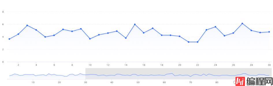
效果图:
实现方法(数据可自行修改):
<div id="container" style="width: 100%;height:370px;position: relative">
  <div id="detailContainer" ref="chart1" style="width:100%;height:370px" />
  <div id="masterContainer" ref="chart2" style="position: absolute;top: 270px;height: 100px;width: 100%" />
</div>
import Highcharts from 'highcharts'//eslint-disable-line
import $ from 'Jquery'
var detailChart //eslint-disable-line
var masterChart //eslint-disable-line
export default {
name: 'CollectDataCharts',
data() {
return {
detailChartData: [//eslint-disable-line
0.8446, 0.8445, 0.8444, 0.8451, 0.8418, 0.8264, 0.8258, 0.8232, 0.8233, 0.8258,
0.8283, 0.8278, 0.8256, 0.8292, 0.8239, 0.8239, 0.8245, 0.8265, 0.8261, 0.8269,
0.8273, 0.8244, 0.8244, 0.8172, 0.8139, 0.8146, 0.8164, 0.82, 0.8269, 0.8269,
0.8269, 0.8258, 0.8247, 1.8286, 0.8289, 0.8316, 0.832, 0.8333, 0.8352, 0.8357,
0.8355, 0.8354, 0.8403, 0.8403, 0.8406, 0.8403, 0.8396, 0.8418, 0.8409, 0.8384,
0.8386, 0.8372, 0.839, 0.84, 0.8389, 0.84, 0.8423, 0.8423, 0.8435, 0.8422,
0.838, 0.8373, 0.8316, 0.8303, 0.8303, 0.8302, 0.8369, 0.84, 0.8385, 0.84,
0.8401, 0.8402, 0.8381, 0.8351, 0.8314, 0.8273, 0.8213, 0.8207, 0.8207, 0.8215,
0.8242, 0.8273, 0.8301, 0.8346, 0.8312, 0.8312, 0.8312, 0.8306, 0.8327, 0.8282,
0.824, 0.8255, 0.8256, 0.8273, 0.8209, 1.8151, 0.8149, 0.8213, 0.8273, 0.8273, // 100
0.8261, 0.8252, 0.824, 0.8262, 0.8258, 0.8261, 0.826, 0.8199, 0.8153, 0.8097,
0.8101, 0.8119, 0.8107, 0.8105, 0.8084, 0.8069, 0.8047, 0.8023, 0.7965, 0.7919,
0.7921, 0.7922, 0.7934, 0.7918, 0.7915, 0.787, 0.7861, 0.7861, 0.7853, 0.7867,
0.7827, 0.7834, 0.7766, 0.7751, 0.7739, 0.7767, 0.7802, 0.7788, 0.7828, 0.7816,
0.7829, 0.783, 0.7829, 0.7781, 0.7811, 0.7831, 0.7826, 0.7855, 0.7855, 0.7845,
0.7798, 0.7777, 0.7822, 0.7785, 0.7744, 0.7743, 0.7726, 0.7766, 0.7806, 0.785,
0.7907, 0.7912, 1.7913, 0.7931, 0.7952, 0.7951, 0.7928, 0.791, 0.7913, 0.7912,
0.7941, 0.7953, 0.7921, 0.7919, 0.7968, 0.7999, 0.7999, 0.7974, 0.7942, 0.796,
0.7969, 0.7862, 0.7821, 0.7821, 0.7821, 0.7811, 0.7833, 0.7849, 0.7819, 0.7809,
0.7809, 0.7827, 0.7848, 0.785, 0.7873, 0.7894, 0.7907, 0.7909, 0.7947, 0.7987, // 200
0.799, 0.7927, 0.79, 0.7878, 0.7878, 0.7907, 0.7922, 0.7937, 0.786, 0.787,
0.7838, 0.7838, 0.7837, 0.7836, 0.7806, 0.7825, 0.7798, 0.777, 0.777, 0.7772,
0.7793, 0.7788, 0.7785, 0.7832, 0.7865, 0.7865, 0.7853, 0.7847, 0.7809, 0.778,
0.7799, 0.78, 0.7801, 0.7765, 0.7785, 0.7811, 0.782, 0.7835, 0.7845, 0.7844,
0.782, 0.7811, 0.7795, 0.7794, 0.7806, 0.7794, 0.7794, 0.7778, 0.7793, 0.7808,
0.7824, 0.787, 0.7894, 0.7893, 0.7882, 1.7871, 0.7882, 0.7871, 0.7878, 0.79,
0.7901, 0.7898, 0.7879, 0.7886, 0.7858, 0.7814, 0.7825, 0.7826, 0.7826, 0.786,
0.7878, 0.7868, 0.7883, 0.7893, 0.7892, 0.7876, 0.785, 0.787, 0.7873, 0.7901,
0.7936, 0.7939, 0.7938, 0.7956, 0.7975, 0.7978, 0.7972, 0.7995, 0.7995, 0.7994,
0.7976, 0.7977, 0.796, 0.7922, 0.7928, 0.7929, 0.7948, 0.797, 0.7953, 0.7907 // 300
]
}
},
mounted() {
$(window).resize(() => {
detailChart.reflow()
masterChart.reflow()
})
},
beforeDestroy() {
$(window).off('resize')
},
methods: {
createDetail(masterChart) {
var detailData = []
Highcharts.each(masterChart.series[0].data, (d, index) => {
if (d.x < 30) {
detailData.push({
x: d.x,
y: d.y,
time: d.time
})
}
})
detailChart = Highcharts.chart('detailContainer', {
chart: {
type: 'area', // areaspline
marginBottom: 120,
reflow: false,
marginLeft: 50,
marginRight: 20,
style: {
position: 'absolute'
}
},
credits: {
enabled: false
},
title: {
text: ''
},
subtitle: {
text: ''
},
xAxis: {
// type: 'datetime'
},
yAxis: {
gridLineDashStyle: 'dash',
title: {
text: null
},
maxZoom: 0.1
},
tooltip: {
fORMatter: function() {
var point = this.points[0]
const date = new Date(point.point.time)
const y = date.getFullYear()
let MM = date.getMonth() + 1
MM = MM < 10 ? ('0' + MM) : MM
let d = date.getDate()
d = d < 10 ? ('0' + d) : d
let h = date.getHours()
h = h < 10 ? ('0' + h) : h
let m = date.getMinutes()
m = m < 10 ? ('0' + m) : m
let s = date.getSeconds()
s = s < 10 ? ('0' + s) : s
const time = y + '-' + MM + '-' + d + ' ' + h + ':' + m + ':' + s
return '<span>' + time + '</span><br/>' +
'<b>' + point.series.name + ':' + point.y + ' mm/s</b>'
},
shared: true
},
legend: {
enabled: false
},
plotOptions: {
series: {
shadow: {
color: '#e1e8fe',
width: 6,
offsetY: 3
},
marker: {
enabled: true,
radius: 3.5,
states: {
hover: {
enabled: true,
radius: 3
}
}
},
fillColor: {// 注意!!!如果是柱状图请使用color,如果是面积图请使用fillColor
linearGradient: {
x1: 0,
y1: 0,
x2: 0,
y2: 1
},
stops: [
[0, '#f3f6ff'],
[1, Highcharts.Color('white').setOpacity(0).get('rgba')]
]
}
}
},
series: [{
name: '总体振动',
animation: false,
color: '#225FFB',
data: detailData
}]
})
},
createMaster() {
let detailData = []//eslint-disable-line
Highcharts.each(this.detailChartData, (d, index) => {
if (d) {
detailData.push({
x: Number(index) + 1,
y: Number(d),
time: 1639538317248
})
}
})
masterChart = Highcharts.chart('masterContainer', {
chart: {
type: 'spline',
reflow: false,
borderWidth: 0,
backgroundColor: null,
marginLeft: 50,
marginRight: 20,
zoomType: 'x',
events: {
// listen to the selection event on the master chart to update the
// extremes of the detail chart
selection: function(event) {
var extremesObject = event.xAxis[0]
var min = extremesObject.min
var max = extremesObject.max
var detailData = []
var xAxis = this.xAxis[0]
Highcharts.each(this.series[0].data, (d, index) => {
if (d.x > min && d.x < max) {
detailData.push({
x: d.x,
y: d.y,
time: d.time
})
}
})
xAxis.removePlotBand('mask-before')
xAxis.addPlotBand({
id: 'mask-before',
from: 1,
to: min,
color: 'rgba(0, 0, 0, 0.1)'
})
xAxis.removePlotBand('mask-after')
xAxis.addPlotBand({
id: 'mask-after',
from: max,
to: 300,
color: 'rgba(0, 0, 0, 0.1)'
})
detailChart.series[0].setData(detailData)
return false
}
}
},
title: {
text: null
},
xAxis: {
plotBands: [{
id: 'mask-before',
from: 30,
to: 300,
color: 'rgba(0, 0, 0, 0.1)'
}],
title: {
text: null
}
},
yAxis: {
gridLineWidth: 0,
labels: {
enabled: false
},
title: {
text: null
},
min: 0.6,
showFirstLabel: false
},
tooltip: {
formatter: () => {
return false
}
},
legend: {
enabled: false
},
credits: {
enabled: false
},
plotOptions: {
series: {
fillColor: {
linearGradient: [0, 0, 0, 70],
stops: [
[0, '#c3cffe'],
[1, 'rgba(255,255,255,0)']
]
},
lineWidth: 1,
marker: {
enabled: false
},
shadow: false,
states: {
hover: {
lineWidth: 1
}
},
enableMouseTracking: false
}
},
series: [{
type: 'area',
name: 'USD to EUR',
pointInterval: 100,
pointStart: 1,
animation: false,
color: '#225FFB',
data: detailData
}],
exporting: {
enabled: false
}
}, (masterChart) => {
this.createDetail(masterChart)
})
return masterChart
}
}
}
--结束END--
本文标题: vue+highCharts实现可选范围的图表
本文链接: https://www.lsjlt.com/news/144045.html(转载时请注明来源链接)
有问题或投稿请发送至: 邮箱/279061341@qq.com QQ/279061341
下载Word文档到电脑,方便收藏和打印~
2024-01-12
2023-05-20
2023-05-20
2023-05-20
2023-05-20
2023-05-20
2023-05-20
2023-05-20
2023-05-20
2023-05-20
回答
回答
回答
回答
回答
回答
回答
回答
回答
回答


官方手机版

微信公众号

商务合作


0