目录介绍演示正文绘制背景拉杆绘制生成条带数字转动介绍 之前在抖音上看的某个脑洞大开的产品设想的几种别具特色的后端看了抓狂前端看了想打人的阴间交互效果,其中一个脑洞是让用户拉一下拉杆如
之前在抖音上看的某个脑洞大开的产品设想的几种别具特色的后端看了抓狂前端看了想打人的阴间交互效果,其中一个脑洞是让用户拉一下拉杆如同抽奖的形式获取到验证码,本期就咱们就还原出这个交互效果看看它到底有多疯狂。
效果就是这样喵~
Markup
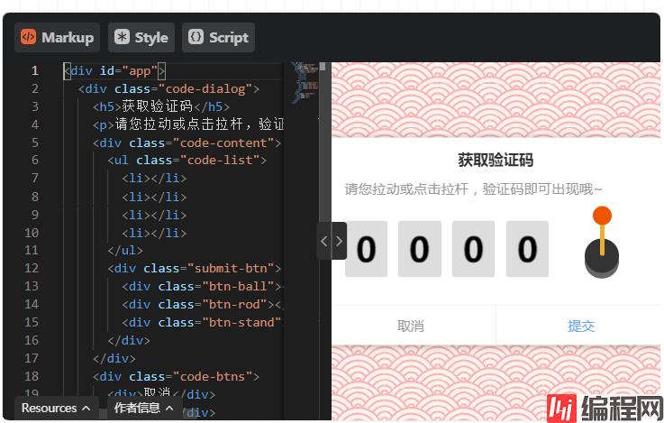
<div id="app">
  <div class="code-dialog">
    <h5>获取验证码</h5>
    <p>请您拉动或点击拉杆,验证码即可出现哦~</p>
    <div class="code-content">
      <ul class="code-list">
        <li></li>
        <li></li>
        <li></li>
        <li></li>
      </ul>
      <div class="submit-btn">
        <div class="btn-ball"></div>
        <div class="btn-rod"></div>
        <div class="btn-stand"></div>
      </div>
    </div>
    <div class="code-btns">
      <div>取消</div>
      <div>提交</div>
    </div>
  </div>
</div>
style
@import url("https://fonts.Googleapis.com/CSS?family=Baloo+Bhaijaan&display=swap");
* {
  -WEBkit-tap-highlight-color: transparent !important;
}
#app{
  width:100%;
  height: 100vh;
  position: relative;
  overflow: hidden;
  background-color: #fff3ef;
  background-image: url("data:image/svg+xml,%3Csvg xmlns='Http://www.w3.org/2000/svg' viewBox='0 0 56 28' width='56' height='28'%3E%3Cpath fill='%23ed5c5c' fill-opacity='0.4' d='M56 26v2h-7.75c2.3-1.27 4.94-2 7.75-2zm-26 2a2 2 0 1 0-4 0h-4.09A25.98 25.98 0 0 0 0 16v-2c.67 0 1.34.02 2 .07V14a2 2 0 0 0-2-2v-2a4 4 0 0 1 3.98 3.6 28.09 28.09 0 0 1 2.8-3.86A8 8 0 0 0 0 6V4a9.99 9.99 0 0 1 8.17 4.23c.94-.95 1.96-1.83 3.03-2.63A13.98 13.98 0 0 0 0 0h7.75c2 1.1 3.73 2.63 5.1 4.45 1.12-.72 2.3-1.37 3.53-1.93A20.1 20.1 0 0 0 14.28 0h2.7c.45.56.88 1.14 1.29 1.74 1.3-.48 2.63-.87 4-1.15-.11-.2-.23-.4-.36-.59H26v.07a28.4 28.4 0 0 1 4 0V0h4.09l-.37.59c1.38.28 2.72.67 4.01 1.15.4-.6.84-1.18 1.3-1.74h2.69a20.1 20.1 0 0 0-2.1 2.52c1.23.56 2.41 1.2 3.54 1.93A16.08 16.08 0 0 1 48.25 0H56c-4.58 0-8.65 2.2-11.2 5.6 1.07.8 2.09 1.68 3.03 2.63A9.99 9.99 0 0 1 56 4v2a8 8 0 0 0-6.77 3.74c1.03 1.2 1.97 2.5 2.79 3.86A4 4 0 0 1 56 10v2a2 2 0 0 0-2 2.07 28.4 28.4 0 0 1 2-.07v2c-9.2 0-17.3 4.78-21.91 12H30zM7.75 28H0v-2c2.81 0 5.46.73 7.75 2zM56 20v2c-5.6 0-10.65 2.3-14.28 6h-2.7c4.04-4.89 10.15-8 16.98-8zm-39.03 8h-2.69C10.65 24.3 5.6 22 0 22v-2c6.83 0 12.94 3.11 16.97 8zm15.01-.4a28.09 28.09 0 0 1 2.8-3.86 8 8 0 0 0-13.55 0c1.03 1.2 1.97 2.5 2.79 3.86a4 4 0 0 1 7.96 0zm14.29-11.86c1.3-.48 2.63-.87 4-1.15a25.99 25.99 0 0 0-44.55 0c1.38.28 2.72.67 4.01 1.15a21.98 21.98 0 0 1 36.54 0zm-5.43 2.71c1.13-.72 2.3-1.37 3.54-1.93a19.98 19.98 0 0 0-32.76 0c1.23.56 2.41 1.2 3.54 1.93a15.98 15.98 0 0 1 25.68 0zm-4.67 3.78c.94-.95 1.96-1.83 3.03-2.63a13.98 13.98 0 0 0-22.4 0c1.07.8 2.09 1.68 3.03 2.63a9.99 9.99 0 0 1 16.34 0z'%3E%3C/path%3E%3C/svg%3E");
}
.code-dialog{
  width:360px;
  height:220px;
  background:#ffffff;
  position:absolute;
  top: 50%;
  left: 50%;
  transfORM: translate(-50%,-50%);
  border-radius: 10px;
  box-shadow: 1px 1px 8px rgba(0,0,0,.3);
  box-sizing: border-box;
  padding: 15px 20px 42px;
  h5{
    text-align: center;
    font-size:16px;
    color:#333333;
    font-weight: 700;
    letter-spacing: .1px;
  }
  p{
    font-size: 14px;
    color: #999999;
    margin: 15px 0 20px;
    line-height: 1.3;
    letter-spacing: .6px;
  }
  .code-btns{
    position: absolute;
    bottom: 0;
    left: 0;
    width:100%;
    display: flex;
    align-items: center;
    border-top: 1px solid #f2f2f2;
    height: 42px;
    &>div{
      flex: 1;
      font-size: 14px;
      color: #999999;
      height: 100%;
      justify-content: center;
      display: flex;
      align-items: center;
      cursor: pointer;
      &:last-of-type{
        color: rgb(102, 168, 255);
        border-left: 1px solid #f2f2f2;
      }
    }
  }
  .code-content{
      display: flex;
      align-items:center;
      box-sizing: border-box;
      margin-top: 15px;
      ul{
        display: flex;
        align-items: center;
        li{
          width:45px;
          height:60px;
          position: relative;
          background-color: #DDD;
          border-radius: 3px;
          overflow: hidden;
          background-repeat: repeat-y;
          background-size:100% auto;
          background-position-y:0px;
          &:not(:last-of-type){
            margin-right: 12px;
          }
        }
      }
      .submit-btn{
        width: 70px;
        height: 70px;
        margin-left: 21px;
        top: -10px;
        display: flex;
        align-items: center;
        justify-content: center;
        position:relative;
        .btn-stand{
          width:36px;
          height:36px;
          background:#333333;
          border-radius: 50%;
          box-shadow: 0 6px #666666;
          position:absolute;
          bottom:0;
        }
        .btn-ball{
          position: absolute;
          width:20px;
          height: 20px;
          border-radius: 50%;
          background-color: #e50;
          z-index: 9;
          top: 0px;
          cursor: pointer;
        }
        .btn-rod{
          z-index: 8;
          width:5px;
          height: 36px;
          background:#e9af30;
          border-radius: 2px;
          margin-left:1px;
          position:absolute;
          bottom:18px;
          transform: scaleY(1);
          transform-origin: center bottom;
        }
        &.active{
          .btn-rod{
            animation:rod-down .32s linear;
          }
          .btn-ball{
            animation:ball-down .32s linear;
          }
        }
      }
  }
}
@keyframes rod-down{
   0%{
     transform: scaleY(1);
   }
   60%{
     transform: scaleY(0);
   }
   80%{
     transform:scaleY(-.2);
   }
   100%{
     transform:scaleY(1);
   }
}
@keyframes ball-down{
   0%{
     transform: translateY(0);
   }
   60%{
     transform: translateY(40px);
   }
   80%{
     transform: translateY(60px);
   }
   100%{
     transform: translateY(0);
   }
}
script
import anime from "https://cdn.skypack.dev/animejs@3.2.1";

(function () {
  let ball = document.querySelector(".btn-ball");
  let submit = document.querySelector(".submit-btn");
  let list = document.querySelector(".code-list");
  let isActive = false;
  let startY,
    isDown = false;
  let w = 45,
    h = 60;
  let backgroundImage = createBackgroundImage(w, h);
  let code = "";

  init();
  bindEvent();

  function bindEvent() {
    if (navigator.userAgent.match(/(iPhone|iPod|Android|iOS)/i)) {
      submit.addEventListener("touchstart", _mouseDown);
      submit.addEventListener("touchmove", _mouseMove);
      submit.addEventListener("touchend", _mouseUp);
    } else {
      ball.addEventListener("mousedown", _mouseDown);
      ball.addEventListener("mousemove", _mouseMove);
      ball.addEventListener("mouseup", _mouseUp);
      ball.addEventListener("mouseout", _mouseUp);
    }
  }

  submit.addEventListener("click", action);

  function _mouseDown(e) {
    if (isActive) return;
    if (isDown) return;
    let clientY =
      e.offsetY || (e.changedTouches && e.changedTouches[0].clientY);
    startY = clientY;
    isDown = true;
  }

  function _mouseMove(e) {
    if (isActive) return;
    if (!isDown) return;
    let clientY =
      e.offsetY || (e.changedTouches && e.changedTouches[0].clientY);
    let d = clientY - startY;
    console.log(d);
    if (d > 3) {
      isDown = false;
      action();
    }
  }

  function _mouseUp(e) {
    isDown = false;
  }

  ball.addEventListener("animationend", (e) => {
    submit.classList.remove("active");
    play();
  });

  function action() {
    if (isActive) return;
    code = "";
    isActive = true;
    submit.classList.add("active");
  }

  function play() {
    let nums = createNums();
    code = nums.join("");
    [].forEach.call(list.children, (el, index) => {
      setTimeout(() => {
        let y = parseInt(el.style.backgroundPositionY || "0", 10);
        anime({
          targets: el,
          backgroundPositionY: [y, y + h * 30 + (10 - nums[index]) * h],
          loop: false, // 循环播放
          direction: "normal",
          easing: "easeOutCirc", // 时间曲线
          duration: 2000, // 播放时间2s
          autoplay: true, // 是否立即播放
          complete: (anim) => {
            if (index == 3) isActive = false;
          }
        });
      }, index * 200);
    });
  }

  function init() {
    addBackgroundImage();
  }
  function addBackgroundImage() {
    [].forEach.call(list.children, (el) => {
      el.style.backgroundImage = `url(${backgroundImage.src})`;
    });
  }

  function createBackgroundImage(w, h) {
    let canvas = document.createElement("canvas");
    let ctx = canvas.getContext("2d");
    canvas.width = ctx.width = w;
    canvas.height = ctx.height = h * 10;
    let BackgroundImage = new Array(10).fill(0);
    BackgroundImage.forEach((n, i) => {
      ctx.save();
      ctx.textAlign = "center";
      ctx.textBaseline = "middle";
      ctx.font = "bold 36px Baloo Bhaijaan";
      ctx.fillText(i, w / 2, h * i + h / 2 + 5, w);
      ctx.restore();
    });
    return convertCanvasToImage(canvas);
  }

  function convertCanvasToImage(canvas) {
    var image = new Image();
    image.src = canvas.toDataURL("image/png");
    return image;
  }

  function random(min, max) {
    return parseInt(Math.random() * (max - min + 1) + min);
  }

  function createNums(l = 4) {
    let num = random(1, 9999);
    let res = (num + "").split("");
    let len = res.length;
    if (len < l) {
      for (let i = 0; i < l - len; i++) {
        res.unshift("0");
      }
    }
    return res;
  }

})();
提前说明下,咱们仅仅实现交互效果不需要考虑后端交互验证和安全这些,所以数字是每次拉动前端随机生成的,也没有加混淆和干扰。
通过上面的演示可以看到,背景svg云纹的效果,那它是怎么实现的呢?不卖关子了,我是用了一个专门生成svg背景的网站来实现的,里面有各种各样的svg背景可以定制颜色,然后拷贝css代码出来就为你所用了。
<div class="submit-btn">
    <div class="btn-ball"></div>
    <div class="btn-rod"></div>
    <div class="btn-stand"></div>
</div>
拉杆主要分别由头,杆,底座三个部分组成,而我们触发事件后赋给容器应该 active 样式,然后由他去控制头和杆执行一段css动画来实现其拉动的效果。
.submit-btn{
    &.active{
        .btn-rod{
            animation:rod-down .32s linear;
        }
        .btn-ball{
            animation:ball-down .32s linear;
        }
    }
}
@keyframes rod-down{
   0%{
     transform: scaleY(1);
   }
   60%{
     transform: scaleY(0);
   }
   80%{
     transform:scaleY(-.2);
   }
   100%{
     transform:scaleY(1);
   }
}
@keyframes ball-down{
   0%{
     transform: translateY(0);
   }
   60%{
     transform: translateY(40px);
   }
   80%{
     transform: translateY(60px);
   }
   100%{
     transform: translateY(0);
   }
}
至于,事件的绑定则非常容易,就说判断鼠标点击滑动抬起事件,看看两点间的变化量是否大于3px,如果大于则向容器赋予 active 样式触发css动画。

让数字转动之前我们先要生成一下条带,当然我们可以直接使用图片,但是咱们没有设计,所以前端自己动手丰衣足食吧。就用 canvas 拼接出一个图片数字条带出来。
function createBackgroundImage(w, h) {
    let canvas = document.createElement("canvas");
    let ctx = canvas.getContext("2d");
    canvas.width = ctx.width = w;
    canvas.height = ctx.height = h * 10;
    let BackgroundImage = new Array(10).fill(0);
    BackgroundImage.forEach((n, i) => {
        ctx.save();
        ctx.textAlign = "center";
        ctx.textBaseline = "middle";
        ctx.font = "bold 36px Baloo Bhaijaan";
        ctx.fillText(i, w / 2, h * i + h / 2 + 5, w);
        ctx.restore();
    });
    return convertCanvasToImage(canvas);
}
function convertCanvasToImage(canvas) {
    var image = new Image();
    image.src = canvas.toDataURL("image/png");
    return image;
}
在项目初始化的时候,就会执行这个方法,利用 canvas 绘制出0到9,10个数字纵向排列出来,最后用 toDataURL 方法导出图片,赋给需要转动区域内的做背景图。
上一步操作背景图都生成出来了,不难想到我们将会通过改变 backgroundPositionY 的形式来实现转动。当然,我们还要让动画不停加速最后在慢慢停下来,所以要加入缓动,这里推荐一个动画库 animejs ,它非常的小巧且灵活好用。
import anime from "https://cdn.skypack.dev/animejs@3.2.1";
function play() {
    let nums = createNums();
    code = nums.join("");
    [].forEach.call(list.children, (el, index) => {
        setTimeout(() => {
            let y = parseInt(el.style.backgroundPositionY || "0", 10);
            anime({
                targets: el,
                backgroundPositionY: [y, y + h * 30 + (10 - nums[index]) * h],
                loop: false, // 循环播放
                direction: "normal",
                easing: "easeOutCirc", // 时间曲线
                duration: 2000, // 播放时间2s
                autoplay: true, // 是否立即播放
                complete: (anim) => {
                    if (index == 3) isActive = false;
                }
            });
        }, index * 200);
    });
}
function createNums(l = 4) {
    let num = random(1, 9999);
    let res = (num + "").split("");
    let len = res.length;
    if (len < l) {
        for (let i = 0; i < l - len; i++) {
            res.unshift("0");
        }
    }
    return res;
}
先获取到要返回来的验证码,我这里用随机数来模拟,然后遍历那四个转动区域,生成好 anime 动画,其backgroundPositionY 最后的结果以刚刚获取到的验证码的数字获取到对应位置来计算得到,当然遍历的同时为了效果更好,我们是用 setTimeout 定时器每隔200ms再让开启下一个转动块执行的。

以上就是JS SVG获取验证码的玩法示例的详细内容,更多关于JS SVG获取验证码的资料请关注编程网其它相关文章!
--结束END--
本文标题: JSSVG获取验证码的玩法示例
本文链接: https://www.lsjlt.com/news/165194.html(转载时请注明来源链接)
有问题或投稿请发送至: 邮箱/279061341@qq.com QQ/279061341
下载Word文档到电脑,方便收藏和打印~
2024-01-12
2023-05-20
2023-05-20
2023-05-20
2023-05-20
2023-05-20
2023-05-20
2023-05-20
2023-05-20
2023-05-20
回答
回答
回答
回答
回答
回答
回答
回答
回答
回答


官方手机版

微信公众号

商务合作


0