实际应用OK,用了比较大篇幅对原理进行了描述。下面我们举一个实际的应用场景。使用上述技巧制作的可拖动便签贴。灵感来自 -- scotTKEllum。代码也不多,如果你了解了上面的内容,下面的代码将非常好理解:<div class=&q
OK,用了比较大篇幅对原理进行了描述。下面我们举一个实际的应用场景。使用上述技巧制作的可拖动便签贴。灵感来自 -- scotTKEllum。
代码也不多,如果你了解了上面的内容,下面的代码将非常好理解:
<div class="g-container">
    <div class="g-resize"></div>
    <div class="g-content"> Lorem ipsum dolor sit amet consectetur?</div>
</div>
完整的 CSS 代码如下:
body {
    position: relative;
    padding: 10px;
    background: url("背景图");
    background-size: cover;
}
.g-container {
    position: absolute;
    display: inline-block;
}
.g-resize {
    content: "";
    position: relative;
    width: 20px;
    height: 20px;
    resize: both;
    overflow: scroll;
    z-index: 1;
}
.g-content {
    position: absolute;
    bottom: -160px;
    right: -180px;
    color: rgba(#000, 0.8);
    background-image: linear-gradient(
        160deg,
        rgb(255, 222, 30) 50%,
        rgb(255, 250, 80)
    );
    width: 200px;
    height: 180px;
    pointer-event: none;
    text-align: center;
    font-family: "marker felt", "comic sans ms", sans-serif;
    font-size: 24px;
    line-height: 1.3;
    padding: 1em;
    box-sizing: border-box;
    &:before {
        content: "";
        position: absolute;
        width: 20px;
        height: 20px;
        top: 0;
        left: 0;
        border-radius: 50%;
        background-image: radial-gradient(
            at 60% 30%,
            #f99,
            red 20%,
            rgb(180, 8, 0)
        );
        background-position: 20% 10%;
        cursor: pointer;
        pointer-events: none;
        transfORM: scale(0.8);
        box-shadow: -5px 10px 3px -8.5px #000, -1px 7px 12px -5px #000;
        transition: all 0.3s ease;
        transform: scale(0.8);
    }
}
.g-container:hover .g-content::before {
    transform: scale(0.9);
    box-shadow: -5px 10px 6px -8.5px #000, -1px 7px 16px -4px #000;
}
.g-resize::-WEBkit-resizer {
    background-color: transparent;
}
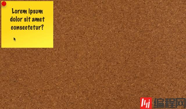
我们通过上述的技巧,实现了一个仅仅使用 CSS 实现的自由拖拽的便签贴。我们可以自由的将其拖拽到任意地方。看看效果:
当然,我们可以再配合上另外一个有意思是 html 属性 -- contenteditable。
contenteditable 是一个 HTML TAG 的属性,表示元素是否可被用户编辑。如果可以,浏览器会修改元素的部件以允许编辑。
简单修改一下 DOM 结构:
<div class="g-container">
    <div class="g-resize"></div>
    <div class="g-content" contenteditable="true"> Lorem ipsum dolor sit amet consectetur?</div>
</div>
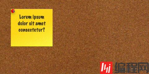
此时,元素不仅可以被拖动,甚至可以被重写,感受一下:
纯 CSS 实现的效果,非常的有意思,完整的代码,你可以戳这里:Pure CSS Auto Drag Demo
基于 resize 这个 CSS 属性,其实还有很多有意思的用法。譬如我之前使用了 Resize 实现了一个图片切换预览的功能:CSS 奇思妙想 | 使用 resize 实现强大的图片拖拽切换预览功能 可以一并看看,相信能碰撞出更多火花。
原文地址:https://www.cnblogs.com/coco1s/p/16774696.html
作者:ChokCoco
以上就是巧用纯CSS实现鼠标点击拖拽效果,让交互更加生动!的详细内容,更多请关注编程网其它相关文章!
--结束END--
本文标题: 巧用纯CSS实现鼠标点击拖拽效果,让交互更加生动!
本文链接: https://www.lsjlt.com/news/173474.html(转载时请注明来源链接)
有问题或投稿请发送至: 邮箱/279061341@qq.com QQ/279061341
下载Word文档到电脑,方便收藏和打印~
2023-05-25
2023-05-25
2023-05-25
2023-05-25
2023-05-25
2023-05-24
2023-05-24
2023-05-24
2023-05-24
2023-05-24
回答
回答
回答
回答
回答
回答
回答
回答
回答
回答


官方手机版

微信公众号

商务合作


0