这篇“纯css3如何实现鼠标滑过按钮动画”除了程序员外大部分人都不太理解,今天小编为了让大家更加理解“纯CSS3如何实现鼠标滑过按钮动画”,给大家总结了以下内容,具有一定借鉴价值,内容详细步骤清晰,细节处理妥当,希望大家通过这篇文章有所收获
这篇“纯css3如何实现鼠标滑过按钮动画”除了程序员外大部分人都不太理解,今天小编为了让大家更加理解“纯CSS3如何实现鼠标滑过按钮动画”,给大家总结了以下内容,具有一定借鉴价值,内容详细步骤清晰,细节处理妥当,希望大家通过这篇文章有所收获,下面让我们一起来看看具体内容吧。
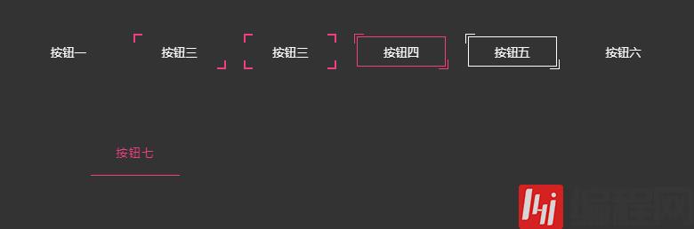
效果示例:
看过前两小节的小伙伴,可能不需要看下面的源码,就知道如何实现了,大家可以先自己动手试试,然后再回头来看看。或许实现方式不一样,但只要能实现,都是好方法。
下面对示例讲解
示例一
<button class="btn-1">按钮一</button><style>button{ position: relative; width: 100px; height: 40px; background: none; cursor: pointer; color: #fff; border: none; margin-right: 20px; margin-bottom: 20px;}button:before, button:after{ position: absolute; content: ''; width: 100%; height: 100%; z-index: 10; transition: all .5s;}.btn-1:before, .btn-1:after{ height: 2px; left: 50%; width: 0; background: #f13f84; transfORM: translateX(-50%);}.btn-1:before{ top: 0;}.btn-1:after{ bottom: 0;}.btn-1:hover:before, .btn-1:hover:after{ width: 100%;}</style>
解析:
:before top为0, :after bottom为0,高度 height: 2px ,而宽度为0,并且水平居中
在绝对定位的作用下, :hover 改变 :before 、 :after 的宽度,即可形成上图效果
示例二
<button class="btn-2">按钮二</button><style>....btn-2{ background: #333; height: 36px;}.btn-2:before, .btn-2:after{ width: 10px; height: 10px; background: #f13f84; mix-blend-mode: hue;}.btn-2:before { left: -2px; top: -2px;}.btn-2:after { right: -2px; bottom: -2px;}.btn-2:hover:before, .btn-2:hover:after{ height: calc(100% + 4px); width: calc(100% + 4px);}</style>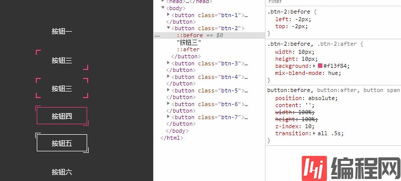
解析:
:before 、 :after ,超出button 2px
:hover 时改变 :before 、 :after 宽高,这里宽高用到了 calc()
calc() 函数用于动态计算长度值。
● 需要注意的是,运算符前后都需要保留一个空格,例如: width: calc(100% - 10px) ;
● 任何长度值都可以使用 calc() 函数进行计算;
● calc() 函数支持 "+", "-", "*", "/" 运算;
● calc() 函数使用标准的数学运算优先级规则;
大家应该都留意到了上图中,特意操作了一个属性 mix-blend-mode ,它在这里的作用让button的背景显示出来覆盖在 :before 、 :after 背景色的上方。
css3 mix-blend-mode 语法
mix-blend-mode:normal | multiply | screen | overlay | darken | lighten | color-dodge | color-burn | hard-light | soft-light | difference | exclusion | hue | saturation | color | luminosity
hue 色相模式 “色相”模式只用“混合色”颜色的色相值进行着色,而使饱和度和亮度值保持不变。
这里就不具体讲述 mix-blend-mode ,希望后面能用一章来专门讲解。
示例三
<button class="btn-3"> <span>按钮三</span></button><style>...button span:before, button span:after{ position: absolute; content: ''; width: 100%; height: 100%; z-index: 10; transition: all .5s;}.btn-3{ background: #333; height: 36px;}.btn-3:before, .btn-3:after, .btn-3 span:before, .btn-3 span:after{ width: 10px; height: 10px; background: #f13f84; mix-blend-mode: hue;}.btn-3:before { left: -2px; top: -2px;}.btn-3:after { right: -2px; top: -2px;}.btn-3 span:before { left: -2px; bottom: -2px;}.btn-3 span:after { right: -2px; bottom: -2px;}.btn-3:hover:before, .btn-3:hover:after,.btn-3:hover span:before,.btn-3:hover span:after { height: 60%; width: 60%;}
解析:
示例三就是示例二的升级版,用span的伪类来完善按钮的四只角
:hover 时改变四个伪类的宽高即可。
示例四
<button class="btn-4">按钮四</button><style>....btn-4{ height: 34px; border: 1px solid #f13f84;}.btn-4:before, .btn-4:after{ width: 10px; height: 10px; border-style: solid; border-color: #f13f84;}.btn-4:before { left: -4px; top: -4px; border-width: 1px 0 0 1px;}.btn-4:after { right: -4px; bottom: -4px; border-width: 0 1px 1px 0;}.btn-4:hover:before, .btn-4:hover:after{ height: calc(100% + 7px); width: calc(100% + 7px);}
解析:
示例四是示例二的另外一种实现方式,不过区别是按钮加了一个边框
:before 、 :after 直接设置 border ,而不是用 background 来展示对角样式。
width: 10px;height: 10px;border-style: solid;border-color: #f13f84;border-width: 1px 0 0 1px;然后 :hover 时改变伪类宽高,即可
示例五
<button class="btn-5">按钮五</button><style>....btn-5{ background: #333; height: 34px; border: 1px solid #fff;}.btn-5:before, .btn-5:after{ width: 10px; height: 10px; border-style: solid; border-color: #fff;}.btn-5:before { left: -4px; top: -4px; border-width: 1px 0 0 1px;}.btn-5:after { right: -4px; bottom: -4px; border-width: 0 1px 1px 0;}.btn-5:hover{ border-color: #f13f84;}.btn-5:hover:before, .btn-5:hover:after{ height: calc(100% + 7px); width: calc(100% + 7px); border-color: #f13f84; transform: rotateY(180deg);}
解析:
示例五,与示例四只有2点区别, :hover 时,使其伪类旋转180°,同时改变边框颜色
border-color: #f13f84;transform: rotateY(180deg);示例六
<button class="btn-6"> <span>按钮六</span></button><style>....btn-6{ overflow: hidden;}.btn-6:before, .btn-6:after, .btn-6 span:before, .btn-6 span:after{ background: linear-gradient(to right, rgba(0,0,0,0), #f13f84); transition: all 2s;}.btn-6:before, .btn-6:after{ width: 100%; height: 1px;}.btn-6:before { top: 0; left: -100%;}.btn-6:after { bottom: 0; right: -100%;}.btn-6 span:before, .btn-6 span:after{ width: 1px; height: 100%;}.btn-6 span:before { bottom: -100%; left: 0;}.btn-6 span:after { top: -100%; right: 0;}.btn-6:hover:before{ animation: topA 1s linear infinite; animation-delay: .5s;}@keyframes topA{ 100%{ left: 100%; }}.btn-6:hover span:after{ animation: rightA 1s linear infinite; animation-delay: 1s;}@keyframes rightA{ 100%{ top: 100%; }}.btn-6:hover:after{ animation: bottomA 1s linear infinite; animation-delay: 1.5s;}@keyframes bottomA{ 100%{ right: 100%; }}.btn-6:hover span:before { animation: leftA 1s linear infinite; animation-delay: 2s;}@keyframes leftA{ 100%{ bottom: 100%; }}
解析:
示例六,可以说和示例三有一点点相似之处吧,升级版
也是通过四个伪类,分别分布在按钮的上右下左位置,上下的伪类高度是1px,宽是100%,左右的伪类宽度是1px,高是100%,同时设置背景为线性渐变 linear-gradient
:hover 时,上方伪类从左边-100%的位置,向左边100%的位置运动;右边伪类从上方-100%的位置,向上方100%的位置运动;下发伪类从右边-100%的位置,向右边100%的位置运动;左边伪类从下方-100%的位置,向下方100%的位置运动。然后设置延时执行动画,即可。
需要注意的是延时执行动画(animation-delay)时间,一定要调整好,否则看起来就没有流畅,衔接会出现问题。
示例七
<button class="btn-7"> <svg height="100%" width="100%" xmlns="Http://www.w3.org/2000/svg"> <rect class="outline" height="100%" width="100%" /> <div class="text">按钮七</div> </svg></button><style>....btn-7{ position: relative; color: #f13f84; text-decoration: none; width: 250px; height: 50px; margin: 50px auto; overflow: hidden;}.btn-7 .outline { position: absolute; top: 0; left: 0; width: 100%; height: 100%; stroke: #f13f84; stroke-width: 2px; fill: transparent; stroke-dasharray: 100 500; stroke-dashoffset: 225; transition: all .5s; box-sizing: border-box;}.btn-7 .text { position: relative; top: -35px; line-height: 1; letter-spacing: 1px; text-transform: uppercase;}.btn-7:hover .outline{ stroke-dasharray: 600 0; stroke-dashoffset: 475;}
解析:
示例七,是一种全选的方式,svg
svg 元素描述
<text> 元素用于定义文本
<rect> 定义为矩形形状(圆形 <circle> 、椭圆 <ellipse> 、线 <line> 、折线 <polyline> 、多边形 <polyGon> 、路径 <path> )
svg 属性描述
stroke 定义一条线,文本或元素轮廓颜色
stroke-width 属性定义了一条线,文本或元素轮廓厚度
stroke-dasharray 属性用来设置描边的点划线的图案范式。就是设置实线和虚线的宽度。即有或者没有线段的长度。
stroke-dashoffset 则指定了dash模式到路径开始的距离
感谢你的阅读,希望你对“纯CSS3如何实现鼠标滑过按钮动画”这一关键问题有了一定的理解,具体使用情况还需要大家自己动手实验使用过才能领会,快去试试吧,如果想阅读更多相关知识点的文章,欢迎关注编程网精选频道!
--结束END--
本文标题: 纯CSS3如何实现鼠标滑过按钮动画
本文链接: https://www.lsjlt.com/news/251318.html(转载时请注明来源链接)
有问题或投稿请发送至: 邮箱/279061341@qq.com QQ/279061341
下载Word文档到电脑,方便收藏和打印~
2024-05-14
2024-05-14
2024-05-14
2024-05-14
2024-05-14
2024-05-14
2024-05-14
2024-05-14
2024-05-14
2024-05-14
回答
回答
回答
回答
回答
回答
回答
回答
回答
回答


官方手机版

微信公众号

商务合作


0