这篇文章将为大家详细讲解有关CSS中怎么使用径向渐变实现卡券效果,小编觉得挺实用的,因此分享给大家做个参考,希望大家阅读完这篇文章后可以有所收获。常见的卡券样式如下: 使用伪元素实现(Less 版本) ticket.less.or
这篇文章将为大家详细讲解有关CSS中怎么使用径向渐变实现卡券效果,小编觉得挺实用的,因此分享给大家做个参考,希望大家阅读完这篇文章后可以有所收获。
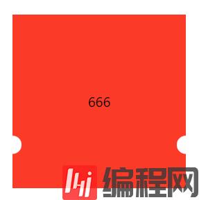
常见的卡券样式如下:

使用伪元素实现(Less 版本)
ticket.less
.ordinary-mixins-ticket-horizontal(@width,@height,@r,@top, @color) { position: relative; box-sizing: border-box; padding: 0 @r; width: @width; height: @height; background-clip: content-box; background-color: @color; &::before { position: absolute; top: 0; left: 0; content: ""; display: block; width: @r + 1px; height: 100%; background: radial-gradient(@r circle at left @top, transparent @r, @color @r + 1px); } &::after { position: absolute; top: 0; right: 0; content: ""; display: block; //这里的 @r + 1px 是为了避免某些百分百比缩放页面时,出现空隙 width: @r + 1px; height: 100%; //这里的 @r + 1px 是为了防止出现锯齿 background: radial-gradient(@r circle at right @top, transparent @r, @color @r + 1px); }}.parent { .ordinary-mixins-ticket-horizontal(200px, 200px, 10px, 150px, #fc3a28);}.child { line-height: 200px;}App.js
import React from 'react';import './App.css';import './ticket.less';function App() { return ( <div className="App" style={ { display: "flex", justifyContent: "center", alignItems: "center", height: 600 } }> <div className={'parent'}> <div className="child">666</div> </div> </div> );}export default App;升级版样式一(Less 版本)
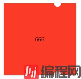
.mixins-ticket-vertical(@width, @height, @r, @left, @l-color, @r-color) { width: @width; height: @height; // @left - 1px 是为了避免某些百分百比缩放页面时,出现空隙 // @r + 1px 是为了防止出现锯齿 // 51% 是为了防止出现元素中间会有一小段空白区域的情况 background: radial-gradient(circle at left top, transparent @r, @l-color @r + 1px) @left - 1px top ~'/' 100% 51% no-repeat, radial-gradient(circle at left bottom, transparent @r, @l-color @r + 1px) @left - 1px bottom ~'/' 100% 51% no-repeat, radial-gradient(circle at right top, transparent @r, @r-color @r + 1px ) -(@width - @left) top ~'/' 100% 51% no-repeat, radial-gradient(circle at right bottom , transparent @r, @r-color @r + 1px ) -(@width - @left) bottom ~'/' 100% 51% no-repeat; filter: drop-shadow(2px 2px 2px rgba(0, 0, 0, .2));}.mixins-ticket-vertical-two(@width, @height, @r, @left, @l-color, @r-color) { width: @width; height: @height; // @left + 1px 是为了避免某些百分百比缩放页面时,出现空隙 // @r + 1px 是为了防止出现锯齿 // 51% 是为了防止出现元素中间会有一小段空白区域的情况 background: radial-gradient(circle at left top, transparent @r, @r-color @r + 1px) right top ~'/' (@width - @left) 51% no-repeat, radial-gradient(circle at left bottom, transparent @r, @l-color @r + 1px) right bottom ~'/' (@width - @left) 51% no-repeat, radial-gradient(circle at right top, transparent @r, @r-color @r + 1px) left top ~'/' @left + 1px 51% no-repeat, radial-gradient(circle at right bottom, transparent @r, @l-color @r + 1px) left bottom ~'/' @left + 1px 51% no-repeat; filter: drop-shadow(2px 2px 2px rgba(0, 0, 0, .2));}.parent { .mixins-ticket-vertical(200px, 200px, 10px, 150px, #fc3a28,#fc3a28); //.mixins-ticket-vertical-two(200px, 200px, 10px, 150px, #fc3a28,#fc3a28);}.child { line-height: 200px;}升级版样式一(Scss 版本)
@mixin mixins-ticket-vertical($width, $height, $r, $left, $l-color, $r-color) { width: $width; height: $height; // $left - 1px 是为了避免某些百分百比缩放页面时,出现空隙 // $r + 1px 是为了防止出现锯齿 // 51% 是为了防止出现元素中间会有一小段空白区域的情况 background: radial-gradient(circle at left top, transparent $r, $l-color $r + 1px) $left - 1px top / 100% 51% no-repeat, radial-gradient(circle at left bottom, transparent $r, $l-color $r + 1px) $left - 1px bottom / 100% 51% no-repeat, radial-gradient(circle at right top, transparent $r, $r-color $r + 1px ) -($width - $left) top / 100% 51% no-repeat, radial-gradient(circle at right bottom , transparent $r, $r-color $r + 1px ) -($width - $left) bottom / 100% 51% no-repeat; filter: drop-shadow(2px 2px 2px rgba(0, 0, 0, .2));}.parent { @include mixins-ticket-vertical(200px, 200px, 10px, 150px, #fc3a28, #fc3a28);}.child { line-height: 200px;}升级版样式二(Less 版本)
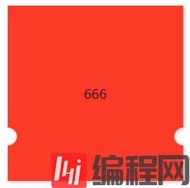
.mixins-ticket-horizontal(@width, @height, @r, @top, @l-color, @r-color) { width: @width; height: @height; background: radial-gradient(circle at left top, transparent @r, @l-color @r + 1px) left @top - 1px ~'/' 51% 100% no-repeat, radial-gradient(circle at left bottom, transparent @r, @l-color @r + 1px) left -(@height - @top) ~'/' 51% 100% no-repeat, radial-gradient(circle at right top, transparent @r, @r-color @r + 1px) right @top - 1px ~'/' 51% 100% no-repeat, radial-gradient(circle at right bottom, transparent @r, @r-color @r + 1px) right -(@height - @top) ~'/' 51% 100% no-repeat; filter: drop-shadow(2px 2px 2px rgba(0, 0, 0, .2));}.mixins-ticket-horizontal-two(@width, @height, @r, @top, @l-color, @r-color) { width: @width; height: @height; background: radial-gradient(circle at left top, transparent @r, @r-color @r + 1px) left bottom ~'/' 51% (@height - @top) no-repeat, radial-gradient(circle at left bottom, transparent @r, @l-color @r + 1px) left top ~'/' 51% @top + 1px no-repeat, radial-gradient(circle at right top, transparent @r, @r-color @r + 1px) right bottom ~'/' 51% (@height - @top) no-repeat, radial-gradient(circle at right bottom, transparent @r, @l-color @r + 1px) right top ~'/' 51% @top + 1px no-repeat; filter: drop-shadow(2px 2px 2px rgba(0, 0, 0, .2));}.parent { .mixins-ticket-horizontal(200px, 200px, 10px, 150px, #fc3a28,#fc3a28); //.mixins-ticket-horizontal-two(200px, 200px, 10px, 150px, #fc3a28,#fc3a28);}.child { line-height: 200px;}升级版样式三(Less 版本)
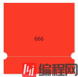
.mixins-ticket-horizontal-line(@width, @height, @r, @top, @l-color, @r-color,@border-offset,@border-color) { width: @width; height: @height; background: radial-gradient(circle at left top, transparent @r, @l-color @r + 1px) left @top - 1px ~'/' 51% 100% no-repeat, radial-gradient(circle at left bottom, transparent @r, @l-color @r + 1px) left -(@height - @top) ~'/' 51% 100% no-repeat, radial-gradient(circle at right top, transparent @r, @r-color @r + 1px) right @top - 1px ~'/' 51% 100% no-repeat, radial-gradient(circle at right bottom, transparent @r, @r-color @r + 1px) right -(@height - @top) ~'/' 51% 100% no-repeat; filter: drop-shadow(2px 2px 2px rgba(0, 0, 0, .2)); &::after { position: absolute; left: 0; right: 0; top: @top; margin: auto; content: ''; width: calc(~"100%" - 2*@r - @border-offset); border-top: 1px dashed @border-color; }}.parent { .mixins-ticket-horizontal(200px, 200px, 10px, 150px, #fc3a28,#fc3a28); //.mixins-ticket-horizontal-two(200px, 200px, 10px, 150px, #fc3a28,#fc3a28);}.child { line-height: 200px;}升级版样式四(Less 版本)
.mixins-ticket-vertical-three(@width, @height, @r, @left, @l-color, @r-color,@sm-r,@sm-offset,@sm-color) { width: @width; height: @height; // @left - 1px 是为了避免某些百分百比缩放页面时,出现空隙 // @r + 1px 是为了防止出现锯齿 // 51% 是为了防止出现元素中间会有一小段空白区域的情况 background: radial-gradient(circle at left top, transparent @r, @l-color @r + 1px) @left - 1px top ~'/' 100% 51% no-repeat, radial-gradient(circle at left bottom, transparent @r, @l-color @r + 1px) @left - 1px bottom ~'/' 100% 51% no-repeat, radial-gradient(circle at right top, transparent @r, @r-color @r + 1px ) -(@width - @left) top ~'/' 100% 51% no-repeat, radial-gradient(circle at right bottom , transparent @r, @r-color @r + 1px ) -(@width - @left) bottom ~'/' 100% 51% no-repeat; filter: drop-shadow(2px 2px 2px rgba(0, 0, 0, .2)); &::after { content: ''; position: absolute; top: 0; right: -@sm-r; width: @sm-r; height: 100%; background-image: radial-gradient(circle at @sm-r, transparent @sm-r, @r-color @sm-r + 1px); //background-size: @sm-r; background-size: @sm-r @sm-offset; }}.parent { .mixins-ticket-vertical-three(200px, 200px, 10px, 150px, #fc3a28, #fc3a28,5px,20px,#fc3a28);}.child { line-height: 200px;}注意事项
// ticket.less//background: radial-gradient(circle at top right, transparent @r, @lcolor 0) -(@width - @left) top ~'/' 100% 55% no-repeat;// 将上面的这行代码拆解如下://background-image: radial-gradient(circle at top right, transparent @r, @lcolor 0);//background-position:-(@width - @left) top ;//background-size:100% 55% ;//background-repeat: no-repeat;关于“CSS中怎么使用径向渐变实现卡券效果”这篇文章就分享到这里了,希望以上内容可以对大家有一定的帮助,使各位可以学到更多知识,如果觉得文章不错,请把它分享出去让更多的人看到。
--结束END--
本文标题: CSS中怎么使用径向渐变实现卡券效果
本文链接: https://www.lsjlt.com/news/251371.html(转载时请注明来源链接)
有问题或投稿请发送至: 邮箱/279061341@qq.com QQ/279061341
下载Word文档到电脑,方便收藏和打印~
2024-05-14
2024-05-14
2024-05-14
2024-05-14
2024-05-14
2024-05-14
2024-05-14
2024-05-14
2024-05-14
2024-05-14
回答
回答
回答
回答
回答
回答
回答
回答
回答
回答


官方手机版

微信公众号

商务合作


0