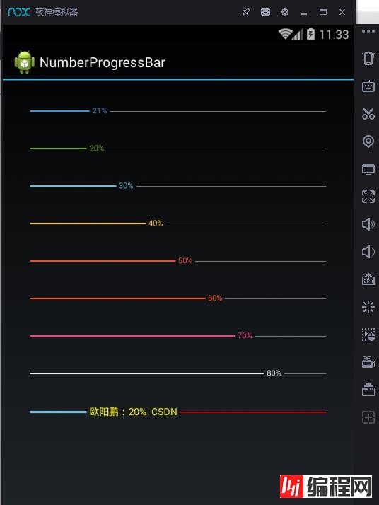
第一步、效果展示 图1、蓝色的进度条 图2、红色的进度条 图3、多条颜色不同的进度条 图4、多条颜色不同的进度条 第二步、自定义ProgressBar实
第一步、效果展示
图1、蓝色的进度条

图2、红色的进度条

图3、多条颜色不同的进度条

图4、多条颜色不同的进度条

第二步、自定义ProgressBar实现带数字的进度条
0、项目结构

如上图所示:library项目为自定义的带数字的进度条NumberProgressBar的具体实现,demo项目为示例项目以工程依赖的方式引用library项目,然后使用自定义的带数字的进度条NumberProgressBar来做展示

如上图所示:自定义的带数字的进度条的library项目的结构图

如上图所示:demo项目的结构图
1、绘制步骤分析
如上面几幅图形所示。这个进度条的可以分为以下三部分:

reacherd area :表示当前进度值之前文本的进度条(长方形)
text area :表示当前进度值文本
unreacherd area :当前进度值文本之后的进度条(长方形)
按照上面的分析,我们要实现带数字的进度条,只需要按照以下三个步骤绘制即可实现:
1、绘制reacherd area(当前进度值之前文本的进度条)
2、绘制text area(当前进度值文本)
3、绘制unreacherd area(当前进度值文本之后的进度条) 即可。
2、自定义属性
由于我们发现以上三个部分的颜色、字体大小、进度条的最大值、表示进度条的长方形的高度等属性都可以改变,从而展现出不同的界面效果。
因此我们将这些属性都做自定义属性。这样我们就能够做到像Android官方提供的那些组件一样用xml来定义它的属性了。
1、定义自己的属性配置文件:attr.xml
在res/values文件下定义一个attrs.xml文件,res/values/attrs.xml定义代码如下所示:
<?xml version="1.0" encoding="utf-8"?>
<resources>
<declare-styleable name="NumberProgressBar">
<!--进度条的当前进度值-->
<attr name="progress_current" fORMat="integer"/>
<!--进度条的最大进度值-->
<attr name="progress_max" format="integer"/>
<!--当前进度值文本之后的进度条颜色-->
<attr name="progress_unreached_color" format="color"/>
<!--当前进度值文本之前的进度条颜色-->
<attr name="progress_reached_color" format="color"/>
<!-- 当前进度值文本之前的进度条的高度-->
<attr name="progress_reached_bar_height" format="dimension"/>
<!--当前进度值文本之后的进度条的高度-->
<attr name="progress_unreached_bar_height" format="dimension"/>
<!--当前进度值文本的字体大小-->
<attr name="progress_text_size" format="dimension"/>
<!--当前进度值文本的颜色-->
<attr name="progress_text_color" format="color"/>
<!--当前进度值之前文本的间距-->
<attr name="progress_text_offset" format="dimension"/>
<!--当前进度值文本是否可见-->
<attr name="progress_text_visibility" format="enum">
<enum name="visible" value="0"/>
<enum name="invisible" value="1"/>
</attr>
</declare-styleable>
<declare-styleable name="Themes">
<attr name="numberProgressBarStyle" format="reference"/>
</declare-styleable>
</resources>
2、定义主题配置文件:styles.xml
在res/values文件下定义一个styles.xml文件,里面定义一些基本的主题选项,以备用户可以选择使用。res/values/styles.xml定义代码如下所示:
<?xml version="1.0" encoding="utf-8"?>
<resources>
<style name="NumberProgressBar_Default">
<item name="android:layout_height">wrap_content</item>
<item name="android:layout_width">match_parent</item>
<item name="progress_max">100</item>
<item name="progress_current">0</item>
<item name="progress_unreached_color">#CCCCCC</item>
<item name="progress_reached_color">#3498DB</item>
<item name="progress_text_size">10sp</item>
<item name="progress_text_color">#3498DB</item>
<item name="progress_reached_bar_height">1.5dp</item>
<item name="progress_unreached_bar_height">0.75dp</item>
</style>
<style name="NumberProgressBar_Passing_Green">
<item name="android:layout_height">wrap_content</item>
<item name="android:layout_width">match_parent</item>
<item name="progress_max">100</item>
<item name="progress_current">0</item>
<item name="progress_unreached_color">#CCCCCC</item>
<item name="progress_reached_color">#70A800</item>
<item name="progress_text_size">10sp</item>
<item name="progress_text_color">#70A800</item>
<item name="progress_reached_bar_height">1.5dp</item>
<item name="progress_unreached_bar_height">0.75dp</item>
</style>
<style name="NumberProgressBar_Beauty_Red">
<item name="android:layout_height">wrap_content</item>
<item name="android:layout_width">match_parent</item>
<item name="progress_max">100</item>
<item name="progress_current">0</item>
<item name="progress_unreached_color">#CCCCCC</item>
<item name="progress_reached_color">#FF3D7F</item>
<item name="progress_text_size">10sp</item>
<item name="progress_text_color">#FF3D7F</item>
<item name="progress_reached_bar_height">1.5dp</item>
<item name="progress_unreached_bar_height">0.75dp</item>
</style>
<style name="NumberProgressBar_Warning_Red">
<item name="android:layout_height">wrap_content</item>
<item name="android:layout_width">match_parent</item>
<item name="progress_max">100</item>
<item name="progress_current">0</item>
<item name="progress_unreached_color">#CCCCCC</item>
<item name="progress_reached_color">#E74C3C</item>
<item name="progress_text_size">10sp</item>
<item name="progress_text_color">#E74C3C</item>
<item name="progress_reached_bar_height">1.5dp</item>
<item name="progress_unreached_bar_height">0.75dp</item>
</style>
<style name="NumberProgressBar_Relax_Blue">
<item name="android:layout_height">wrap_content</item>
<item name="android:layout_width">match_parent</item>
<item name="progress_max">100</item>
<item name="progress_current">0</item>
<item name="progress_unreached_color">#CCCCCC</item>
<item name="progress_reached_color">#6DBCDB</item>
<item name="progress_text_size">10sp</item>
<item name="progress_text_color">#6DBCDB</item>
<item name="progress_reached_bar_height">1.5dp</item>
<item name="progress_unreached_bar_height">0.75dp</item>
</style>
<style name="NumberProgressBar_Grace_Yellow">
<item name="android:layout_height">wrap_content</item>
<item name="android:layout_width">match_parent</item>
<item name="progress_max">100</item>
<item name="progress_current">0</item>
<item name="progress_unreached_color">#CCCCCC</item>
<item name="progress_reached_color">#FFC73B</item>
<item name="progress_text_size">10sp</item>
<item name="progress_text_color">#FFC73B</item>
<item name="progress_reached_bar_height">1.5dp</item>
<item name="progress_unreached_bar_height">0.75dp</item>
</style>
<style name="NumberProgressBar_Funny_Orange">
<item name="android:layout_height">wrap_content</item>
<item name="android:layout_width">match_parent</item>
<item name="progress_max">100</item>
<item name="progress_current">0</item>
<item name="progress_unreached_color">#CCCCCC</item>
<item name="progress_reached_color">#FF530D</item>
<item name="progress_text_size">10sp</item>
<item name="progress_text_color">#FF530D</item>
<item name="progress_reached_bar_height">1.5dp</item>
<item name="progress_unreached_bar_height">0.75dp</item>
</style>
<style name="NumberProgressBar_Twinkle_Night">
<item name="android:layout_height">wrap_content</item>
<item name="android:layout_width">match_parent</item>
<item name="progress_max">100</item>
<item name="progress_current">0</item>
<item name="progress_unreached_color">#CCCCCC</item>
<item name="progress_reached_color">#ECF0F1</item>
<item name="progress_text_size">10sp</item>
<item name="progress_text_color">#ECF0F1</item>
<item name="progress_reached_bar_height">1.5dp</item>
<item name="progress_unreached_bar_height">0.75dp</item>
</style>
</resources>
3、自定义View实现带数字的进度条
package com.daimajia.numberprogressbar;
import android.content.Context;
import android.content.res.TypedArray;
import android.graphics.canvas;
import android.graphics.Color;
import android.graphics.Paint;
import android.graphics.RectF;
import android.os.Bundle;
import android.os.Parcelable;
import android.util.AttributeSet;
import android.view.View;
import static com.daimajia.numberprogressbar.NumberProgressBar.ProgressTextVisibility.Invisible;
import static com.daimajia.numberprogressbar.NumberProgressBar.ProgressTextVisibility.Visible;

public class NumberProgressBar extends View {

private int mMaxProgress = 100;

private int mCurrentProgress = 0;

private int mReachedBarColor;

private int mUnreachedBarColor;

private int mTextColor;

private float mTextSize;

private float mReachedBarHeight;

private float mUnreachedBarHeight;

private String mSuffix = "%";

private String mPrefix = "";
//当前进度值文本的默认颜色
private final int default_text_color = Color.rgb(66, 145, 241);
//当前进度值文本的字体大小
private final float default_text_size;
//当前进度值之前的默认进度条颜色
private final int default_reached_color = Color.rgb(66, 145, 241);
//当前进度值之后的默认进度条颜色
private final int default_unreached_color = Color.rgb(204, 204, 204);
//当前进度值之前文本的默认间距
private final float default_progress_text_offset;
//当前进度值文本之前的进度条的默认高度
private final float default_reached_bar_height;
//当前进度值文本之后的进度条的默认高度
private final float default_unreached_bar_height;

private static final String INSTANCE_STATE = "saved_instance";
private static final String INSTANCE_TEXT_COLOR = "text_color";
private static final String INSTANCE_TEXT_SIZE = "text_size";
private static final String INSTANCE_REACHED_BAR_HEIGHT = "reached_bar_height";
private static final String INSTANCE_REACHED_BAR_COLOR = "reached_bar_color";
private static final String INSTANCE_UNREACHED_BAR_HEIGHT = "unreached_bar_height";
private static final String INSTANCE_UNREACHED_BAR_COLOR = "unreached_bar_color";
private static final String INSTANCE_MAX = "max";
private static final String INSTANCE_PROGRESS = "progress";
private static final String INSTANCE_SUFFIX = "suffix";
private static final String INSTANCE_PREFIX = "prefix";
private static final String INSTANCE_TEXT_VISIBILITY = "text_visibility";
//默认显示当前进度值文本 0为显示,1为不显示
private static final int PROGRESS_TEXT_VISIBLE = 0;

private float mDrawTextWidth;

private float mDrawTextStart;

private float mDrawTextEnd;

private String mCurrentDrawText;

private Paint mReachedBarPaint;

private Paint mUnreachedBarPaint;

private Paint mTextPaint;

private RectF mUnreachedRectF = new RectF(0, 0, 0, 0);

private RectF mReachedRectF = new RectF(0, 0, 0, 0);

private float mOffset;

private boolean mDrawUnreachedBar = true;

private boolean mDrawReachedBar = true;

private boolean mIfDrawText = true;

private OnProgressBarListener mListener;
public enum ProgressTextVisibility {
Visible, Invisible
}
public NumberProgressBar(Context context) {
this(context, null);
}
public NumberProgressBar(Context context, AttributeSet attrs) {
this(context, attrs, R.attr.numberProgressBarStyle);
}
public NumberProgressBar(Context context, AttributeSet attrs, int defStyleAttr) {
super(context, attrs, defStyleAttr);
default_reached_bar_height = dp2px(1.5f);
default_unreached_bar_height = dp2px(1.0f);
default_text_size = sp2px(10);
default_progress_text_offset = dp2px(3.0f);
//获取自定义属性
final TypedArray attributes = context.getTheme().obtainStyledAttributes(attrs, R.styleable.NumberProgressBar,
defStyleAttr, 0);
mReachedBarColor = attributes.getColor(R.styleable.NumberProgressBar_progress_reached_color, default_reached_color);
mUnreachedBarColor = attributes.getColor(R.styleable.NumberProgressBar_progress_unreached_color, default_unreached_color);
mTextColor = attributes.getColor(R.styleable.NumberProgressBar_progress_text_color, default_text_color);
mTextSize = attributes.getDimension(R.styleable.NumberProgressBar_progress_text_size, default_text_size);
mReachedBarHeight = attributes.getDimension(R.styleable.NumberProgressBar_progress_reached_bar_height, default_reached_bar_height);
mUnreachedBarHeight = attributes.getDimension(R.styleable.NumberProgressBar_progress_unreached_bar_height, default_unreached_bar_height);
mOffset = attributes.getDimension(R.styleable.NumberProgressBar_progress_text_offset, default_progress_text_offset);
int textVisible = attributes.getInt(R.styleable.NumberProgressBar_progress_text_visibility, PROGRESS_TEXT_VISIBLE);
if (textVisible != PROGRESS_TEXT_VISIBLE) {
mIfDrawText = false;
}
setProgress(attributes.getInt(R.styleable.NumberProgressBar_progress_current, 0));
setMax(attributes.getInt(R.styleable.NumberProgressBar_progress_max, 100));
//回收 TypedArray,用于后续调用时可复用之。回收到TypedArrayPool池中,以备后用
attributes.recycle();
initializePainters();
}
@Override
protected int getSuggestedMinimumWidth() {
return (int) mTextSize;
}
@Override
protected int getSuggestedMinimumHeight() {
return Math.max((int) mTextSize, Math.max((int) mReachedBarHeight, (int) mUnreachedBarHeight));
}
@Override
protected void onMeasure(int widthMeasureSpec, int heightMeasureSpec) {

setMeasuredDimension(measure(widthMeasureSpec, true), measure(heightMeasureSpec, false));
}
private int measure(int measureSpec, boolean isWidth) {
int result;
int mode = MeasureSpec.getMode(measureSpec);
int size = MeasureSpec.getSize(measureSpec);
int padding = isWidth ? getPaddingLeft() + getPaddingRight() : getPaddingTop() + getPaddingBottom();

if (mode == MeasureSpec.EXACTLY) {
result = size;
} else {
result = isWidth ? getSuggestedMinimumWidth() : getSuggestedMinimumHeight();
result += padding;

if (mode == MeasureSpec.AT_MOST) {
if (isWidth) {
result = Math.max(result, size);
} else {
result = Math.min(result, size);
}
}
}
return result;
}
@Override
protected void onDraw(Canvas canvas) {
//如果要绘制当前进度值文本
if (mIfDrawText) {
calculateDrawRectF();
}else {
calculateDrawRectFWithoutProgressText();
}
//如果要绘制当前进度值之前的进度条
if (mDrawReachedBar) {
canvas.drawRect(mReachedRectF, mReachedBarPaint);
}
//如果要绘制当前进度值之后的进度条
if (mDrawUnreachedBar) {
canvas.drawRect(mUnreachedRectF, mUnreachedBarPaint);
}
//绘制当前进度值文本
if (mIfDrawText)
canvas.drawText(mCurrentDrawText, mDrawTextStart, mDrawTextEnd, mTextPaint);
}

private void initializePainters() {
mReachedBarPaint = new Paint(Paint.ANTI_ALIAS_FLAG);
mReachedBarPaint.setColor(mReachedBarColor);
mUnreachedBarPaint = new Paint(Paint.ANTI_ALIAS_FLAG);
mUnreachedBarPaint.setColor(mUnreachedBarColor);
mTextPaint = new Paint(Paint.ANTI_ALIAS_FLAG);
mTextPaint.setColor(mTextColor);
mTextPaint.setTextSize(mTextSize);
}

private void calculateDrawRectFWithoutProgressText() {
//当前进度值不画
//当前进度值之前的进度条(长方形)的属性
mReachedRectF.left = getPaddingLeft();
mReachedRectF.top = getHeight() / 2.0f - mReachedBarHeight / 2.0f;
mReachedRectF.right =
(getWidth() - getPaddingLeft() - getPaddingRight()) / (getMax() * 1.0f) * getProgress()
+ getPaddingLeft();
mReachedRectF.bottom = getHeight() / 2.0f + mReachedBarHeight / 2.0f;
//当前进度值之后的进度条(长方形)的属性
mUnreachedRectF.left = mReachedRectF.right;
mUnreachedRectF.right = getWidth() - getPaddingRight();
mUnreachedRectF.top = getHeight() / 2.0f + -mUnreachedBarHeight / 2.0f;
mUnreachedRectF.bottom = getHeight() / 2.0f + mUnreachedBarHeight / 2.0f;
}

private void calculateDrawRectF() {
//要绘制的当前进度值的文本
mCurrentDrawText = String.format("%d", getProgress() * 100 / getMax());
mCurrentDrawText = mPrefix + mCurrentDrawText + mSuffix;
//要绘制的当前进度值的文本的宽度
mDrawTextWidth = mTextPaint.measureText(mCurrentDrawText);
//如果当前进度值为0,则不绘制当前进度值之前的进度条
if (getProgress() == 0) {
mDrawReachedBar = false;
mDrawTextStart = getPaddingLeft();
}
//否则绘制当前进度值文本之前的进度条
else {
mDrawReachedBar = true;
//当前进度值文本之前的进度条(长方形)的属性
mReachedRectF.left = getPaddingLeft();
mReachedRectF.top = getHeight() / 2.0f - mReachedBarHeight / 2.0f;
mReachedRectF.right= (getWidth() - getPaddingLeft() - getPaddingRight()) / (getMax() * 1.0f) * getProgress()
- mOffset + getPaddingLeft();
mReachedRectF.bottom = getHeight() / 2.0f + mReachedBarHeight / 2.0f;
//当前进度值的文本的起始位置
mDrawTextStart = (mReachedRectF.right + mOffset);
}
//当前进度值的文本的结束位置
mDrawTextEnd = (int) ((getHeight() / 2.0f) - ((mTextPaint.descent() + mTextPaint.ascent()) / 2.0f));
//如果画不下当前进度值的文本了,就重新计算下当前进度值的文本的起始位置和当前进度值之前的进度条(长方形)的右边
if ((mDrawTextStart + mDrawTextWidth) >= getWidth() - getPaddingRight()) {
mDrawTextStart = getWidth() - getPaddingRight() - mDrawTextWidth;
mReachedRectF.right = mDrawTextStart - mOffset;
}
//当前进度值文本之后的进度条的起始位置
float unreachedBarStart = mDrawTextStart + mDrawTextWidth + mOffset;
//如果画不下进度值文本之后的进度条了,就不画进度值之后的进度条
if (unreachedBarStart >= getWidth() - getPaddingRight()) {
mDrawUnreachedBar = false;
} else {
mDrawUnreachedBar = true;
//当前进度值文本之后的进度条(长方形)的属性
mUnreachedRectF.left = unreachedBarStart;
mUnreachedRectF.right = getWidth() - getPaddingRight();
mUnreachedRectF.top = getHeight() / 2.0f + -mUnreachedBarHeight / 2.0f;
mUnreachedRectF.bottom = getHeight() / 2.0f + mUnreachedBarHeight / 2.0f;
}
}

public int getTextColor() {
return mTextColor;
}

public float getProgressTextSize() {
return mTextSize;
}

public int getUnreachedBarColor() {
return mUnreachedBarColor;
}

public int getReachedBarColor() {
return mReachedBarColor;
}

public int getProgress() {
return mCurrentProgress;
}

public int getMax() {
return mMaxProgress;
}

public float getReachedBarHeight() {
return mReachedBarHeight;
}

public float getUnreachedBarHeight() {
return mUnreachedBarHeight;
}

public void setProgressTextSize(float textSize) {
this.mTextSize = textSize;
mTextPaint.setTextSize(mTextSize);
invalidate();
}

public void setProgressTextColor(int textColor) {
this.mTextColor = textColor;
mTextPaint.setColor(mTextColor);
invalidate();
}

public void setUnreachedBarColor(int barColor) {
this.mUnreachedBarColor = barColor;
mUnreachedBarPaint.setColor(mUnreachedBarColor);
invalidate();
}

public void setReachedBarColor(int progressColor) {
this.mReachedBarColor = progressColor;
mReachedBarPaint.setColor(mReachedBarColor);
invalidate();
}

public void setReachedBarHeight(float height) {
mReachedBarHeight = height;
}

public void setUnreachedBarHeight(float height) {
mUnreachedBarHeight = height;
}

public void setMax(int maxProgress) {
if (maxProgress > 0) {
this.mMaxProgress = maxProgress;
invalidate();
}
}

public void setSuffix(String suffix) {
if (suffix == null) {
mSuffix = "";
} else {
mSuffix = suffix;
}
}

public String getSuffix() {
return mSuffix;
}

public void setPrefix(String prefix) {
if (prefix == null)
mPrefix = "";
else {
mPrefix = prefix;
}
}

public String getPrefix() {
return mPrefix;
}

public void incrementProgressBy(int by) {
if (by > 0) {
setProgress(getProgress() + by);
}
if (mListener != null) {
//回调onProgressChange()方法来处理进度值变化后的事件
mListener.onProgressChange(getProgress(), getMax());
}
}

public void setProgress(int progress) {
if (progress <= getMax() && progress >= 0) {
this.mCurrentProgress = progress;
invalidate();
}
}
@Override
protected Parcelable onSaveInstanceState() {
final Bundle bundle = new Bundle();
bundle.putParcelable(INSTANCE_STATE, super.onSaveInstanceState());
bundle.putInt(INSTANCE_TEXT_COLOR, getTextColor());
bundle.putFloat(INSTANCE_TEXT_SIZE, getProgressTextSize());
bundle.putFloat(INSTANCE_REACHED_BAR_HEIGHT, getReachedBarHeight());
bundle.putFloat(INSTANCE_UNREACHED_BAR_HEIGHT, getUnreachedBarHeight());
bundle.putInt(INSTANCE_REACHED_BAR_COLOR, getReachedBarColor());
bundle.putInt(INSTANCE_UNREACHED_BAR_COLOR, getUnreachedBarColor());
bundle.putInt(INSTANCE_MAX, getMax());
bundle.putInt(INSTANCE_PROGRESS, getProgress());
bundle.putString(INSTANCE_SUFFIX, getSuffix());
bundle.putString(INSTANCE_PREFIX, getPrefix());
bundle.putBoolean(INSTANCE_TEXT_VISIBILITY, getProgressTextVisibility());
return bundle;
}
@Override
protected void onRestoreInstanceState(Parcelable state) {
if (state instanceof Bundle) {
final Bundle bundle = (Bundle) state;
mTextColor = bundle.getInt(INSTANCE_TEXT_COLOR);
mTextSize = bundle.getFloat(INSTANCE_TEXT_SIZE);
mReachedBarHeight = bundle.getFloat(INSTANCE_REACHED_BAR_HEIGHT);
mUnreachedBarHeight = bundle.getFloat(INSTANCE_UNREACHED_BAR_HEIGHT);
mReachedBarColor = bundle.getInt(INSTANCE_REACHED_BAR_COLOR);
mUnreachedBarColor = bundle.getInt(INSTANCE_UNREACHED_BAR_COLOR);
initializePainters();
setMax(bundle.getInt(INSTANCE_MAX));
setProgress(bundle.getInt(INSTANCE_PROGRESS));
setPrefix(bundle.getString(INSTANCE_PREFIX));
setSuffix(bundle.getString(INSTANCE_SUFFIX));
setProgressTextVisibility(bundle.getBoolean(INSTANCE_TEXT_VISIBILITY) ? Visible : Invisible);
super.onRestoreInstanceState(bundle.getParcelable(INSTANCE_STATE));
return;
}
super.onRestoreInstanceState(state);
}

public float dp2px(float dp) {
final float scale = getResources().getDisplayMetrics().density;
return dp * scale + 0.5f;
}

public float sp2px(float sp) {
final float scale = getResources().getDisplayMetrics().scaledDensity;
return sp * scale;
}

public void setProgressTextVisibility(ProgressTextVisibility visibility) {
mIfDrawText = visibility == Visible;
invalidate();
}

public boolean getProgressTextVisibility() {
return mIfDrawText;
}

public void setOnProgressBarListener(OnProgressBarListener listener) {
mListener = listener;
}
}
如以上代码所示:
在自定义NumberProgressBar控件的构造方法中,去获取了全部设置好了的自定义属性值,如果没有设置则使用默认的自定义属性值。
然后先重写onMeasure(int widthMeasureSpec, int heightMeasureSpec)方法,来确定自定义NumberProgressBar控件的大小。
接着重写onDraw()方法,进行绘制自定义的带数字的进度条。
第三步、将自定义带数字的进度条添加到布局文件中
在res/layout目录下定义一个activity_main.xml文件,res/layout/activity_main.xml定义代码如下所示:
<LinearLayout
xmlns:android="Http://schemas.android.com/apk/res/android"
xmlns:tools="http://schemas.android.com/tools"
xmlns:custom="http://schemas.android.com/apk/res-auto"
android:layout_width="match_parent"
android:layout_height="match_parent"
android:paddingLeft="@dimen/activity_horizontal_margin"
android:paddingRight="@dimen/activity_horizontal_margin"
android:paddingTop="@dimen/activity_vertical_margin"
android:paddingBottom="@dimen/activity_vertical_margin"
android:orientation="vertical"
tools:context="com.daimajia.numberprogressbar.example.MainActivity=">
<com.daimajia.numberprogressbar.NumberProgressBar
android:id="@+id/numberbar1"
android:layout_width="wrap_content"
android:padding="20dp"
custom:progress_current="0"
style="@style/NumberProgressBar_Default"
android:layout_height="wrap_content" />
<com.daimajia.numberprogressbar.NumberProgressBar
android:id="@+id/numberbar2"
android:layout_height="wrap_content"
android:padding="20dp"
custom:progress_current="20"
android:layout_width="match_parent"
style="@style/NumberProgressBar_Passing_Green"
/>
<com.daimajia.numberprogressbar.NumberProgressBar
android:id="@+id/numberbar3"
android:layout_margin="20dp"
style="@style/NumberProgressBar_Relax_Blue"
custom:progress_current="30"
android:layout_height="wrap_content" />
<com.daimajia.numberprogressbar.NumberProgressBar
android:id="@+id/numberbar4"
android:layout_width="wrap_content"
android:layout_margin="20dp"
style="@style/NumberProgressBar_Grace_Yellow"
custom:progress_current="40"
android:layout_height="wrap_content" />
<com.daimajia.numberprogressbar.NumberProgressBar
android:id="@+id/numberbar5"
android:layout_width="wrap_content"
android:layout_margin="20dp"
custom:progress_current="50"
style="@style/NumberProgressBar_Warning_Red"
android:layout_height="wrap_content" />
<com.daimajia.numberprogressbar.NumberProgressBar
android:id="@+id/numberbar6"
android:layout_width="wrap_content"
android:layout_margin="20dp"
style="@style/NumberProgressBar_Funny_Orange"
custom:progress_current="60"
android:layout_height="wrap_content" />
<com.daimajia.numberprogressbar.NumberProgressBar
android:id="@+id/numberbar7"
android:layout_width="wrap_content"
android:layout_margin="20dp"
style="@style/NumberProgressBar_Beauty_Red"
custom:progress_current="70"
android:layout_height="wrap_content" />
<com.daimajia.numberprogressbar.NumberProgressBar
android:id="@+id/numberbar8"
android:layout_width="wrap_content"
android:layout_margin="20dp"
style="@style/NumberProgressBar_Twinkle_Night"
custom:progress_current="80"
android:layout_height="wrap_content" />
<com.daimajia.numberprogressbar.NumberProgressBar
android:id="@+id/numberbar9"
android:layout_width="wrap_content"
android:layout_margin="20dp"
custom:progress_current="20"
custom:progress_max="100"
custom:progress_unreached_color="#FF530D"
custom:progress_reached_color="#6DBCDB"
custom:progress_text_size="10sp"
custom:progress_text_color="#ECF0F1"
custom:progress_reached_bar_height="1.5dp"
custom:progress_unreached_bar_height="0.75dp"
android:layout_height="wrap_content" />
</LinearLayout>
第四步、编写Activity加载布局文件,显示自定义的带数字的进度条
MainActity的代码如下所示:
package com.daimajia.numberprogressbar.example;
import android.app.Activity;
import android.graphics.Color;
import android.os.Bundle;
import android.widget.Toast;
import com.daimajia.numberprogressbar.NumberProgressBar;
import com.daimajia.numberprogressbar.OnProgressBarListener;
import java.util.Timer;
import java.util.TimerTask;
public class MainActivity extends Activity implements OnProgressBarListener {
private Timer timer;
private NumberProgressBar bnp;
private NumberProgressBar bnp9;
@Override
protected void onCreate(Bundle savedInstanceState) {
super.onCreate(savedInstanceState);
setContentView(R.layout.activity_main);
bnp = (NumberProgressBar)findViewById(R.id.numberbar1);
bnp.setOnProgressBarListener(this);
bnp9 = (NumberProgressBar)findViewById(R.id.numberbar9);
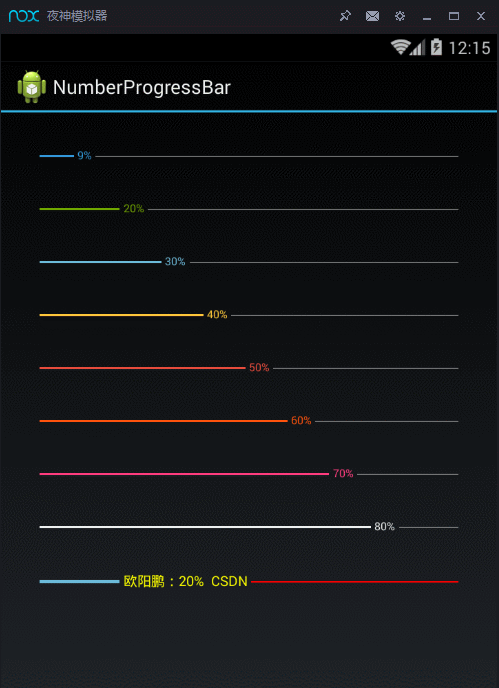
bnp9.setPrefix("欧阳鹏:");
bnp9.setSuffix("% CSDN");
bnp9.setProgressTextSize(20);
bnp9.setProgressTextColor(Color.YELLOW);
bnp9.setProgressTextVisibility(NumberProgressBar.ProgressTextVisibility.Visible);
bnp9.setUnreachedBarColor(Color.RED);
bnp9.setReachedBarHeight(10);
bnp9.setReachedBarHeight(5);
timer = new Timer();
timer.schedule(new TimerTask() {
@Override
public void run() {
runOnUiThread(new Runnable() {
@Override
public void run() {
bnp.incrementProgressBy(1);
}
});
}
}, 1000, 100);
}
@Override
protected void onDestroy() {
super.onDestroy();
timer.cancel();
}
@Override
public void onProgressChange(int current, int max) {
if(current == max) {
Toast.makeText(getApplicationContext(), getString(R.string.finish), Toast.LENGTH_SHORT).show();
bnp.setProgress(0);
}
}
}显示出的效果图为:

看完介绍后,读者可以到以下地址去查看完整的项目代码
daimajia的GitHub上该项目的原始地址
https://github.com/daimajia/NumberProgressBar
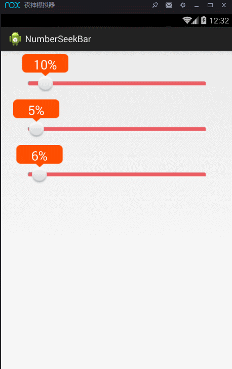
这里还有另外一个NumberProgresBar的例子,如下图所示


以上内容是小编给大家介绍的Android自定义View实现带数字的进度条实例代码,希望对大家有所帮助!
您可能感兴趣的文章:Android 自定义view和属性动画实现充电进度条效果Android自定义View基础开发之图片加载进度条Android自定义view实现水波纹进度球效果Android自定义View仿华为圆形加载进度条Android自定义View之圆形进度条式按钮Android自定义View弧线进度控件Android自定义View实现渐变色进度条Android自定义View实现环形进度条的思路与实例android自定义view制作圆形进度条效果Android自定义View实现简单炫酷的球体进度球实例代码
--结束END--
本文标题: Android自定义View实现带数字的进度条实例代码
本文链接: https://www.lsjlt.com/news/25401.html(转载时请注明来源链接)
有问题或投稿请发送至: 邮箱/279061341@qq.com QQ/279061341
下载Word文档到电脑,方便收藏和打印~
2024-01-21
2023-10-28
2023-10-28
2023-10-27
2023-10-27
2023-10-27
2023-10-27
回答
回答
回答
回答
回答
回答
回答
回答
回答
回答


官方手机版

微信公众号

商务合作


0