这篇文章将为大家详细讲解有关怎么在R语言中使用ggplot2绘制分组散点图,文章内容质量较高,因此小编分享给大家做个参考,希望大家阅读完这篇文章后对相关知识有一定的了解。 首先载入ggplot2包,library(ggplot2) 然后进行
这篇文章将为大家详细讲解有关怎么在R语言中使用ggplot2绘制分组散点图,文章内容质量较高,因此小编分享给大家做个参考,希望大家阅读完这篇文章后对相关知识有一定的了解。
首先载入ggplot2包,
library(ggplot2)然后进行ggplot(data = NULL, mapping = aes(), ..., environment = parent.frame())绘制,在绘制中第一个参数是数据,第二个参数是数据映射,是绘制的全局变量,其中包含的参数有x,y,color,size,alpha,shape等。
例如:ggplot(iris, aes(Sepal.Length, Sepal.Width, color = Species)),然后通过快捷散点绘制
+geom_point(size = 2.0, shape = 16),颜色代表不同的物种,如下图:
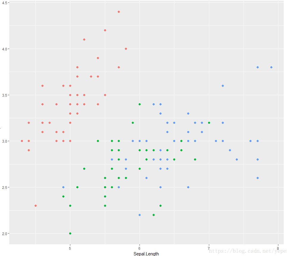
上面显示的是最原始的散点绘制,通过颜色区分不同的物种,那么如何进行效果的提升呢?
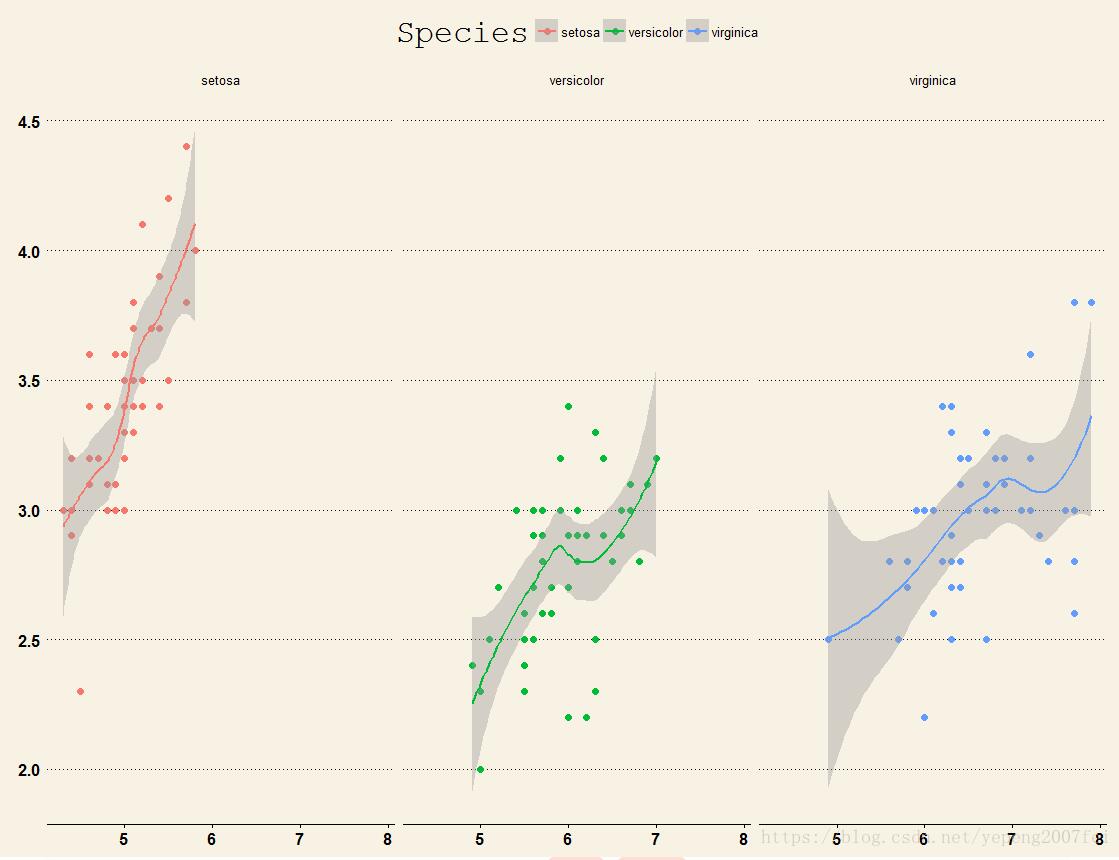
首先是可以进行分面,使得不同物种的对比效果更为显著,这里使用+facet_wrap( ~ Species),效果如下:
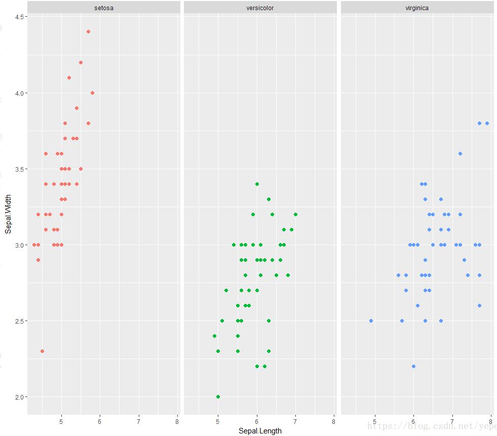
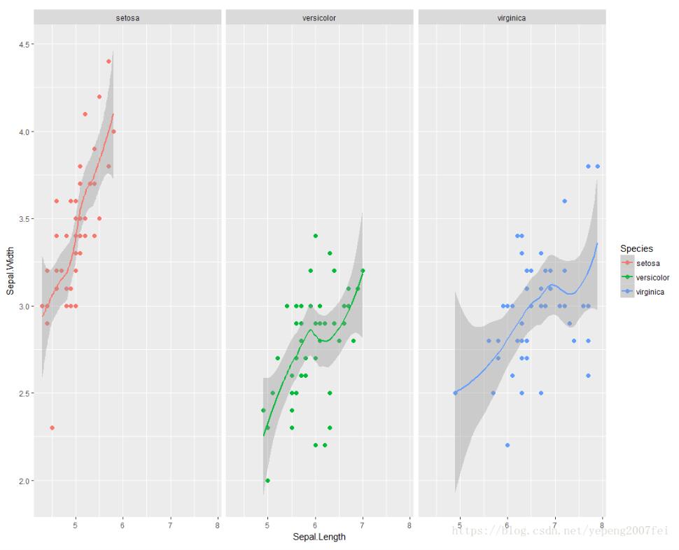
通过分面后对比效果好了不少,如果想看下不同物种下花萼长度与宽度的关系呢?可以使用+geom_smooth(method = "loess"),效果图如下:
通过上面的操作效果好了很多,但是还是感觉不够高大上,那我们可以使用library(ggthemes)这个包进行精修一下,通过修改theme,使用+theme_solarized(),效果如下:
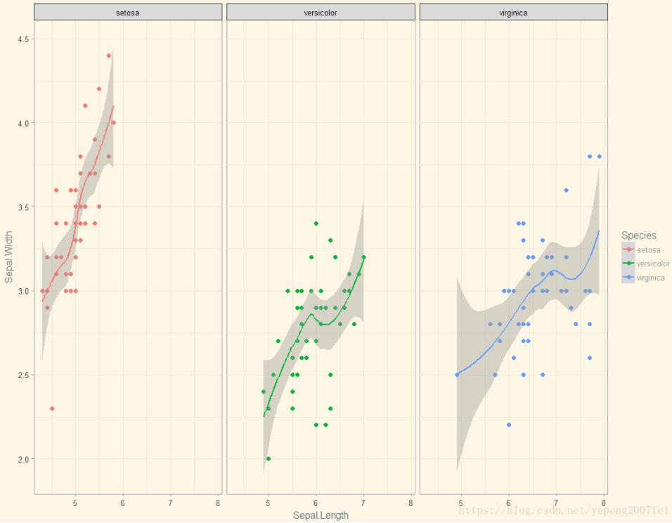
还有更多的theme选择,例如+theme_wsj(),效果如下:
这样我们的图是不是高大上了很多呢,所以其实数据可视化也没有多难。最后给下源码:
library(ggthemes)library(ggplot2)ggplot(iris, aes(Sepal.Length, Sepal.Width, color = Species)) + geom_point(size = 2.0, shape = 16) + facet_wrap( ~ Species) + geom_smooth(method = "loess")+ theme_wsj()补充:R语言 画图神器ggplot2包
R语言里画图最好用的包啦。感觉图都挺清晰的,就懒得加文字了(或者以后回来补吧>.)前面几个图挺基础的,后面也许会有没见过的ggplot用法哦。
install.packages("ggplot2")library(ggplot2)为了方便展示,用gapminder的数据
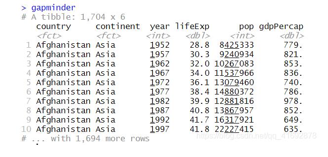
if(!require(gapminder)) install.packages("gapminder") library(gapminder)gapminder数据大概是这样的
假设我们现在想要知道2007年lifeExp和人均GDP之间的关系。
先筛选数据
library(dplyr)gapminder_2007 <- gapminder %>% filter(year == 2007)画lifeExp和gdpPercap关系的散点图,x为gdpPercap,y为lifeExp。
ggplot(gapminder_2007,aes(x = gdpPercap, y = lifeExp))+geom_point()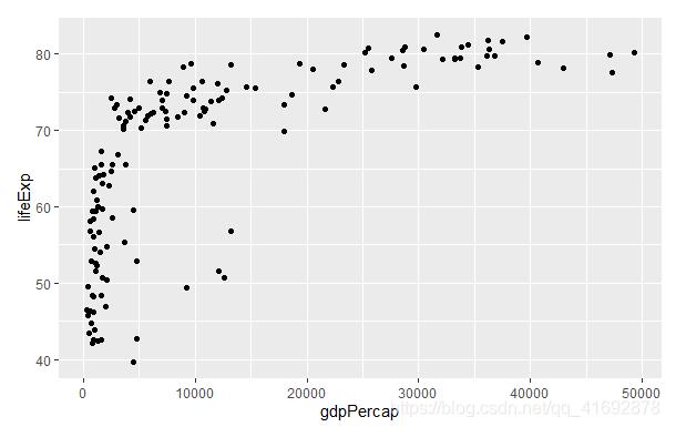
看的出来lifeExp与gdpPercap存在近似lifeExp=log(gdpPercap)的关系,对x轴的数值进行log值处理。另外,为了呈现更多信息,用颜色标记国家所在的洲,并用点的大小表示人口数量。
ggplot(gapminder_2007,aes(x = gdpPercap, y = lifeExp, color = continent, size = pop))+ geom_point()+scale_x_log10()+theme_minimal()+ labs(x = "GDP per capita", y = "Life expectancy", title = "Life expectancy increases as GDP per capita increases", caption = "Data source: gapminder")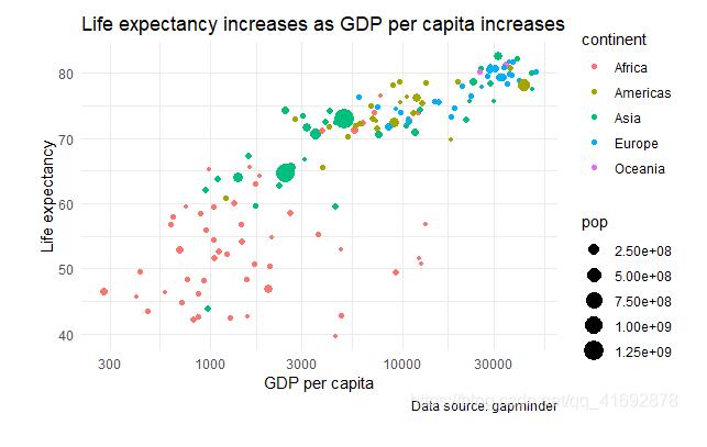
另外一种呈现方式如下:
加入了回归线和坐标轴的histogram。
plot <- ggplot(gapminder_2007, aes(x = gdpPercap, y = lifeExp)) + geom_point()+geom_smooth(method="lm")+scale_x_log10()+ labs(x = "GDP per capita", y = "Life expectancy", title = "Life expectancy increases as GDP per capita increases", caption = "Data source: gapminder")ggMarginal(plot, type = "histogram", fill="transparent")#ggMarginal(plot, type = "boxplot", fill="transparent")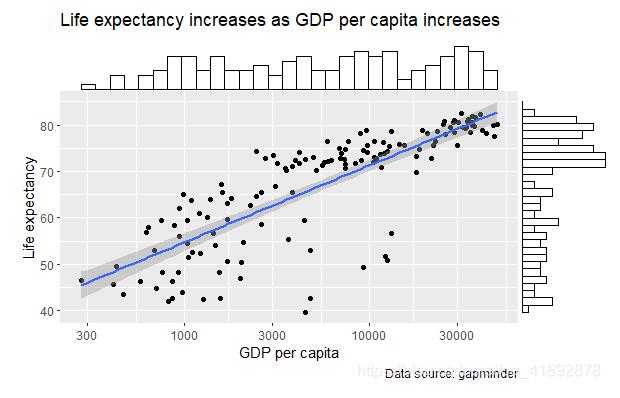
gapminder_gdp2007 <- gapminder %>% filter(year == 2007, continent == "Americas") %>% mutate(country = fct_reorder(country,gdpPercap,last))ggplot(gapminder_gdp2007, aes(x=country, y = gdpPercap))+ geom_col(fill="skyblue", color="black")+ labs(x = "Country", y = "GDP per capita", title = "GDP per capita in North America and South America, 2007", caption = "Data source: gapminder")+ coord_flip()+theme_minimal()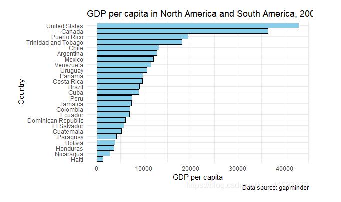
gapminder_pop <- gapminder %>% filter(country %in% c("United States","China"))ggplot(gapminder_pop,aes(x = year, y = pop, color = country))+ geom_line(lwd = 0.8)+theme_light()+ labs(x = "Year", y = "Population", title = "Population in China and United States, 1953-2007", caption = "Data source: gapminder")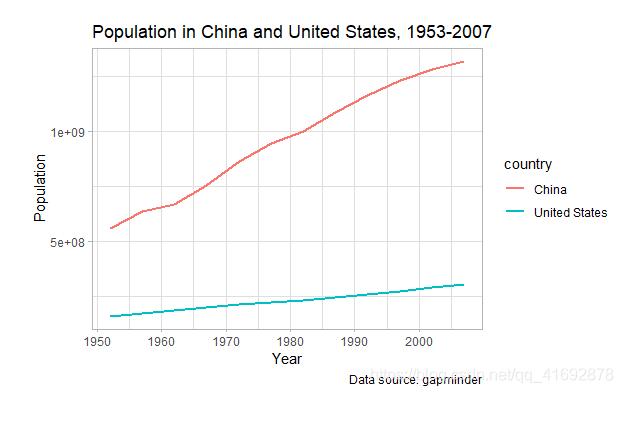
gapminder_gdp <- gapminder %>% group_by(year, continent) %>% summarize(avg_gdp = mean(gdpPercap))ggplot(gapminder_gdp,aes(x = year, y = avg_gdp, color = continent))+ geom_line(lwd = 0.8)+theme_light()+facet_wrap(~continent)+ labs(x = "Year", y = "Average GDP per capita", title = "Average GDP per capita change in different continent", caption = "Data source: gapminder")+ scale_x_continuous(breaks=c(1955,1970,1985,2000))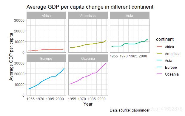
gapminder_lifeexp <- gapminder %>% filter(year %in% c(1957,2007), continent == "Europe") %>% arrange(year) %>% mutate(country = fct_reorder(country,lifeExp,last))ggplot(gapminder_lifeexp) +geom_path(aes(x = lifeExp, y = country), arrow = arrow(length = unit(1.5, "mm"), type = "closed")) + geom_text( aes(x = lifeExp, y = country, label = round(lifeExp, 1), hjust = ifelse(year == 2007,-0.2,1.2)), size =3, family = "Bookman", color = "gray25")+ scale_x_continuous(limits=c(45, 85))+ labs( x = "Life expectancy", y = "Country", title = "People live longer in 2007 compared to 1957", subtitle = "Life expectancy in European countries", caption = "Data source: gapminder" )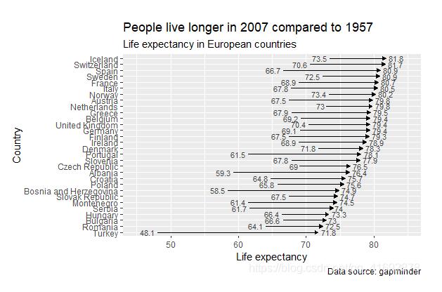
gapminder_1992 <- gapminder %>% filter(year == 1992)ggplot(gapminder_1992, aes(lifeExp))+theme_classic()+ geom_density(aes(fill=factor(continent)), alpha=0.8) + labs( x="Life expectancy", title="Life expectancy group by continent, 1992", caption="Data source: gapminder", fill="Continent")
gapminder_lifeexp2 <- gapminder %>% filter(year %in% c(1977,1987,1997,2007), country %in% c("Canada", "United States","Mexico","Haiti","El Salvador", "Guatemala","Jamaica")) %>% mutate(lifeExp = round(lifeExp))ylabs <- subset(gapminder_lifeexp2, year==head(year,1))$countryyvals <- subset(gapminder_lifeexp2, year==head(year,1))$lifeExpggplot(gapminder_lifeexp2, aes(x=as.factor(year),y=lifeExp)) + geom_line(aes(group=country),colour="grey80") + geom_point(colour="white",size=8) + geom_text(aes(label=lifeExp), size=3, color = "black") + scale_y_continuous(name="", breaks=yvals, labels=ylabs)+ theme_classic()+ labs(title="Life Expectancy of some North America countries change from 1977 to 2007") + theme(axis.title=element_blank(), axis.ticks = element_blank(), plot.title = element_text(hjust=0.5))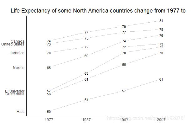
关于怎么在R语言中使用ggplot2绘制分组散点图就分享到这里了,希望以上内容可以对大家有一定的帮助,可以学到更多知识。如果觉得文章不错,可以把它分享出去让更多的人看到。
--结束END--
本文标题: 怎么在R语言中使用ggplot2绘制分组散点图
本文链接: https://www.lsjlt.com/news/269757.html(转载时请注明来源链接)
有问题或投稿请发送至: 邮箱/279061341@qq.com QQ/279061341
下载Word文档到电脑,方便收藏和打印~
2024-05-15
2024-05-15
2024-05-15
2024-05-14
2024-05-14
2024-05-14
2024-05-14
2024-05-14
2024-05-14
2024-05-14
回答
回答
回答
回答
回答
回答
回答
回答
回答
回答


官方手机版

微信公众号

商务合作


0