这篇文章将为大家详细讲解有关基于React封装组件的实现步骤是怎样的,文章内容质量较高,因此小编分享给大家做个参考,希望大家阅读完这篇文章后对相关知识有一定的了解。前言很多小伙伴在第一次尝试封装组件时会和我一样碰到许多问题,比如人家的组件会
这篇文章将为大家详细讲解有关基于React封装组件的实现步骤是怎样的,文章内容质量较高,因此小编分享给大家做个参考,希望大家阅读完这篇文章后对相关知识有一定的了解。
很多小伙伴在第一次尝试封装组件时会和我一样碰到许多问题,比如人家的组件会有 color 属性,我们在使用组件时传入组件文档中说明的属性值如 primary ,那么这个组件的字体颜色会变为 primary 对应的颜色,这是如何做到的?还有别人封装的组件类名都有自己独特的前缀,这是如何处理的呢,难道是 CSS 类名全部加上前缀吗,这也太麻烦了!
如果你正在困惑这些问题,你可以看看这篇文章。
我会参照 antd的divider组件 来讲述如何基于React封装一个组件,以及解答上述的一些问题,请耐心看完!
仓库地址
antd 的源码使用了 typescript 语法,因此不了解语法的同学要及时了解哦!
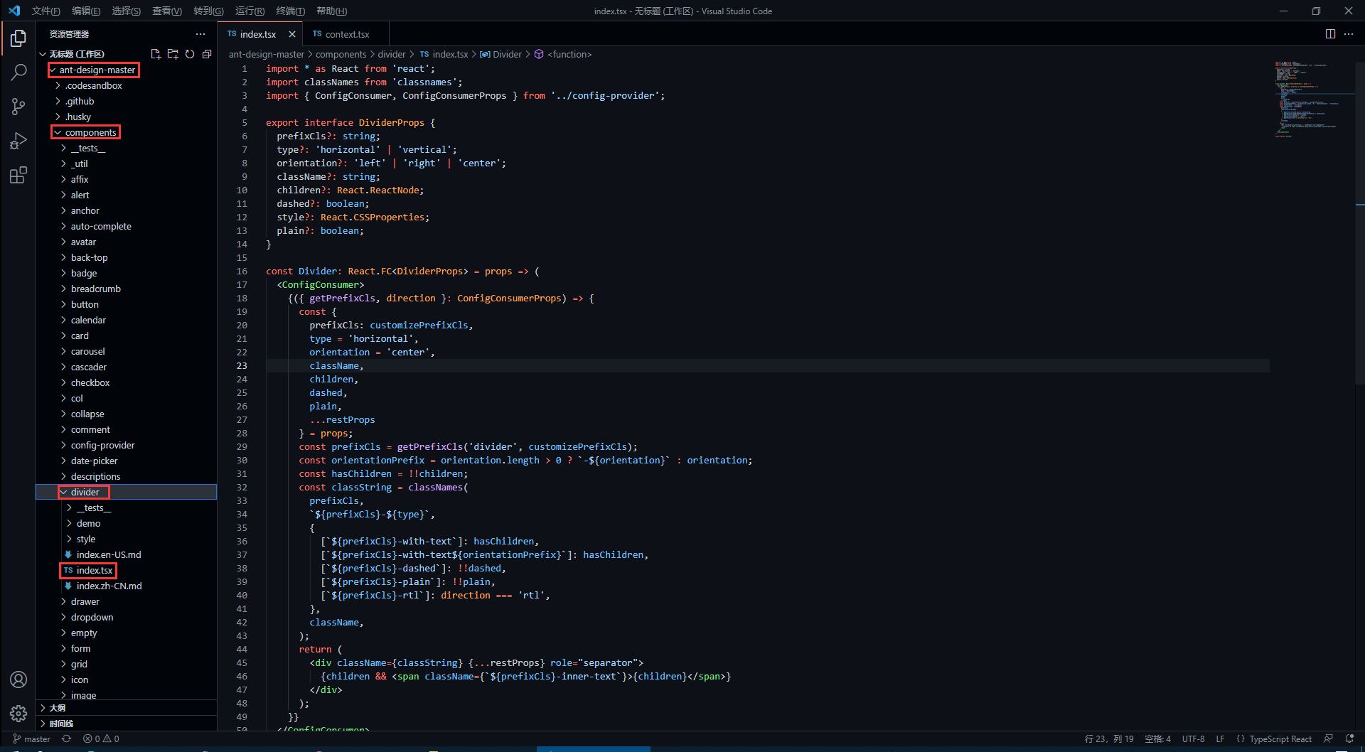
import * as React from 'react';import classNames from 'classnames';import { ConfiGConsumer, ConfigConsumerProps } from '../config-provider';export interface DividerProps { prefixCls?: string; type?: 'horizontal' | 'vertical'; orientation?: 'left' | 'right' | 'center'; className?: string; children?: React.Reactnode; dashed?: boolean; style?: React.CSSProperties; plain?: boolean;}const Divider: React.FC<DividerProps> = props => ( <ConfigConsumer> {({ getPrefixCls, direction }: ConfigConsumerProps) => { const { prefixCls: customizePrefixCls, type = 'horizontal', orientation = 'center', className, children, dashed, plain, ...restProps } = props; const prefixCls = getPrefixCls('divider', customizePrefixCls); const orientationPrefix = orientation.length > 0 ? `-${orientation}` : orientation; const hasChildren = !!children; const classString = classNames( prefixCls, `${prefixCls}-${type}`, { [`${prefixCls}-with-text`]: hasChildren, [`${prefixCls}-with-text${orientationPrefix}`]: hasChildren, [`${prefixCls}-dashed`]: !!dashed, [`${prefixCls}-plain`]: !!plain, [`${prefixCls}-rtl`]: direction === 'rtl', }, className, ); return ( <div className={classString} {...restProps} role="separator"> {children && <span className={`${prefixCls}-inner-text`}>{children}</span>} </div> ); }} </ConfigConsumer>);export default Divider;在源码中,最先看到的是以下内容,这些属性也就是divider组件所暴露的属性,我们可以 <Divider type='vertical' /> 这样来传入 type 属性,那么 divider 分割线样式就会渲染为垂直分割线,是不是很熟悉!
export interface DividerProps { // interface 是 TypeScript 的语法 prefixCls?: string; type?: 'horizontal' | 'vertical'; // 限定 type 只能传入两个值中的一个 orientation?: 'left' | 'right' | 'center'; className?: string; children?: React.ReactNode; dashed?: boolean; style?: React.CSSProperties; plain?: boolean;}在上面的属性中,我们还发现 className 和 style是比较常见的属性,这代表我们可以 <Divider type='vertical' className='myClassName' style={{width: '1em'}} /> 这样使用这些属性。
我们知道,antd 的组件类名会有他们独特的前缀 ant-,这是如何处理的呢?继续看源码。
<ConfigConsumer> {({ getPrefixCls, direction }: ConfigConsumerProps) => { const { prefixCls: customizePrefixCls, type = 'horizontal', orientation = 'center', className, children, dashed, plain, ...restProps } = props; const prefixCls = getPrefixCls('divider', customizePrefixCls);从源码中,我们发现 prefixCls ,这里是通过 getPrefixCls 方法生成,再看看 getPrefixCls 方法的源码,如下。
export interface ConfigConsumerProps { ... getPrefixCls: (suffixCls?: string, customizePrefixCls?: string) => string; ...}const defaultGetPrefixCls = (suffixCls?: string, customizePrefixCls?: string) => { if (customizePrefixCls) return customizePrefixCls; return suffixCls ? `ant-${suffixCls}` : 'ant';};不难发现此时会生成的类名前缀为 ant-divider 。
我们封装的组件肯定是有预设的样式,又因为样式要通过类名来定义,而我们传入的属性值则会决定组件上要添加哪个类名,这又是如何实现的呢?下面看源码。
import classNames from 'classnames';const classString = classNames( prefixCls, `${prefixCls}-${type}`, { [`${prefixCls}-with-text`]: hasChildren, [`${prefixCls}-with-text${orientationPrefix}`]: hasChildren, [`${prefixCls}-dashed`]: !!dashed, [`${prefixCls}-plain`]: !!plain, [`${prefixCls}-rtl`]: direction === 'rtl', }, className,);return ( <div className={classString} {...restProps} role="separator"> {children && <span className={`${prefixCls}-inner-text`}>{children}</span>} </div>);我们发现,它通过 classNames 方法(classNames是React处理多类名的组件)定义了一个所有类名的常量,然后传给了 div 中的 className 属性。
其实生成的类名也就是 ant-divider-horizontal 这个样子,那么css中以此类名定义的样式也就自然会生效了。而 className 和 style 属性则是通过 {...restProps} 来传入。
最后我们再看看它的css样式代码是怎么写的!
antd 组件的样式使用 Less 书写,不了解 Less 语法的同学一定要了解一下。
@import '../../style/themes/index';@import '../../style/mixins/index';@divider-prefix-cls: ~'@{ant-prefix}-divider'; // 可以看到这里对应的也就是之前说到的类名前缀.@{divider-prefix-cls} { .reset-component(); border-top: @border-width-base solid @divider-color; &-vertical { // 这里的完整类名其实就是 ant-divider-vertical, 也就是 divider 组件的 type 属性值为 vertical 时对应的样式 position: relative; top: -0.06em; display: inline-block; height: 0.9em; margin: 0 8px; vertical-align: middle; border-top: 0; border-left: @border-width-base solid @divider-color; } &-horizontal { display: flex; clear: both; width: 100%; min-width: 100%; margin: 24px 0; } &-horizontal&-with-text { display: flex; margin: 16px 0; color: @heading-color; font-weight: 500; font-size: @font-size-lg; white-space: nowrap; text-align: center; border-top: 0; border-top-color: @divider-color; &::before, &::after { position: relative; top: 50%; width: 50%; border-top: @border-width-base solid transparent; // Chrome not accept `inherit` in `border-top` border-top-color: inherit; border-bottom: 0; transfORM: translateY(50%); content: ''; } } &-horizontal&-with-text-left { &::before { top: 50%; width: @divider-orientation-margin; } &::after { top: 50%; width: 100% - @divider-orientation-margin; } } &-horizontal&-with-text-right { &::before { top: 50%; width: 100% - @divider-orientation-margin; } &::after { top: 50%; width: @divider-orientation-margin; } } &-inner-text { display: inline-block; padding: 0 @divider-text-padding; } &-dashed { background: none; border-color: @divider-color; border-style: dashed; border-width: @border-width-base 0 0; } &-horizontal&-with-text&-dashed { border-top: 0; &::before, &::after { border-style: dashed none none; } } &-vertical&-dashed { border-width: 0 0 0 @border-width-base; } &-plain&-with-text { color: @text-color; font-weight: normal; font-size: @font-size-base; }}@import './rtl';这样一来,我相信同学们也大概了解如何去封装一个组件以及关键点了,在源码中还有很多地方值得我们学习,比如这里的 ConfigConsumer 的定义与使用。
关于基于React封装组件的实现步骤是怎样的就分享到这里了,希望以上内容可以对大家有一定的帮助,可以学到更多知识。如果觉得文章不错,可以把它分享出去让更多的人看到。
--结束END--
本文标题: 基于React封装组件的实现步骤是怎样的
本文链接: https://www.lsjlt.com/news/300716.html(转载时请注明来源链接)
有问题或投稿请发送至: 邮箱/279061341@qq.com QQ/279061341
下载Word文档到电脑,方便收藏和打印~
2024-05-14
2024-05-14
2024-05-14
2024-05-14
2024-05-14
2024-05-14
2024-05-14
2024-05-14
2024-05-14
2024-05-14
回答
回答
回答
回答
回答
回答
回答
回答
回答
回答


官方手机版

微信公众号

商务合作


0