今天小编给大家分享一下基于element UI input组件自行封装数字区间输入框组件的问题怎么解决的相关知识点,内容详细,逻辑清晰,相信大部分人都还太了解这方面的知识,所以分享这篇文章给大家参考一下,希望大家阅读完这
今天小编给大家分享一下基于element UI input组件自行封装数字区间输入框组件的问题怎么解决的相关知识点,内容详细,逻辑清晰,相信大部分人都还太了解这方面的知识,所以分享这篇文章给大家参考一下,希望大家阅读完这篇文章后有所收获,下面我们一起来了解一下吧。
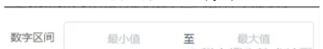
在开发时遇到一个数字区间输入框的需求,如下图:
项目使用的是Vue,组件库用的是element UI,但是element UI并没有提供数字区间组件,只提供了InputNumber 计数器输入框,如果用两个计数器输入框进行拼接也能满足需求,但是样式调试起来太过于复杂且不够灵活,不能令人满意,并且该数字区间输入框在其它界面也有这种需求,于是就在element input输入框的基础上自行封装了一个数字区间组件使用。
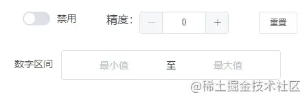
实现效果如下:
使用方式如下:
<input-number-range :disabled="isDisabled" :precision="num" v-model="value"></input-number-range>其中disabled属性控制是否禁用,precision属性控制精度默认为0即只能输入整数,v-model双向绑定要传递的值,该值是一个数组类型 [最小值,最大值]
另外该组件只能输入数字,输入其他非数字,或错误数字(多个小数)都会默认为空;在先输入最小值时,如果后输入的最大值小于最小值,则最大值默认为最小值,同理先输入最大值时,如果后输入的最小值大于最大值,则最小值默认为最大值
实现代码可以分为两块一块为组件的封装代码,一块为上述实现效果的演示代码
数字区间组件代码
<template> <div> <div class="input-number-range" :class="{ 'is-disabled': disabled }"> <div class="flex"> <div class="from"> <!-- blur:最小值失焦事件 focus:最小值聚焦事件 input:最小值输入事件 change:最小值change事件 --> <el-input ref="input_from" v-model="userInputFORM" :disabled="disabled" placeholder="最小值" @blur="handleBlurFrom" @focus="handleFocusFrom" @input="handleInputFrom" @change="handleInputChangeFrom" ></el-input> </div> <div class="center"> <span>至</span> </div> <div class="to"> <!-- blur:最大值失焦事件 focus:最大值聚焦事件 input:最大值输入事件 change:最大值change事件 --> <el-input ref="input_to" v-model="userInputTo" :disabled="disabled" placeholder="最大值" @blur="handleBlurTo" @focus="handleFocusTo" @input="handleInputTo" @change="handleInputChangeTo" ></el-input> </div> </div> </div> </div></template><script>export default { name: "InputNumberRange", props: { value: { required: true }, // 是否禁用 disabled: { type: Boolean, default: false, }, // 精度参数 precision: { type: Number, default: 0, validator(val) { return val >= 0 && val === parseInt(val, 10); }, }, }, data() { return { userInputForm: null, // 最小值 userInputTo: null, // 最大值 }; }, watch: { value: { immediate: true, handler(value) { // 判断是否为数字number类型 if (value instanceof Array && this.precision !== undefined) { let fromVal = value[0] && typeof value[0] === "number" ? value[0] : null; let toVal = value[1] && typeof value[1] === "number" ? value[1] : null; this.userInputForm = fromVal ? fromVal : null; this.userInputTo = toVal ? toVal : null; } }, }, }, methods: { // 根据精度保留数字 toPrecision(num, precision) { if (precision === undefined) precision = 0; return parseFloat( Math.round(num * Math.pow(10, precision)) / Math.pow(10, precision) ); }, handleBlurFrom(event) { this.$emit("blurfrom", event); }, handleFocusFrom(event) { this.$emit("focusfrom", event); }, handleBlurTo(event) { this.$emit("blurto", event); }, handleFocusTo(event) { this.$emit("focusto", event); }, handleInputFrom(value) { this.$emit("inputfrom", value); this.userInputFrom = value; }, handleInputTo(value) { this.$emit("inputto", value); this.userInputTo = value; }, // from输入框change事件 handleInputChangeFrom(value) { const newVal = this.setPrecisionValue(value); this.userInputForm = newVal; // 如果初始化数字的精度不符合代码设置时重置数字 this.userInputTo = this.setPrecisionValue(this.userInputTo); if (!this.userInputForm && !this.userInputTo) { this.$emit("input", []); this.$emit("changefrom", newVal); return; } if (!this.userInputTo) { this.userInputForm = newVal; } else { // 最小值大于最大值时逻辑判断 this.userInputForm = !newVal || parseFloat(newVal) <= parseFloat(this.userInputTo) ? newVal : this.userInputTo; } this.$emit("input", [this.userInputForm, this.userInputTo]); this.$emit("changefrom", newVal); }, // to输入框change事件 handleInputChangeTo(value) { const newVal = this.setPrecisionValue(value); this.userInputTo = newVal; this.userInputForm = this.setPrecisionValue(this.userInputForm); if (!this.userInputTo && !this.userInputForm) { this.$emit("input", []); this.$emit("changefrom", newVal); return; } if (!this.userInputForm) { this.userInputTo = newVal; } else { // 最大值小于最小值时逻辑判断 this.userInputTo = !newVal || parseFloat(newVal) >= parseFloat(this.userInputForm) ? newVal : this.userInputForm; } this.$emit("input", [this.userInputForm, this.userInputTo]); this.$emit("changeto", newVal); }, // 设置成精度数字 setPrecisionValue(value) { if (!value) return null; const newVal = Number(value); // 如果是非数字空返回null if (isNaN(value)) return null; if (typeof newVal === "number" && this.precision !== undefined) { const val = this.toPrecision(value, this.precision); return val; } return null; }, },};</script><style lang="sCSS" scoped>// 取消element原有的input框样式::v-deep .el-input .el-input__inner { border: 0px; margin: 0; padding: 0 15px; background-color: transparent; text-align: center;}.input-number-range { background-color: #fff; border: 1px solid #dcdfe6; border-radius: 4px;}.flex { display: flex; flex-direction: row; width: 100%; justify-content: center; align-items: center; .center { margin-top: 1px; }}.is-disabled { background-color: #f5f7fa; border-color: #e4e7ed; color: #c0c4cc; cursor: not-allowed;}</style>上述就是完整的组件代码,写好组件代码后,就是在项目中使用,有两种方式,一种是使用时在通过引用进行使用如下:
<template> <div> <InputNumberRange></InputNumberRange> </div></template><script>import InputNumberRange from './components/inputNumberRange.vue'export default { name: "XXXX" components: { InputNumberRange, }, data() {}}</script>另一种方式是在main.js中进行全局组测,这样就可以自由使用<input-number-range>标签,如下:
import InputNumberRange from './components/inputNumberRange.vue' Vue.component(InputNumberRange.name, InputNumberRange)示例演示代码
<template> <div class="main"> <!-- 演示操作按钮模块 --> <div class="caseHeader"> <div> <el-switch v-model="isDisabled" size="small" active-text="禁用" @change="switchChange" > </el-switch> </div> <div > <span>精度:</span> <el-input-number size="small" v-model="num" @change="precisionChange" :min="0" :max="10" label="描述文字" ></el-input-number> </div> <div> <el-button type="link" size="small" @click="reset">重置</el-button> </div> </div> <!-- 数字区间使用模块 --> <div class="numberRange"> <el-form ref="form" :model="formData" label-width="80px"> <el-form-item label="数字区间"> <input-number-range :disabled="isDisabled" :precision="num" v-model="formData.numberRange" ></input-number-range> </el-form-item> </el-form> </div> </div></template><script>export default { name: "TestCase", data() { return { isDisabled: false, // 是否禁用 num: 0, // 精度 formData: { numberRange: [], }, }; }, methods: { reset() { this.formData.numberRange = []; } },};</script><style lang="scss" scoped>.main { width: 100%; margin: 16px; position: relative;}.numberRange { width: 400px;}.caseHeader { width: 400px; display: flex; justify-content: space-between; margin: 24px;}</style>以上就是“基于element UI input组件自行封装数字区间输入框组件的问题怎么解决”这篇文章的所有内容,感谢各位的阅读!相信大家阅读完这篇文章都有很大的收获,小编每天都会为大家更新不同的知识,如果还想学习更多的知识,请关注编程网精选频道。
--结束END--
本文标题: 基于element UI input组件自行封装数字区间输入框组件的问题怎么解决
本文链接: https://www.lsjlt.com/news/329998.html(转载时请注明来源链接)
有问题或投稿请发送至: 邮箱/279061341@qq.com QQ/279061341
下载Word文档到电脑,方便收藏和打印~
2024-05-14
2024-05-14
2024-05-14
2024-05-14
2024-05-14
2024-05-14
2024-05-14
2024-05-14
2024-05-14
2024-05-14
回答
回答
回答
回答
回答
回答
回答
回答
回答
回答


官方手机版

微信公众号

商务合作


0