本文实例为大家分享了js+CSS实现卡片轮播图效果的具体代码,供大家参考,具体内容如下 实现点击的时候切换卡片,自动轮播,鼠标移入暂停,移出继续轮播,有动画事件效果就是这样 下面是
本文实例为大家分享了js+CSS实现卡片轮播图效果的具体代码,供大家参考,具体内容如下
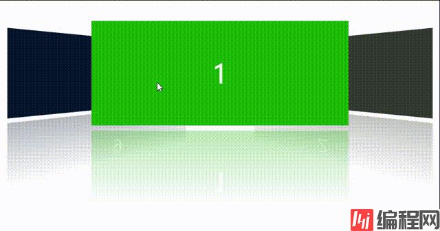
实现点击的时候切换卡片,自动轮播,鼠标移入暂停,移出继续轮播,有动画事件
效果就是这样
下面是代码
<html lang="en">

<head>
    <meta charset="UTF-8">
    <meta Http-equiv="X-UA-Compatible" content="IE=edge">
    <meta name="viewport" content="width=device-width, initial-scale=1.0">
    <title>Document</title>
    <style>
        .box {
            width: 680px;
            padding: 50px;
            margin: auto;
            margin-top: 300px;
        }

        .swiper,
        #swiper {
            width: 830px;
            height: 200px;
            position: relative;
        }

        .swiper div {
            display: block;
            position: absolute;
            width: 500px;
            height: 200px;
            overflow: hidden;
            left: 165px;
            top: 0;
            transition: 0.5s;
            color: #fff;
            font-size: 50px;
            text-align: center;
            line-height: 200px;

        }

        .swiper div:nth-child(1) {
            background: #1ebe09;
        }

        .swiper div:nth-child(2) {
            background: #323a31;
        }

        .swiper div:nth-child(3) {
            background: #0985be;
        }

        .swiper div:nth-child(4) {
            background: #090cbe;
        }

        .swiper div:nth-child(5) {
            background: #be5109;
        }

        .swiper div:nth-child(6) {
            background: #be09af;
        }

        .swiper div:nth-child(7) {
            background: #be8e09;
        }

        .swiper div:nth-child(8) {
            background: #be0909;
        }

        .swiper div:nth-child(9) {
            background: #06162c;
        }

        .swiper .a {
            opacity: 1;
            z-index: 23;
            -WEBkit-transfORM: translateX(255px) translateZ(-300px) rotateY(-45deg);
            -ms-transform: translateX(255px) translateZ(-300px) rotateY(-45deg);
            transform: perspective(500px) translateX(300px) translateZ(-253px) rotateY(-45deg);
            -webkit-box-reflect: below 10px -webkit-gradient(linear, left top, left bottom, from(transparent), color-stop(30%, transparent), to(rgba(250, 250, 250, 0.3)));
        }

        .swiper .b {
            opacity: 1;
            z-index: 33;
            -webkit-box-reflect: below 10px -webkit-gradient(linear, left top, left bottom, from(transparent), color-stop(30%, transparent), to(rgba(250, 250, 250, 0.3)));
            transform: translateX(0) translateZ(-100px) rotateY(0deg)
        }

        .swiper .c {
            opacity: 1;
            z-index: 23;
            -webkit-box-reflect: below 10px -webkit-gradient(linear, left top, left bottom, from(transparent), color-stop(30%, transparent), to(rgba(250, 250, 250, 0.3)));
            -webkit-transform: translateX(255px) translateZ(-300px) rotateY(-45deg);
            -ms-transform: translateX(255px) translateZ(-300px) rotateY(-45deg);
            transform: perspective(500px) translateX(-300px) translateZ(-253px) rotateY(45deg);
        }

        .swiper .dd {
            opacity: 0;
            z-index: -1;
            -webkit-transform: translateX(0) translateZ(-300px) rotateY(0);
            -ms-transform: translateX(0) translateZ(-300px) rotateY(0);
            transform: perspective(500px) translateX(0) translateZ(-253px) rotateY(0);

        }
    </style>
</head>

<body>
    <div class="box">
        <div class="swiper" id="swiper">
            <div class="swiper-time b">1</div>
            <div class="swiper-time a">2</div>
            <div class="swiper-time dd">3</div>
            <div class="swiper-time dd">4</div>
            <div class="swiper-time dd">5</div>
            <div class="swiper-time dd">6</div>
            <div class="swiper-time dd">7</div>
            <div class="swiper-time dd">8</div>
            <div class="swiper-time c">9</div>

        </div>
    </div>
    <script>
        const time = 3000 ;  //自动播放速度
        var index = 0  // 索引
        const swiperitem = document.getElementById('swiper') //获取父元素
        const swiper = swiperitem.getElementsByTagName('div') //获取合集
                //    自动轮播
        var setTime = setInterval(() => {
            if (index < swiper.length-1) {
                index++
            } else {
                index = 0
            }
            style()
        }, time)
        // 点解切换
        for (let i = 0; i < swiper.length; i++) {
            swiper[i].onclick = function () {
                if (i === index) return
                index = i
                style()
            }
        }
        // 鼠标移入暂停
        swiperitem.onmouseover  = function () {
            clearInterval(setTime)
        }
        // 鼠标移出继续轮播
        swiperitem.onmouseout  = function () {
            setTime = setInterval(() => {
                if (index < swiper.length-1) {
                    index++
                } else {
                    index = 0
                }
                style()
            }, time)
        }
        // 滚动事件
        function style() {
            console.log(index)
            for (let i = 0; i < swiper.length; i++) {
                swiper[i].className = 'swiper-time dd'
            }
            if (index === swiper.length - 1) {
                swiper[index].className = 'swiper-time b'
                swiper[0].className = 'swiper-time a'
                swiper[index - 1].className = 'swiper-time c'
            } else if (index === 0) {
                swiper[index].className = 'swiper-time b'
                swiper[index + 1].className = 'swiper-time a'
                swiper[swiper.length - 1].className = 'swiper-time c'
            } else {
                swiper[index].className = 'swiper-time b'
                swiper[index + 1].className = 'swiper-time a'
                swiper[index - 1].className = 'swiper-time c'
            }
        }

    </script>
</body>

</html>--结束END--
本文标题: js+css实现卡片轮播图效果
本文链接: https://www.lsjlt.com/news/140144.html(转载时请注明来源链接)
有问题或投稿请发送至: 邮箱/279061341@qq.com QQ/279061341
下载Word文档到电脑,方便收藏和打印~
2024-01-12
2023-05-20
2023-05-20
2023-05-20
2023-05-20
2023-05-20
2023-05-20
2023-05-20
2023-05-20
2023-05-20
回答
回答
回答
回答
回答
回答
回答
回答
回答
回答


官方手机版

微信公众号

商务合作


0