目录安装脚手架工具使用Vue CLI新建项目$slotsTable组件相关源码安装脚手架工具 npm install -g @vue/cli 查看@vue/cli版本,vue -V。
npm install -g @vue/cli查看@vue/cli版本,vue -V。
vue create antd-demo下载ant-design-vue,ant-design-vue@2.1.6
npm install ant-design-vue@next --save修改main.js,完整引入ant-design-vue所有组件及样式
import { createApp } from 'vue'
import App from './App.vue'
import Antd from "ant-design-vue";
import "ant-design-vue/dist/antd.CSS";
createApp(App).use(Antd).mount('#app')
修改HelloWorld.vue,使用Antd的Table组件
<template>
  <a-table :dataSource="dataSource" :columns="columns" />
</template>
<script>
export default {
name:"Helloworld",
setup() {
return {
dataSource: [
{
key: '1',
name: '胡彦斌',
age: 32,
address: '西湖区湖底公园1号',
},
{
key: '2',
name: '胡彦祖',
age: 42,
address: '西湖区湖底公园1号',
},
],
columns: [
{
title: '姓名',
dataindex: 'name',
key: 'name',
},
{
title: '年龄',
dataIndex: 'age',
key: 'age',
},
{
title: '住址',
dataIndex: 'address',
key: 'address',
},
],
};
},
};
</script>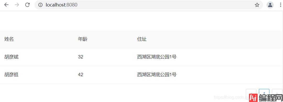
:columns="columns",columns是一个数组,用于指定列头
dataIndex值依次是:name、age和address,与dataSource每项的name、age和address对应。title,dataIndex值对应的列头名称name,对应的列头名称是姓名age,对应的列头名称是年龄address,对应的列头名称是地址key,Vue需要的key,如果已经设置了唯一的dataIndex,可以忽略这个属性:dataSource=dataSource,指定数据源dataSource是一个数组修改HelloWorld.vue,使用Antd的Table组件
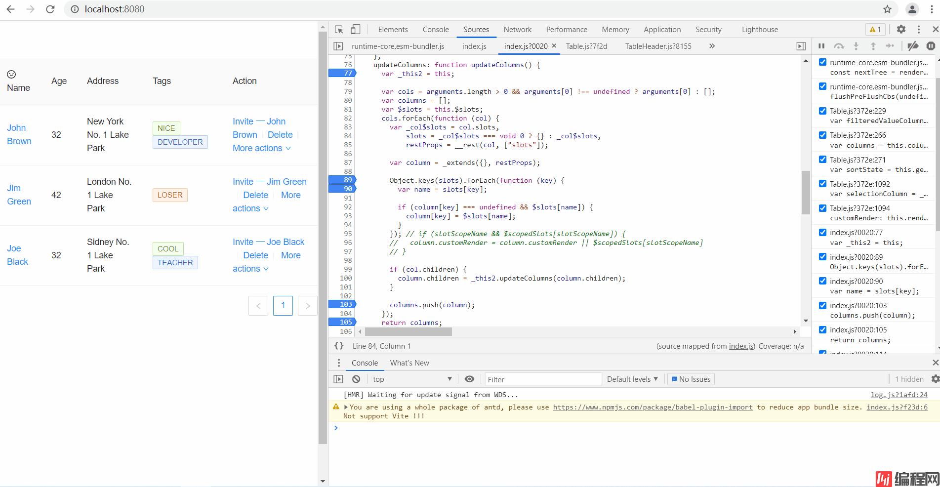
<template>
  <a-table :columns="columns" :data-source="data">
    <template #name="{ text }">
      <a>{{ text }}</a>
    </template>
    <template #customTitle>
      <span>
        <smile-outlined />
        Name
      </span>
    </template>
    <template #tags="{ text: tags }">
      <span>
        <a-tag
          v-for="tag in tags"
          :key="tag"
          :color="tag === 'loser' ? 'volcano' : tag.length > 5 ? 'geekblue' : 'green'"
        >
          {{ tag.toUpperCase() }}
        </a-tag>
      </span>
    </template>
    <template #action="{ record }">
      <span>
        <a>Invite 一 {{ record.name }}</a>
        <a-divider type="vertical" />
        <a>Delete</a>
        <a-divider type="vertical" />
        <a class="ant-dropdown-link">
          More actions
          <down-outlined />
        </a>
      </span>
    </template>
  </a-table>
</template>
<script lang="ts">
import { SmileOutlined, DownOutlined } from '@ant-design/icons-vue';
import { defineComponent } from 'vue';
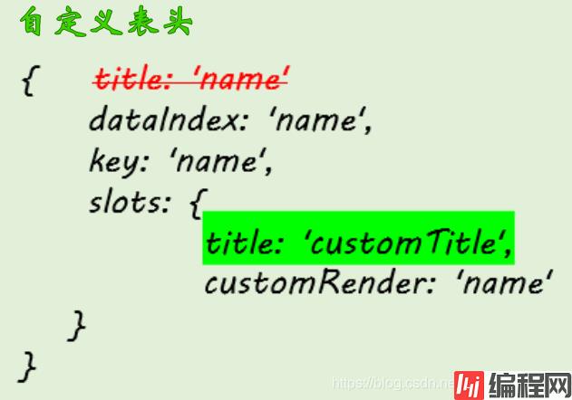
const columns = [
{
dataIndex: 'name',
key: 'name',
slots: { title: 'customTitle', customRender: 'name' },
},
{
title: 'Age',
dataIndex: 'age',
key: 'age',
},
{
title: 'Address',
dataIndex: 'address',
key: 'address',
},
{
title: 'Tags',
key: 'tags',
dataIndex: 'tags',
slots: { customRender: 'tags' },
},
{
title: 'Action',
key: 'action',
slots: { customRender: 'action' },
},
];
const data = [
{
key: '1',
name: 'John Brown',
age: 32,
address: 'New York No. 1 Lake Park',
tags: ['nice', 'developer'],
},
{
key: '2',
name: 'Jim Green',
age: 42,
address: 'London No. 1 Lake Park',
tags: ['loser'],
},
{
key: '3',
name: 'Joe Black',
age: 32,
address: 'Sidney No. 1 Lake Park',
tags: ['cool', 'teacher'],
},
];
export default defineComponent({
setup() {
return {
data,
columns,
};
},
components: {
SmileOutlined,
DownOutlined,
},
});
</script>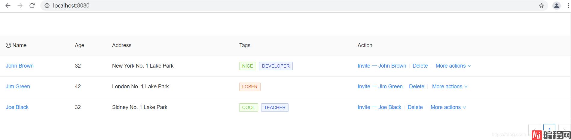
注意哈,ant-design-vue Table里:data-source与:dataSource是等效的。
要使用slots自定义样式,就有必要了解下Vue里的$slots和Table组件的源码。
插槽内容可以在this.$slots中看到,举个例子。
组件base-layout
<template>
    <header>
        <slot name="header"></slot>
    </header>
    <main>
        <slot name="default"></slot>
    </main>
    <footer>
        <slot name="footer"></slot>
    </footer>
</template>
<script>
export default {
name:"base-layout"
}
</script>App.vue
<template>
  <BaseLayout>
    <template #header>
      <p>Here is part one</p>
    </template>
    <template #default>
      <p>Here is part two</p>
    </template>
    <template #footer>
      <p>Here is part three</p>
    </template>
  </BaseLayout>
</template>
<script>
import BaseLayout from "./components/base-layout.vue";
export default {
name: 'App',
components: {
BaseLayout
}
}
</script><style>
#app {
font-family: Avenir, Helvetica, Arial, sans-serif;
-WEBkit-font-smoothing: antialiased;
-moz-osx-font-smoothing: grayscale;
text-align: center;
color: #2c3e50;
margin-top: 60px;
}
</style>main.js
import { createApp } from 'vue'
import App from './App.vue'
import Antd from "ant-design-vue";
import "ant-design-vue/dist/antd.css";
createApp(App).use(Antd).mount('#app');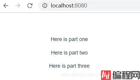
现在我们修改base-layout.vue,使用this.$slots来访问插槽内容。
<template>
    <header>
        <slot name="header"></slot>
    </header>
    <main>
        <slot name="default"></slot>
    </main>
    <footer>
        <slot name="footer"></slot>
    </footer>
</template>
<script>
export default {
name:"base-layout",
mounted:function(){
console.log(this);
console.log(this.$slots);
console.log(this.$slots.header);
console.log(this.$slots.header());
console.log(this.$slots.header()[0].el);
console.log(this.$slots.default()[0].el);
console.log(this.$slots.footer()[0].el);
}
}
</script>
node_modules/ant-design-vue/es/table/index.js
updateColumns(cols = []) {
  const columns = [];
  const { $slots, $scopedSlots } = this;
  cols.forEach(col => {
    const { slots = {}, scopedSlots = {}, ...restProps } = col;
    const column = {
      ...restProps,
    };
    Object.keys(slots).forEach(key => {
      const name = slots[key];
      if (column[key] === undefined && $slots[name]) {
        column[key] = $slots[name].length === 1 ? $slots[name][0] : $slots[name];
      }
    });
    Object.keys(scopedSlots).forEach(key => {
      const name = scopedSlots[key];
      if (column[key] === undefined && $scopedSlots[name]) {
        column[key] = $scopedSlots[name];
      }
    });
    // if (slotScopeName && $scopedSlots[slotScopeName]) {
    //   column.customRender = column.customRender || $scopedSlots[slotScopeName]
    // }
    if (col.children) {
      column.children = this.updateColumns(column.children);
    }
    columns.push(column);
  });
  return columns;
}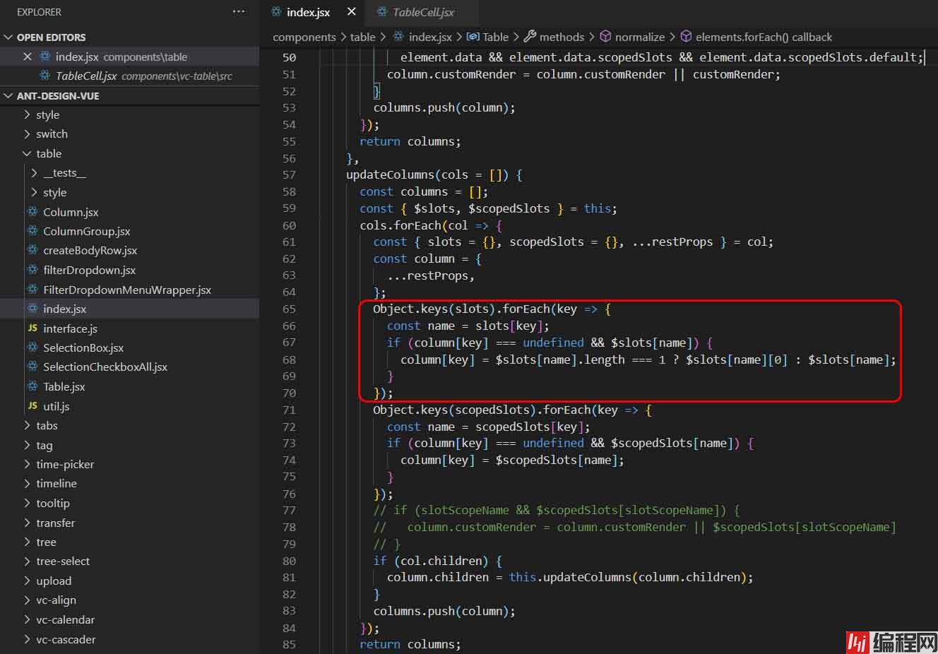

只有满足条件(column[key] === undefined && $slots[name]),才能使用作用域插槽来自定义表头。本例中,dataIndex:'name'想自定义表头,所以不能定义title属性,而是在slots属性中定义了title属性。
node_modules/ant-design-vue/es/vc-table/src/TableCell.js
render() {
  const {
    record,
    indentSize,
    prefixCls,
    indent,
    index,
    expandIcon,
    column,
    component: BodyCell,
  } = this;
  const { dataIndex, customRender, className = '' } = column;
  const { transfORMCellText } = this.table;
  // We should return undefined if no dataIndex is specified, but in order to
  // be compatible with object-path's behavior, we return the record object instead.
  let text;
  if (typeof dataIndex === 'number') {
    text = get(record, dataIndex);
  } else if (!dataIndex || dataIndex.length === 0) {
    text = record;
  } else {
    text = get(record, dataIndex);
  }
  let tdProps = {
    props: {},
    attrs: {},
    on: {
      click: this.handleClick,
    },
  };
  let colSpan;
  let rowSpan;
  if (customRender) {
    text = customRender(text, record, index, column);
    if (isInvalidRenderCellText(text)) {
      tdProps.attrs = text.attrs || {};
      tdProps.props = text.props || {};
      tdProps.class = text.class;
      tdProps.style = text.style;
      colSpan = tdProps.attrs.colSpan;
      rowSpan = tdProps.attrs.rowSpan;
      text = text.children;
    }
  }
  if (column.customCell) {
    tdProps = mergeProps(tdProps, column.customCell(record, index));
  }
  // Fix https://GitHub.com/ant-design/ant-design/issues/1202
  if (isInvalidRenderCellText(text)) {
    text = null;
  }
  if (transformCellText) {
    text = transformCellText({ text, column, record, index });
  }
  const indentText = expandIcon ? (
    <span
      style={{ paddingLeft: `${indentSize * indent}px` }}
      class={`${prefixCls}-indent indent-level-${indent}`}
    />
  ) : null;
  if (rowSpan === 0 || colSpan === 0) {
    return null;
  }
  if (column.align) {
    tdProps.style = { textAlign: column.align, ...tdProps.style };
  }
  const cellClassName = classNames(className, column.class, {
    [`${prefixCls}-cell-ellipsis`]: !!column.ellipsis,
    // 如果有宽度,增加断行处理
    // Https://github.com/ant-design/ant-design/issues/13825#issuecomment-449889241
    [`${prefixCls}-cell-break-Word`]: !!column.width,
  });
  if (column.ellipsis) {
    if (typeof text === 'string') {
      tdProps.attrs.title = text;
    } else if (text) {
      // const { props: textProps } = text;
      // if (textProps && textProps.children && typeof textProps.children === 'string') {
      //   tdProps.attrs.title = textProps.children;
      // }
    }
  }
  return (
    <BodyCell class={cellClassName} {...tdProps}>
      {indentText}
      {expandIcon}
      {text}
    </BodyCell>
  );
}
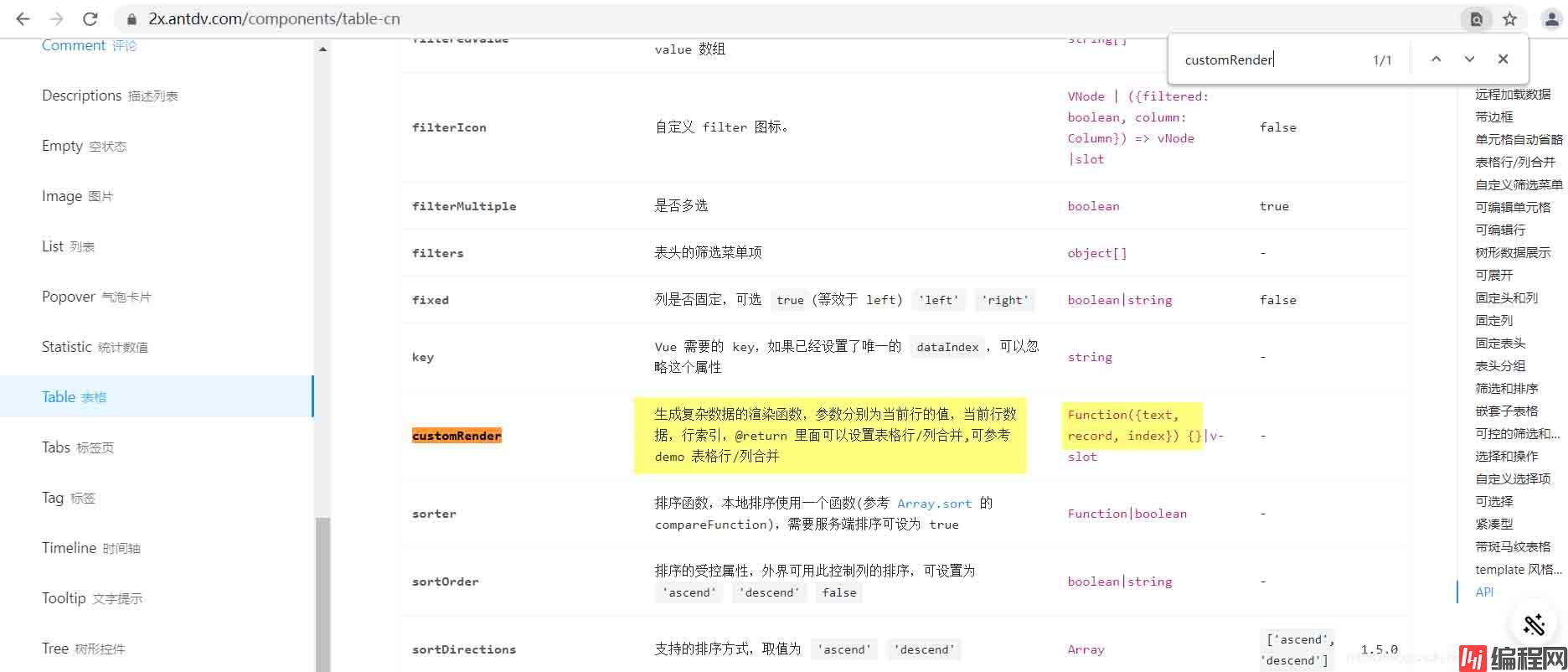
其中,customRender是渲染函数,用来对表中的值进行自定义渲染。该函数接受4个参数,分别是 text、 record、index和 column。
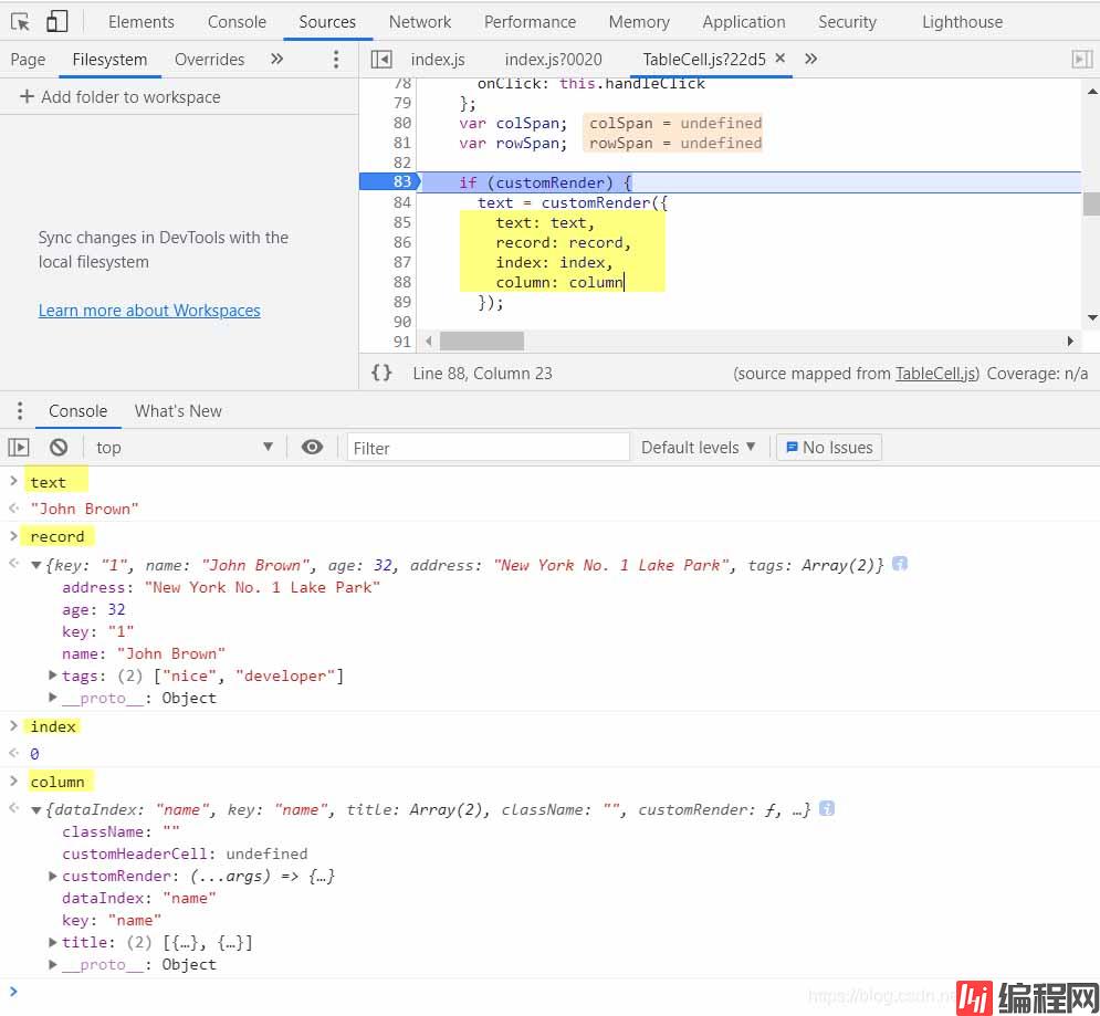
antd官网也有customRender的相关说明,如下
以上为个人经验,希望能给大家一个参考,也希望大家多多支持编程网。
--结束END--
本文标题: 如何使用ant-design-vue的Table组件
本文链接: https://www.lsjlt.com/news/150340.html(转载时请注明来源链接)
有问题或投稿请发送至: 邮箱/279061341@qq.com QQ/279061341
下载Word文档到电脑,方便收藏和打印~
2024-01-12
2023-05-20
2023-05-20
2023-05-20
2023-05-20
2023-05-20
2023-05-20
2023-05-20
2023-05-20
2023-05-20
回答
回答
回答
回答
回答
回答
回答
回答
回答
回答


官方手机版

微信公众号

商务合作


0