Python 官方文档:入门教程 => 点击学习
目录一、绘制带趋势线的散点图二、绘制边缘直方图一、绘制带趋势线的散点图 实现功能: 在散点图上添加趋势线(线性拟合线)反映两个变量是正相关、负相关或者无相关关系。 实现代码: imp
实现功能:
在散点图上添加趋势线(线性拟合线)反映两个变量是正相关、负相关或者无相关关系。
实现代码:
import pandas as pd
import matplotlib as mpl
import matplotlib.pyplot as plt
import seaborn as sns
import warnings
warnings.filterwarnings(action='once')
plt.style.use('seaborn-whitegrid')
sns.set_style("whitegrid")
print(mpl.__version__)
print(sns.__version__)
def draw_scatter(file):
    # Import Data
    df = pd.read_csv(file)
    df_select = df.loc[df.cyl.isin([4, 8]), :]

    # Plot
    gridobj = sns.lmplot(
        x="displ",
        y="hwy",
        hue="cyl",
        data=df_select,
        height=7,
        aspect=1.6,
        palette='Set1',
        scatter_kws=dict(s=60, linewidths=.7, edgecolors='black'))
    # Decorations
    sns.set(style="whitegrid", font_scale=1.5)
    gridobj.set(xlim=(0.5, 7.5), ylim=(10, 50))
    gridobj.fig.set_size_inches(10, 6)
    plt.tight_layout()
    plt.title("Scatterplot with line of best fit grouped by number of cylinders")
    plt.show()
draw_scatter("F:\数据杂坛\datasets\mpg_ggplot2.csv")
实现效果:
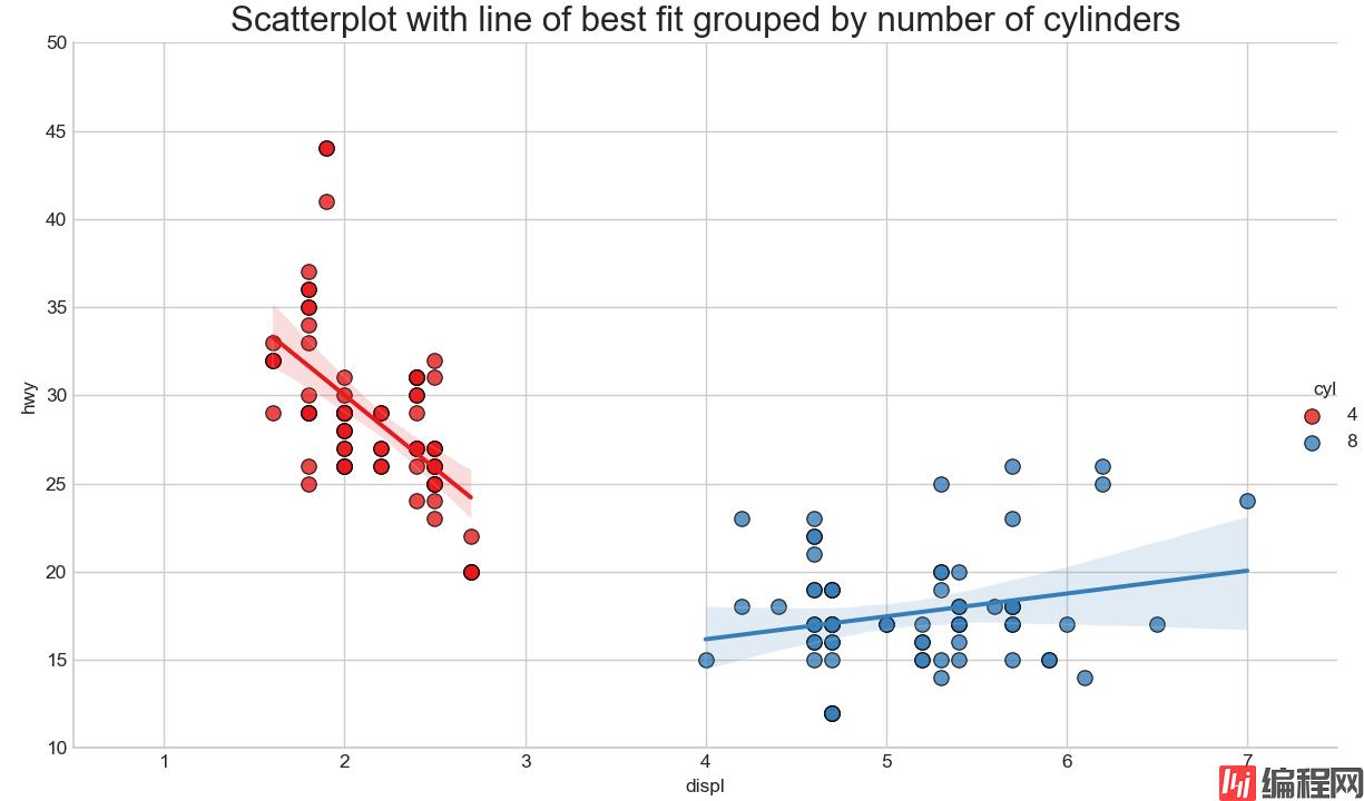
在散点图上添加趋势线(线性拟合线)反映两个变量是正相关、负相关或者无相关关系。红蓝两组数据分别绘制出最佳的线性拟合线。
实现功能:
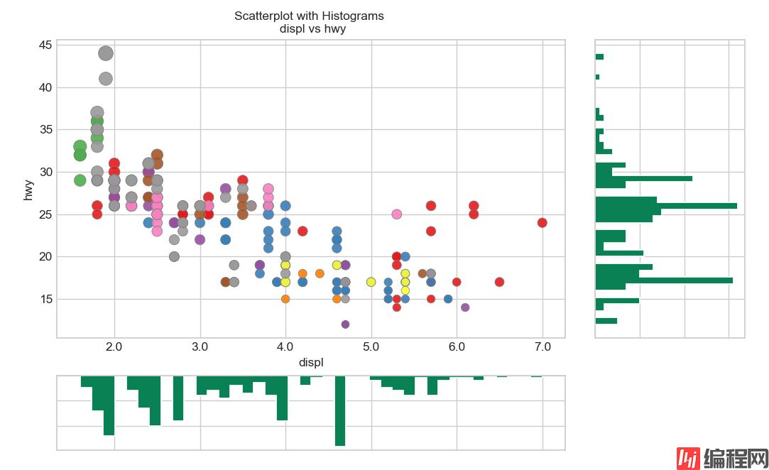
python绘制边缘直方图,用于展示X和Y之间的关系、及X和Y的单变量分布情况,常用于数据探索分析。
实现代码:
import pandas as pd
import matplotlib as mpl
import matplotlib.pyplot as plt
import seaborn as sns
import warnings
warnings.filterwarnings(action='once')
plt.style.use('seaborn-whitegrid')
sns.set_style("whitegrid")
print(mpl.__version__)
print(sns.__version__)
def draw_Marginal_Histogram(file):
    # Import Data
    df = pd.read_csv(file)

    # Create Fig and gridspec
    fig = plt.figure(figsize=(10, 6), dpi=100)
    grid = plt.GridSpec(4, 4, hspace=0.5, wspace=0.2)
    # Define the axes
    ax_main = fig.add_subplot(grid[:-1, :-1])
    ax_right = fig.add_subplot(grid[:-1, -1], xticklabels=[], yticklabels=[])
    ax_bottom = fig.add_subplot(grid[-1, 0:-1], xticklabels=[], yticklabels=[])
    # Scatterplot on main ax
    ax_main.scatter('displ',
                    'hwy',
                    s=df.cty * 4,
                    c=df.manufacturer.astype('cateGory').cat.codes,
                    alpha=.9,
                    data=df,
                    cmap="Set1",
                    edgecolors='gray',
                    linewidths=.5)
    # histogram on the right
    ax_bottom.hist(df.displ,
                   40,
                   histtype='stepfilled',
                   orientation='vertical',
                   color='#098154')
    ax_bottom.invert_yaxis()
    # histogram in the bottom
    ax_right.hist(df.hwy,
                  40,
                  histtype='stepfilled',
                  orientation='horizontal',
                  color='#098154')
    # Decorations
    ax_main.set(title='Scatterplot with Histograms \n displ vs hwy',
                xlabel='displ',
                ylabel='hwy')
    ax_main.title.set_fontsize(10)
    for item in ([ax_main.xaxis.label, ax_main.yaxis.label] +
                 ax_main.get_xticklabels() + ax_main.get_yticklabels()):
        item.set_fontsize(10)

    xlabels = ax_main.get_xticks().tolist()
    ax_main.set_xticklabels(xlabels)
    plt.show()
draw_Marginal_Histogram("F:\数据杂坛\datasets\mpg_ggplot2.csv")
实现效果:
到此这篇关于Python可视化分析绘制带趋势线的散点图和边缘直方图的文章就介绍到这了,更多相关python绘制内容请搜索编程网以前的文章或继续浏览下面的相关文章希望大家以后多多支持编程网!
--结束END--
本文标题: python可视化分析绘制带趋势线的散点图和边缘直方图
本文链接: https://www.lsjlt.com/news/152581.html(转载时请注明来源链接)
有问题或投稿请发送至: 邮箱/279061341@qq.com QQ/279061341
下载Word文档到电脑,方便收藏和打印~
2024-03-01
2024-03-01
2024-03-01
2024-02-29
2024-02-29
2024-02-29
2024-02-29
2024-02-29
2024-02-29
2024-02-29
回答
回答
回答
回答
回答
回答
回答
回答
回答
回答


官方手机版

微信公众号

商务合作


0