目录1. 概述2. 常用组件2.1 Text2.1.1 TextStyle2.1.2 TextSpan2.1.3 DefaultTextStyle2.1.4 使用字体2.2 Butt
上一篇说到,Basics Widget 并不是 Flutter 的一个专门的Widget类别,而是 Flutter 官方挑选一些开发常用的 Widget 构成的,希望我们掌握到一些最基本的开发能力。
包括:
Text 用于显示简单样式文本,然后可以填充一些文本显示样式的属性,如下例子:
Text("Hello World",
        textAlign: TextAlign.left,
        maxLines: 1,
        overflow: TextOverflow.ellipsis,
textScaleFactor: 1.5);textAlignmaxLines 、 overflowoverflow 指定了阶段方式, 例如 ellipsis 就是将多余的文本用 “…” 表示textScaleFactorMediaQueryData.textScaleFactor 获得, 如果没有 MediaQuery,那么会默认值为 1.0TextStyle 用于指定文本样式,例如颜色、字体、粗细、背景等,如下:
  @override
  Widget build(BuildContext context) {
    return MaterialApp(
        title: "Flutter",
        home: Scaffold(
            appBar: AppBar(
              title: const Text("Basics Widget"),
            ),
            body: Text(
              "Hello World",
              style: TextStyle(
                  color: Colors.blue,
                  fontSize: 19.0,
                  height: 2,
                  fontFamily: "Courier",
                  background: Paint()..color = Colors.yellow,
                  decoration: TextDecoration.underline,
                  decorationStyle: TextDecorationStyle.dashed),
            )));
  }
效果如图:

一些属性:
heightheight*fontSize ,同理行宽也是fontFamilyfontSizetextScaleFactor 都用于控制字体大小,但是有两个区别,fontSize 可以精确指定字体大小, 而 textScaleFactor 只能缩放比例textScaleFactor 主要是用于系统字体大小设置改变时,对Flutter 应用字体进行全局调整,而 fontSzie通常用于单个文本,字体大小不会跟随系统字体大小变化如果我们需要对Text内容不同部分按照不同的样式显示,就可以使用 TextSpan,代表文本的一个“片段”,看看 TextSpan的定义:
  const TextSpan({
    this.text,
    this.children,
    TextStyle? style,
    this.recognizer,
    MouseCursor? mouseCursor,
    this.onEnter,
    this.onExit,
    this.semanticsLabel,
    this.locale,
    this.spellOut,
  })
其中 style 和 text 代表样式和文本内容, children是 List<InlineSpan>? 类型,也就说 TextSpan 可以包含其他 Span
reconizer 用于表示该文本片段上用于手势进行识别处理,下面我们看一个效果图,然后用 TextSpan 来实现:

body: const Text.rich(TextSpan(children: [
              TextSpan(text: "Home: "),
              TextSpan(
                text: "https://flutterchina.club",
                style: TextStyle(color: Colors.blue),
                recognizer: _recognizer
              ),
            ]))));
这里的代码,用 TextSpan实现了一个基础文本和一个链接片段
Text.rich 方法将 TextSpan 添加到 Text 中,之所以可以这样做,是因为 Text 其实就是 RichText 的一个包装,而 RichText 是可以显示多种多样的 widget_reconizer 是点击链接的处理器在 Widget 树中, 文本的样式默认是可以被继承的,因此如果 Widget树的某一个节点处设置一个默认的文本样式,那么该节点的子树所有的文本都会默认使用这个样式,而 DefaultTextStyle 正是用于设置默认文本样式的,看下面例子:
DefaultTextStyle(
  //1.设置文本默认样式
  style: TextStyle(
    color:Colors.red,
    fontSize: 20.0,
  ),
  textAlign: TextAlign.start,
  child: Column(
    crossAxisAlignment: CrossAxisAlignment.start,
    children: <Widget>[
      Text("hello world"),
      Text("I am Jack"),
      Text("I am Jack",
        style: TextStyle(
          inherit: false, //2.不继承默认样式
          color: Colors.grey
        ),
      ),
    ],
  ),
);
这里的代码首先设置了一个默认的样式,字体大小为20,、颜色为红色,然后将 DefaultTextStyle 设置给了子树,这样一来 Column 所有子孙 Text 默认都会继承该样式, 除非 Text 设置 inherit: false,如下所示:

在 Flutter 中可以使用自定义的字体,或者其他第三方字体, 这里就不介绍配置了,具体可以看官方文档:字体
Material 组件库提供了多种多样的按钮,他们都是直接或间接对 RawMaterialButton 的包装定制,所以大部分属性都一样。另外 Marterial 库中的按钮都有以下共同点:
onPressed 属性来设置回调,当按钮按下时会执行该回调,如果不提供回调则按钮会处于禁用状态,不会响应用户点击即 带阴影的按钮, 默认带有阴影和灰色背景,按下后阴影会变大,如下所示:

代码如下:
        child: ElevatedButton(
          child: const Text("i am ElevatedButton"),
          onPressed: () {},
        ),
),文本按钮,按下后会有背景色,如下图所示:

默认有一个边框,不带阴影且背景透明,按下后,边框颜色会变亮、同时出现背景和阴影,如下图所示:

可以点击的 Icon, 不包含文字,点击后会出现背景,如下所示:


代码设置为:
IconButton(
 icon: Icon(Icons.eleven_mp),
 onPressed: () {},
),上面学到的 ElevatedButton、 TextButton、 OutlinedButton 都有一个 icon() 的构造函数,这样就可以代入一个图片进去,例如设置:
ElevatedButton.icon(
          icon: const Icon(Icons.send),
          label: const Text("发送"),
          onPressed: () {},
        ),
效果为(这里有编码问题,可以无视):

可以通过 Image 组件来加载并显示布局, Image 的数据源可以是
ImageProvider 是抽象类,主要定义了图片的获取接口 load(),从不同的数据源获取图片需要实现不同的 ImageProvider,如 AssetImage 是实现了从 Asset 中加载图片, NetworkImage 则实现了从网络中加载图片。
Image 组件在构建时有一个必选的 image 参数,它对应一个 ImageProvier,下面分别演示一下如何从 asset 和 网络中加载图片。
在工程根目录下创建一个 images 目录,并将图片拷贝到该目录。
接下来在 pubspec.yaml 文件的 flutter部分 中,写入(注意缩进):
flutter:
  ..
  assets:
    - assets/images/bobo.jpg
最后在代码中使用:
Image(
  image: AssetImage("images/bobo.jpg"),
  width: 100.0,
)
就能展示图片。
(不过我这里遇到一个问题,使用手机运行Flutter应用能正常展示图片,但是使用 Chrome 模拟器会报错,不知道是什么原因造成的

直接使用代码:
Image(
  image: NetworkImage("Https://www.wahaotu.com/uploads/allimg/201904/1554901831804910.jpg"),
  width: 100.0,
)
可以正常展示图片。
(不过这里出现了很上面一样的问题,但是使用官方使用的url又能正常展示图片
我们可以来看下 Image 的参数,通过这些参数可以控制图片外观、大小、混合效果等。
  const Image({
    Key? key,
    required this.image,
    this.frameBuilder,
    this.loadingBuilder,
    this.errorBuilder,
    this.semanticLabel,
    this.excludeFromSemantics = false,
    this.width,
    this.height,
    this.color,
    this.opacity,
    this.colorBlendMode,
    this.fit,
    this.alignment = Alignment.center,
    this.repeat = ImageRepeat.noRepeat,
    this.centerSlice,
    this.matchTextDirection = false,
    this.gaplessPlayback = false,
    this.isAntiAlias = false,
    this.filterQuality = FilterQuality.low,
})width、heightfitBoxFit 中定义的,它是一个枚举类型,有这些值:fill:拉伸填充满显示空间 ,图片会便是cover:会按图片的长宽比放大后居中填满显示空间,图片不会变形,超出显示部分会被剪裁contain:图片默认适应规则,图片会保证图片本身长宽比不变的情况下缩放以适应当前的显示空间fitWidth:图片宽度会缩放到显示空间的宽度,高度会按比例缩放,居中显示,图片不会变形fitHeight:和上面的反着来none:图片没有适应策略,会在显示空间内显示图片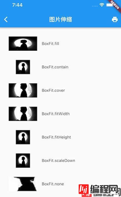
color 和 colorBlendMode:在图片绘制时可以对每一个像素进行颜色混合处理,color指定混合色,而 colorBlendMode 指定混合模式下,因为用的比较少,这里就不做实例repeat:当图片本身大小小于显示空间时,指定图片的重复规则,这里也不做展示Android中有 svg 矢量图, 而 Flutter 中的也有,就是 Icon,它有下面这些优点:
Flutter 默认实现了一套Icon,在 pubspec.yaml 的配置文件可以看到:
flutter:
  uses-material-design: true
来看下官方的示例代码:
String icons = "";
// accessible: 0xe03e
icons += "\uE03e";
// error:  0xe237
icons += " \uE237";
// fingerprint: 0xe287
icons += " \uE287";

Text(
  icons,
  style: TextStyle(
    fontFamily: "MaterialIcons",
    fontSize: 24.0,
    color: Colors.green,
  ),
);
效果为:

为了不让开发者码点,Flutter 封装了 IconData 和 Icon来专门显示字体图片,上面的例子也可以用下面方式实现:
Row(
  mainAxisAlignment: MainAxisAlignment.center,
  children: <Widget>[
    Icon(Icons.accessible,color: Colors.green),
    Icon(Icons.error,color: Colors.green),
    Icon(Icons.fingerprint,color: Colors.green),
  ],
)
我们也可以使用自定义的字体图标,这里就不赘述了,可以看看官方示例:Icon自定义字体图标
Flutter 提供了 Material 风格的 开关Switch 和 复选框Checkbox,它们都继承自 StatfulWidget,但是它们不会保存选中的状态,选中状态是由父组件来管理的。 当 Switch 或者 Checkbox 被点击时,会触发 onChanged 回调,我们可以在此回调中处理选中状态改变逻辑,下面看官方例子:
class SwitchAndCheckBoxTestRoute extends StatefulWidget {
  @override
  _SwitchAndCheckBoxTestRouteState createState() => _SwitchAndCheckBoxTestRouteState();
}

class _SwitchAndCheckBoxTestRouteState extends State<SwitchAndCheckBoxTestRoute> {
  bool _switchSelected=true; //维护单选开关状态
  bool _checkboxSelected=true;//维护复选框状态
  @override
  Widget build(BuildContext context) {
    return Column(
      children: <Widget>[
        Switch(
          value: _switchSelected,//当前状态
          onChanged:(value){
            //重新构建页面
            setState(() {
              _switchSelected=value;
            });
          },
        ),
        Checkbox(
          value: _checkboxSelected,
          activeColor: Colors.red, //选中时的颜色
          onChanged:(value){
            setState(() {
              _checkboxSelected=value!;
            });
          } ,
        )
      ],
    );
  }
}
代码中需要维护 Switch 和 Checkbox 的选中状态,所以 Widget 继承自 StatefulWidget。 在其 build 方法中分别状态了 Switch 和 Checkbox, 并且用两个 bool 值来维护分别的选中状态。 当按钮被点击时,会回调 onChanged 回调选中状态出去,此时我们需要调用 setState() 方法来触发 Flutter 重绘。
为什么要这样子设计,我的理解是:
它们的属性比较简单,常用的有:
activeColor:设置激活状态的颜色tristate: 是否为三态,仅 Checbox有,一般情况下只有 “true” 和 “false”,表示选中和非选中,如果设置了 tristate 后,还会增加一个 “null” 状态此外, Checkbox 不可设置宽高,其大小是自定义的,而 Switch 也仅能设置宽度而已。
Flutter Material组件提供了 输入款TextField 和 表单FORM
来看下 TextField 提供的属性:
  const TextField({
    ...
    this.controller,
    this.focusnode,
    this.decoration = const InputDecoration(),
    TextInputType? keyboardType,
    this.textInputAction,
    this.textCapitalization = TextCapitalization.none,
    this.style,
    this.strutStyle,
    this.textAlign = TextAlign.start,
    this.textAlignVertical,
    this.textDirection,
    this.readOnly = false,
    ToolbarOptions? toolbarOptions,
    this.showCursor,
    this.autofocus = false,
    this.obscurinGCharacter = '•',
    this.obscureText = false,
    this.autocorrect = true,
    SmartDashesType? smartDashesType,
    SmartQuotesType? smartQuotesType,
    this.enableSuggestions = true,
    this.maxLines = 1,
    this.minLines,
    this.expands = false,
    this.maxLength,
    this.maxLengthEnforcement,
    this.onChanged,
    this.onEditingComplete,
    this.onSubmitted,
    this.onAppPrivateCommand,
    this.inputFormatters,
    this.enabled,
    this.cursorWidth = 2.0,
    this.cursorHeight,
    this.cursorRadius,
    this.cursorColor,
    this.selectionHeightStyle = ui.BoxHeightStyle.tight,
    this.selectionWidthStyle = ui.BoxWidthStyle.tight,
    this.keyboardAppearance,
    this.scrollPadding = const EdgeInsets.all(20.0),
    this.dragStartBehavior = DragStartBehavior.start,
    this.enableInteractiveSelection = true,
    this.selectionControls,
    this.onTap,
    this.mouseCursor,
    this.buildCounter,
    this.scrollController,
    this.scrollPhysics,
    this.autofillHints,
    this.restorationId,
    this.enableIMEPersonalizedLearning = true,
  })
属性比较多,列几个关键的讲解:
controllercontroller 来与文本框交互,如果设置的话, TextField 内部会创建一个focusNodeTextField 是否占有当前键盘的输入焦点InputDecorationkeyboardTypetextInputActionstyletextAlignautofocusobscureTextmaxLinesmaxLenth 和 maxLengthEnforcementmaxLenth 代表输入框文本的最大长度,设置后输入框右下角会显示输入的文本计数maxLengthEnforcement 决定输入文本长度超过 maxLength 时如何处理,如截断toolbarOptionscontroller 也可以做到监听onEditingComplete 、onSubmittedinputFormattersenablecursorWidth、 cursorRadius、 cursorColor一个简单的设置代码如下:
Column(children: const <Widget>[
        TextField(
          autofocus: true,
          decoration: InputDecoration(
            labelText: "用户名",
            hintText: "请输入用户名或密码",
            prefixIcon: Icon(Icons.person)
          ),
        ),
        TextField(
          decoration: InputDecoration(
            labelText: "密码",
            hintText: "请输入密码",
            prefixIcon: Icon(Icons.lock)
          ),
          obscureText: true,
        )
      ]),
我们可以通过 onChange 拿到内容。 当然也可以使用 controller 来获取
步骤为:
controller:
final TextEditingController _tfController = TextEditingController();
TextField(
  controller: _tfController,
  ...
)
最后就可以通过 : print(_tfController.text) 来获得输入框的内容
可以通过 onChange 来监听文本, controller 可以通过设置监听器来监听文本,如下:
  @override
  void initState() {
    super.initState();
    _tfController.addListener(() {
      print(_tfController.text);
    });
  }
controller 的功能更多,除了监听文本,还可以设置默认值、选择文本等,这里就不多赘述。
可以使用 FocusNode 和 FocusScopeNode 来控制焦点。默认情况下是由 FocusScope 来管理,可以在这个范围内通过 FocusScopeNode 在输入框之间移动焦点、设置默认焦点。
我们可以通过下面代码来获取当前 Widget 树中默认的 FocusScopeNode:
focusScopeNode = FocusScope.of(context)拿到句柄后,可以使用下面代码来获取焦点:
focusScopeNode.requestFocus(focusNode);其中 focucsNode 是为 TextField 创建的 FocusNode, 这个操作可以让该 TextField 获取焦点。 调用 focusNode.unfocus() 可以取消焦点。
通过 FocusNode 可以监听焦点改变的事件:
focusNode.addListener((){
   print(focusNode.hasFocus);
})
true为获取焦点,false为失去焦点
表单Form 对输入框进行分组和统一操作。 就像 Android 的原生组件 RadioGroup 之于 RadioButton 一样, Form 可以管理内容校验、输入框重置等。
Form 继承自 StatefulWidget,其状态管理在 FormState 里面,来看看 From 的定义:
class Form extends StatefulWidget {
  const Form({
    Key? key,
    required this.child,
    @Deprecated(
      'Use autovalidateMode parameter which provides more specific '
      'behavior related to auto validation. '
      'This feature was deprecated after v1.19.0.',
    )
    this.autovalidate = false,
    this.onWillPop,
    this.onChanged,
    AutovalidateMode? autovalidateMode,
  })
...autovalidateFormState.validate() 来手动校验AutovalidateModeautovalidateModedisable:当 FormField 内容改变时不做校验always:即使用户没有用户交互也要校验合法性onUserInteraction:只有在用户交互时才会去校验合法性onWillPopForm 所在的路由是否可以直接返回。该回调返回一个 Future 对象,如果 Future 的最终结果是 false,则当前路由不会返回,如果为 true,则会返回到上一个路由。onChangedForm 的子孙元素是 FormField 类型,FormField 是一个抽象类,定义了几个属性, FormState 内部通过他们来完成操作, FormField 部分定义如下:
  const FormField({
    Key? key,
    required this.builder,
    this.onSaved,
    this.validator,
    this.initialValue,
    @Deprecated(
      'Use autovalidateMode parameter which provides more specific '
      'behavior related to auto validation. '
      'This feature was deprecated after v1.19.0.',
    )
    this.autovalidate = false,
    this.enabled = true,
    AutovalidateMode? autovalidateMode,
    this.restorationId,
})onSavedvalidatorinitValue为了方便使用, Flutter 提供了一个 TextFormFild 组件,继承自 FormField 类,还包装了 TextFileld ,可以直接当成 Form 的 FormField 来使用, 相当于用 Form 来管理 TextField
Form 表单的状态类就是 FormState, 可以通过 Form.of 或者 GlobalKey 获得,通过获得它来对 Form 的子孙 FormField 进行统一操作。
FormState 常用的三个方法:
FormState.validate():调用此方法后, 会调用 Form 子孙 FormField.validate() 回调,如果有一个检验失败,那么会返回 false,这样所有校验失败的 Widget 都会给出错误提示FormState.save():调用此方法后,会调用 子孙的 FormFild.save() 回调,用于保存表单内容FormState.reset(): 会将子孙 FormField 的内容清空我们做一个用户登录的程序,再点击登录前需要做到输入检查:
代码如下:
import 'package:flutter/material.dart';

class FormTestRoute extends StatefulWidget {
  const FormTestRoute({Key? key}) : super(key: key);

  @override
  State<StatefulWidget> createState() => _FormTestRouteState();
}

class _FormTestRouteState extends State<FormTestRoute> {
  final TextEditingController _usernameController = TextEditingController();
  final TextEditingController _passWordController = TextEditingController();
  final GlobalKey _formKey = GlobalKey<FormState>();

  @override
  Widget build(BuildContext context) {
    return Scaffold(
        appBar: AppBar(
          title: const Text('Form demo'),
        ),
        body: Form(
            key: _formKey,
            autovalidateMode: AutovalidateMode.onUserInteraction,
            child: Column(
              children: [
                TextFormField(
                  autofocus: true,
                  controller: _usernameController,
                  decoration: const InputDecoration(
                      labelText: "username",
                      hintText: "username or email",
                      icon: Icon(Icons.person)),
                  validator: (username) {
                    return username!.trim().isNotEmpty
                        ? null
                        : "username cannot empty";
                  },
                ),
                TextFormField(
                  controller: _passwordController,
                  decoration: const InputDecoration(
                      labelText: "password",
                      hintText: "please input your password",
                      icon: Icon(Icons.lock)),
                  obscureText: true,
                  validator: (pwd) {
                    return pwd!.trim().length >= 6
                        ? null
                        : "password digit cannot less than 6!";
                  },
                ),
                // login button
                Padding(
                  padding: const EdgeInsets.only(top: 28.0),
                  child: Row(
                    children: [
                      Expanded(
                          child: ElevatedButton(
                        onPressed: () {
                          if ((_formKey.currentState as FormState).validate()) {
                            print("Loing success");
                          }
                        },
                        child: const Padding(
                          padding: EdgeInsets.all(16.0),
                          child: Text("Login"),
                        ),
                      ))
                    ],
                  ),
                )
              ],
            )));
  }
}
效果如下图所示:

以上所述是小编给大家介绍的Flutter基本组件Basics Widget学习,希望对大家有所帮助。在此也非常感谢大家对编程网网站的支持!
--结束END--
本文标题: Flutter基本组件Basics Widget学习
本文链接: https://www.lsjlt.com/news/160243.html(转载时请注明来源链接)
有问题或投稿请发送至: 邮箱/279061341@qq.com QQ/279061341
下载Word文档到电脑,方便收藏和打印~
2024-01-21
2023-10-28
2023-10-28
2023-10-27
2023-10-27
2023-10-27
2023-10-27
回答
回答
回答
回答
回答
回答
回答
回答
回答
回答


官方手机版

微信公众号

商务合作


0