目录引言PART1:安装PART2:函数部分参数详解PART3:示例——以ggplot2内置数据集mpg为例PART4:来点花的——何
该包目前仅适用于利用 ggplot2 进行绘制的图形
我们在利用ggplot2进行数据可视化的时候经常会需要对两组数据进行比较,并添加显著性标记,自己学习之余,也给大家分享一个好用的添加显著性标记的包:ggsignif。
ggsignif: Significance Brackets for ‘ggplot2’
#从cran安装:
install.packages("ggsignif")
#从GitHub安装(最新版):
install.packages("remotes")
remotes::install_github("const-ae/ggsignif")
?geom_signif
函数帮助文档如下:
geom_signif(
  mapping = NULL,
  data = NULL,
  stat = "signif",
  position = "identity",
  na.rm = FALSE,
  show.legend = NA,
  inherit.aes = TRUE,
  comparisons = NULL,
  test = "wilcox.test",
  test.args = NULL,
  annotations = NULL,
  map_signif_level = FALSE,
  y_position = NULL,
  xmin = NULL,
  xmax = NULL,
  margin_top = 0.05,
  step_increase = 0,
  extend_line = 0,
  tip_length = 0.03,
  size = 0.5,
  textsize = 3.88,
  family = "",
  vjust = 0,
  parse = FALSE,
  manual = FALSE,
  orientation = NA,
  ...
)
在这些里面,我们常用的一些参数就是这些啦:
· comparisons #指定比较对象,是一个由长度为2的向量组成的列表
· test #指定使用的检验方法,包括 wilcox.test 和 t.test
· comparisons #指定比较对象,是一个由长度为2的向量组成的列表
· test #指定使用的检验方法,包括 wilcox.test 和 t.test
· annotations #指定注释的内容
· map_signif_level #布尔型变量,如果为TRUE,就用诸如***的形式来展示显著性差异
· y_position #指定标记在y轴方向上的坐标,是个数字向量
· xmin, xmax #指定标记在x轴方向上的位置,是个数字向量
· tip_length #指定标记小竖线的长度,是个数字向量
· size #指定标记尺寸,即线条的粗线
· textsize #指定标记中文字部分的大小
· family #指定标记中文字部分的字体
· vjust #指定标记部分中的文字与标记中的短横线之间的距离,负值在横线上方,正值在下方
· orientation #指定整个图的方向,一般不会修改,如果想让图“躺下”,就设置成为"y"
问题描述:
我们想绘制一个箱型图,横轴为每辆车的车型,纵坐标为hwy,使用mpg数据集,其结构如下:
library(ggplot2)
head(mpg)

# A tibble: 6 x 11
  manufacturer model displ  year   cyl trans      drv     cty   hwy fl    class
  <chr>        <chr> <dbl> <int> <int> <chr>      <chr> <int> <int> <chr> <chr>
1 audi         a4      1.8  1999     4 auto(l5)   f        18    29 p     compact
2 audi         a4      1.8  1999     4 manual(m5) f        21    29 p     compact
3 audi         a4      2    2008     4 manual(m6) f        20    31 p     compact
4 audi         a4      2    2008     4 auto(av)   f        21    30 p     compact
5 audi         a4      2.8  1999     6 auto(l5)   f        16    26 p     compact
6 audi         a4      2.8  1999     6 manual(m5) f        18    26 p     compact
开始绘制:
library(ggsignif)

ggplot(data = mpg, aes(x = class, y = hwy)) +
  geom_boxplot(aes(group = class, fill = class), size = 1) + #指定箱子线条宽度为1
  geom_signif(comparisons = list(c("midsize", "minivan"), c("compact", "midsize")), #指定比较对象
              test = "t.test", #指定检验方法
              y_position = c(40, 47), #指定两个标记在y轴上的坐标,按照前面指定比较对象的顺序
              size = 1, #指定标记中线条的尺寸
              textsize = 5, #指定标记中文字部分的大小
              vjust = -0.3, #指定标记中文字部分与横线之间的距离
              tip_length = c(0.2, 0.45, 0.05, 0.05), #指定短竖线的长度
              map_signif_level = T) +
  scale_y_continuous(limits = c(10, 55)) +
  theme(legend.position = "none",
        panel.background = element_rect(fill = NA),
        panel.border = element_rect(fill = NA, colour = "black", size = 1),
        axis.title = element_text(size = 15, face = "bold"),
        axis.text.x = element_text(size = 12, hjust = 1, angle = 45, color = "black"),
        axis.title.y = element_text(size = 12, color = "black"))
成图:
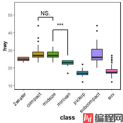
丑是丑了点,但还是凑合,毕竟针对主题的修改美化没有花大力气。需要注意的几个点:
关于y轴范围:
y轴的范围在这里很重要,范围不合适会直接导致显著性标记溢出图外,显示不全,所以可以用 scale_y_*(limits = numeric.vecter) 或者 ylab() 指定范围,保证好看的前提下尽可能大一点。
关于短竖线的长度:
短竖线长度指定的数值向量中数值的顺序应该是与你指定的比较对象的出现顺序是一致的,这个参数可以慢慢一个一个修改,多试试就好了。
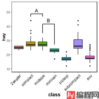
前面的函数帮助文档里有 annotations 参数,让人不禁想试试(狗头)。
话不多说,直接开始:
问题描述:我们想把上面的图中的 NS. 和 *** 分别替换成为字母 A 和 B。
一样的代码:
ggplot(data = mpg, aes(x = class, y = hwy)) +
  geom_boxplot(aes(group = class, fill = class), size =1) +
  geom_signif(comparisons = list(c("midsize", "minivan"), c("compact", "midsize")),
              annotations = c("B", "A"), #差别在这儿
              y_position = c(40, 47),
              size = 1,
              textsize = 5,
              vjust = -0.3,
              tip_length = c(0.2, 0.45, 0.05, 0.05)) +
  scale_y_continuous(limits = c(10, 55)) +
  theme(legend.position = "none",
        panel.background = element_rect(fill = NA),
        panel.border = element_rect(fill = NA, colour = "black", size = 1),
        axis.title = element_text(size = 15, face = "bold"),
        axis.text.x = element_text(size = 12, hjust = 1, angle = 45, color = "black"),
        axis.title.y = element_text(size = 12, color = "black"))
出图:
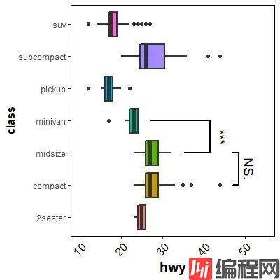
ggplot(data = mpg, aes(x = hwy, y = class)) +  #这里改了
  geom_boxplot(aes(group = class, fill = class), size =1, orientation = "y") +
  geom_signif(comparisons = list(c("midsize", "minivan"), c("compact", "midsize")),
              test = "t.test",
              y_position = c(40, 47),
              size = 1,
              textsize = 5,
              vjust = -0.3,
              tip_length = c(0.2, 0.45, 0.05, 0.05),
              map_signif_level = T,
              orientation = "y") +  #这里改了
  scale_x_continuous(limits = c(10, 55)) + #这里改了
  theme(legend.position = "none",
        panel.background = element_rect(fill = NA),
        panel.border = element_rect(fill = NA, colour = "black", size = 1),
        axis.title = element_text(size = 15, face = "bold"),
        axis.text.x = element_text(size = 12, hjust = 1, angle = 45, color = "black"),
        axis.title.y = element_text(size = 12, color = "black"))
ggplot(data = mpg, aes(x = class, y = hwy)) +
  geom_boxplot(aes(group = class, fill = class), size =1) +
  geom_signif(comparisons = list(c("midsize", "minivan"), c("compact", "midsize")),
              test = "t.test",
              y_position = c(40, 47),
              size = 1,
              textsize = 5,
              vjust = -0.3,
              tip_length = c(0.2, 0.45, 0.05, 0.05),
              map_signif_level = T) +
  scale_y_continuous(limits = c(10, 55)) +
  theme(legend.position = "none",
        panel.background = element_rect(fill = NA),
        panel.border = element_rect(fill = NA, colour = "black", size = 1),
        axis.title = element_text(size = 15, face = "bold"),
        axis.text.x = element_text(size = 12, hjust = 1, angle = 45, color = "black"),
        axis.title.y = element_text(size = 12, color = "black")) +
  coord_flip() #只改了这里
出图:
以上就是使用ggsignif优雅添加显著性标记详解的详细内容,更多关于ggsignif添加显著性标记的资料请关注编程网其它相关文章!
--结束END--
本文标题: 使用ggsignif优雅添加显著性标记详解
本文链接: https://www.lsjlt.com/news/167150.html(转载时请注明来源链接)
有问题或投稿请发送至: 邮箱/279061341@qq.com QQ/279061341
下载Word文档到电脑,方便收藏和打印~
2024-03-01
2024-03-01
2024-02-29
2024-02-29
2024-02-29
2024-02-29
2024-02-29
2024-02-29
2024-02-29
2024-02-29
回答
回答
回答
回答
回答
回答
回答
回答
回答
回答


官方手机版

微信公众号

商务合作


0