目录Flutter 适配组件1. MediaQuery2. LayoutBuilder3. OrientationBuilder4. Expanded 和 Flexible5. Fr
在 Flutter 我们只需要掌握一些 Widget 即可,实际的开发过程中,我们也只需要在合适的地方使用它们即可。
第一个 Widget 即是 MediaQuery,通过它可以直接获得屏幕的大小(宽度 / 高度)和方向(纵向 / 横向)。
cclass HomePage extends StatelessWidget {
  @override
  Widget build(BuildContext context) {
    Size screenSize = MediaQuery.of(context).size;
    Orientation orientation = MediaQuery.of(context).orientation;
    return Scaffold(
      body: Container(
        color: CustomColors.Android,
        child: Center(
          child: Text(
            'View\n\n' +
                '[MediaQuery width]: ${screenSize.width.toStringAsFixed(2)}\n\n' +
                '[MediaQuery orientation]: $orientation',
            style: TextStyle(color: Colors.white, fontSize: 18),
          ),
        ),
      ),
    );
  }
}
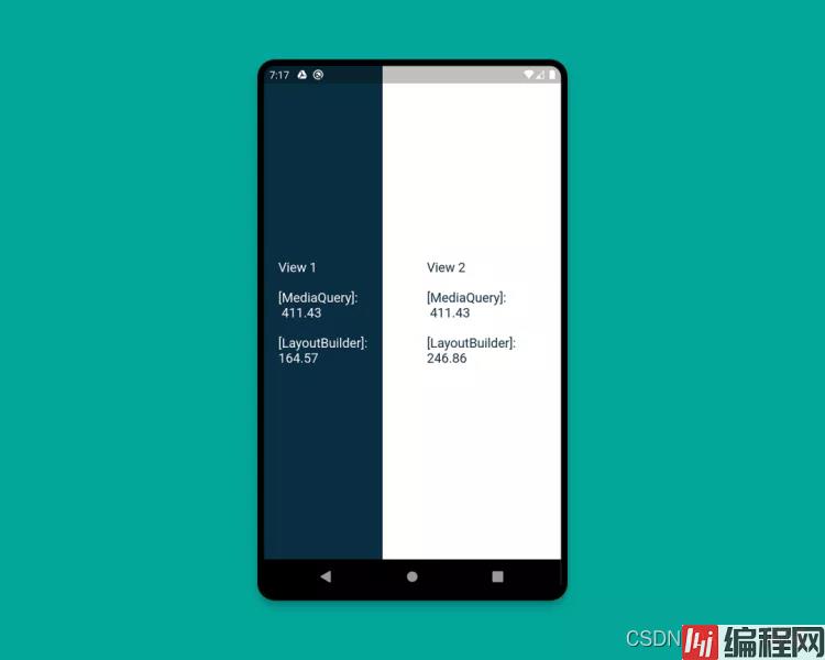
使用 LayoutBuilder 组件,可以获得一个 BoxConstraints 对象,通过该对象我们就可以拿到 Widget 的 maxWidth(最大宽度) 和maxHeight(最大高度)
MediaQuery 和 LayoutBuilder 的区别在在于,MediaQuery 得到的是整个屏幕的宽高,而 LayoutBuilder 得到的是特定组件的最大高度和宽度。
class HomePage extends StatelessWidget {
  @override
  Widget build(BuildContext context) {
    Size screenSize = MediaQuery.of(context).size;
    return Scaffold(
      body: Row(
        children: [
          Expanded(
            flex: 2,
            child: LayoutBuilder(
              builder: (context, constraints) => Container(
                color: CustomColors.android,
                child: Center(
                  child: Text(
                    'View 1\n\n' +
                        '[MediaQuery]:\n ${screenSize.width.toStringAsFixed(2)}\n\n' +
                        '[LayoutBuilder]:\n${constraints.maxWidth.toStringAsFixed(2)}',
                    style: TextStyle(color: Colors.white, fontSize: 18),
                  ),
                ),
              ),
            ),
          ),
          Expanded(
            flex: 3,
            child: LayoutBuilder(
              builder: (context, constraints) => Container(
                color: Colors.white,
                child: Center(
                  child: Text(
                    'View 2\n\n' +
                        '[MediaQuery]:\n ${screenSize.width.toStringAsFixed(2)}\n\n' +
                        '[LayoutBuilder]:\n${constraints.maxWidth.toStringAsFixed(2)}',
                    style: TextStyle(color: CustomColors.android, fontSize: 18),
                  ),
                ),
              ),
            ),
          ),
        ],
      ),
    );
  }
}
要确定当前 Widget 的方向,可以使用 OrientationBuilder 组件。这里的方向与 MediaQuery 提供的设备方向不同。
class HomePage extends StatelessWidget {
  @override
  Widget build(BuildContext context) {
    Orientation deviceOrientation = MediaQuery.of(context).orientation;
    return Scaffold(
      body: Column(
        children: [
          Expanded(
            flex: 2,
            child: Container(
              color: CustomColors.android,
              child: OrientationBuilder(
                builder: (context, orientation) => Center(
                  child: Text(
                    'View 1\n\n' +
                        '[MediaQuery orientation]:\n$deviceOrientation\n\n' +
                        '[OrientationBuilder]:\n$orientation',
                    style: TextStyle(color: Colors.white, fontSize: 18),
                  ),
                ),
              ),
            ),
          ),
          Expanded(
            flex: 3,
            child: OrientationBuilder(
              builder: (context, orientation) => Container(
                color: Colors.white,
                child: Center(
                  child: Text(
                    'View 2\n\n' +
                        '[MediaQuery orientation]:\n$deviceOrientation\n\n' +
                        '[OrientationBuilder]:\n$orientation',
                    style: TextStyle(color: CustomColors.android, fontSize: 18),
                  ),
                ),
              ),
            ),
          ),
        ],
      ),
    );
  }
}

Expanded 和 Flexible 这两个组件可以和 Column/Row 搭配使用,来实现非常完美的自适应效果。Expanded 可以用来拓展 Row, 、Column 和 Flex,从而让子组件填充可用空间,Flexible 功能类似但并不一定能填充全部可用空间。
下面这个例子演示了混合使用 Expanded 和 Flexible 的各种方式:
class HomePage extends StatelessWidget {
  @override
  Widget build(BuildContext context) {
    return Scaffold(
      backgroundColor: Colors.white,
      body: SafeArea(
        child: Column(
          children: [
            Row(
              children: [
                ExpandedWidget(),
                FlexibleWidget(),
              ],
            ),
            Row(
              children: [
                ExpandedWidget(),
                ExpandedWidget(),
              ],
            ),
            Row(
              children: [
                FlexibleWidget(),
                FlexibleWidget(),
              ],
            ),
            Row(
              children: [
                FlexibleWidget(),
                ExpandedWidget(),
              ],
            ),
          ],
        ),
      ),
    );
  }
}
class ExpandedWidget extends StatelessWidget {
  @override
  Widget build(BuildContext context) {
    return Expanded(
      child: Container(
        decoration: BoxDecoration(
          color: CustomColors.android,
          border: Border.all(color: Colors.white),
        ),
        child: Padding(
          padding: const EdgeInsets.all(16.0),
          child: Text(
            'Expanded',
            style: TextStyle(color: Colors.white, fontSize: 24),
          ),
        ),
      ),
    );
  }
}
class FlexibleWidget extends StatelessWidget {
  @override
  Widget build(BuildContext context) {
    return Flexible(
      child: Container(
        decoration: BoxDecoration(
          color: CustomColors.androidAccent,
          border: Border.all(color: Colors.white),
        ),
        child: Padding(
          padding: const EdgeInsets.all(16.0),
          child: Text(
            'Flexible',
            style: TextStyle(color: CustomColors.android, fontSize: 24),
          ),
        ),
      ),
    );
  }
}
FractionallySizedBox 组件可以使子组件填充部分可用空间,该特性在 Expanded 或 Flexible 中特别有用。
class HomePage extends StatelessWidget {
  @override
  Widget build(BuildContext context) {
    return Scaffold(
      backgroundColor: Colors.white,
      body: SafeArea(
        child: Column(
          mainAxisAlignment: MainAxisAlignment.start,
          children: [
            Row(
              crossAxisAlignment: CrossAxisAlignment.start,
              children: [
                FractionallySizedWidget(widthFactor: 0.4),
              ],
            ),
            Row(
              crossAxisAlignment: CrossAxisAlignment.start,
              children: [
                FractionallySizedWidget(widthFactor: 0.6),
              ],
            ),
            Row(
              crossAxisAlignment: CrossAxisAlignment.start,
              children: [
                FractionallySizedWidget(widthFactor: 0.8),
              ],
            ),
            Row(
              crossAxisAlignment: CrossAxisAlignment.start,
              children: [
                FractionallySizedWidget(widthFactor: 1.0),
              ],
            ),
          ],
        ),
      ),
    );
  }
}
class FractionallySizedWidget extends StatelessWidget {
  final double widthFactor;
  FractionallySizedWidget({@required this.widthFactor});
  @override
  Widget build(BuildContext context) {
    return Expanded(
      child: FractionallySizedBox(
        alignment: Alignment.centerLeft,
        widthFactor: widthFactor,
        child: Container(
          decoration: BoxDecoration(
            color: CustomColors.android,
            border: Border.all(color: Colors.white),
          ),
          child: Padding(
            padding: const EdgeInsets.all(16.0),
            child: Text(
              '${widthFactor * 100}%',
              style: TextStyle(color: Colors.white, fontSize: 24),
            ),
          ),
        ),
      ),
    );
  }
}
AspectRatio 组件可以直接指定子组件的固定宽高比例,使用时,我们可以使用布局约束的最大宽度,并给定一个宽高比自适应其高度
class HomePage extends StatelessWidget {
  @override
  Widget build(BuildContext context) {
    return Scaffold(
      backgroundColor: Colors.white,
      body: SafeArea(
        child: Column(
          children: [
            AspectRatioWidget(ratio: '16 / 9'),
            AspectRatioWidget(ratio: '3 / 2'),
          ],
        ),
      ),
    );
  }
}
class AspectRatioWidget extends StatelessWidget {
  final String ratio;
  AspectRatioWidget({@required this.ratio});
  @override
  Widget build(BuildContext context) {
    return AspectRatio(
      aspectRatio: Fraction.fromString(ratio).toDouble(),
      child: Container(
        decoration: BoxDecoration(
          color: CustomColors.android,
          border: Border.all(color: Colors.white),
        ),
        child: Padding(
          padding: const EdgeInsets.all(16.0),
          child: Center(
            child: Text(
              'AspectRatio - $ratio',
              style: TextStyle(color: Colors.white, fontSize: 24),
            ),
          ),
        ),
      ),
    );
  }
}
到此这篇关于Flutter组件适配方法实现详解的文章就介绍到这了,更多相关Flutter组件适配内容请搜索编程网以前的文章或继续浏览下面的相关文章希望大家以后多多支持编程网!
--结束END--
本文标题: Flutter组件适配方法实现详解
本文链接: https://www.lsjlt.com/news/170487.html(转载时请注明来源链接)
有问题或投稿请发送至: 邮箱/279061341@qq.com QQ/279061341
下载Word文档到电脑,方便收藏和打印~
2024-01-21
2023-10-28
2023-10-28
2023-10-27
2023-10-27
2023-10-27
2023-10-27
回答
回答
回答
回答
回答
回答
回答
回答
回答
回答


官方手机版

微信公众号

商务合作


0