目录基础用法禁用状态尺寸继承原生 input 属性可清空密码框 show-passWord带 Icon 的输入框文本域可自适应高度文本域复合型输入框总结源码地址本篇文章将为我们的组件
本篇文章将为我们的组件库添加一个新成员:Input组件。其中Input组件要实现的功能有:
基础用法禁用状态尺寸大小输入长度可清空密码框带Icon的输入框文本域自适应文本高度的文本域复合型输入框每个功能的实现代码都做了精简,方便大家快速定位到核心逻辑,接下来就开始对这些功能进行一一的实现。
首先先新建一个input.Vue文件,然后写入一个最基本的input输入框
<template>
  <div class="k-input">
    <input class="k-input__inner" />
  </div>
</template>
然后在我们的 vue 项目examples下的app.vue引入Input组件
<template>
  <div class="Shake-demo">
    <Input />
  </div>
</template>
<script lang="ts" setup>
import { Input } from "kitty-ui";
</script>
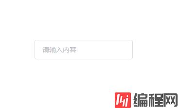
此时页面上便出现了原生的输入框,所以需要对这个输入框进行样式的添加,在input.vue同级新建style/index.less,Input样式便写在这里
.k-input {
  font-size: 14px;
  display: inline-block;
  position: relative;

  .k-input__inner {
    background-color: #fff;
    border-radius: 4px;
    border: 1px solid #dcdfe6;
    box-sizing: border-box;
    color: #606266;
    display: inline-block;
    font-size: inherit;
    height: 40px;
    line-height: 40px;
    outline: none;
    padding: 0 15px;
    width: 100%;
    &::placeholder {
      color: #c2c2ca;
    }

    &:hover {
      border: 1px solid #c0c4cc;
    }

    &:focus {
      border: 1px solid #409eff;
    }
  }
}
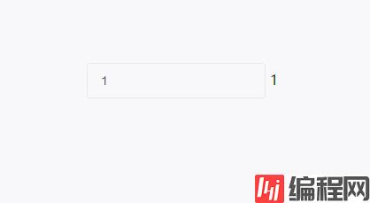
接下来要实现Input组件的核心功能:双向数据绑定。当我们在 vue 中使用input输入框的时候,我们可以直接使用v-model来实现双向数据绑定,v-model其实就是value @input结合的语法糖。而在 vue3 组件中使用v-model则表示的是modelValue @update:modelValue的语法糖。比如Input组件为例
<Input v-model="tel" />
其实就是
<Input :modelValue="tel" @update:modelValue="tel = $event" />
所以在input.vue中我们就可以根据这个来实现Input组件的双向数据绑定,这里我们使用setup语法
<template>
  <div class="k-input">
    <input
      class="k-input__inner"
      :value="inputProps.modelValue"
      @input="changeInputVal"
    />
  </div>
</template>
<script lang="ts" setup>
//组件命名
defineOptions({
  name: "k-input",
});
//组件接收的值类型
type InputProps = {
  modelValue?: string | number;
};

//组件发送事件类型
type InputEmits = {
  (e: "update:modelValue", value: string): void;
};

//withDefaults可以为props添加默认值等
const inputProps = withDefaults(defineProps<InputProps>(), {
  modelValue: "",
});
const inputEmits = defineEmits<InputEmits>();

const changeInputVal = (event: Event) => {
  inputEmits("update:modelValue", (event.target as htmlInputElement).value);
};
</script>
到这里基础用法就完成了,接下来开始实现禁用状态
这个比较简单,只要根据props的disabled来赋予禁用类名即可
<template>
  <div class="k-input" :class="styleClass">
    <input
      class="k-input__inner"
      :value="inputProps.modelValue"
      @input="changeInputVal"
      :disabled="inputProps.disabled"
    />
  </div>
</template>
<script lang="ts" setup>
//...
type InputProps = {
  modelValue?: string | number;
  disabled?: boolean;
};
//...

//根据props更改类名
const styleClass = computed(() => {
  return {
    "is-disabled": inputProps.disabled,
  };
});
</script>然后给is-disabled写些样式
//...

.k-input.is-disabled {
  .k-input__inner {
    background-color: #f5f7fa;
    border-color: #e4e7ed;
    color: #c0c4cc;
    cursor: not-allowed;
    &::placeholder {
      color: #c3c4cc;
    }
  }
}
按钮尺寸包括medium,small,mini,不传则是默认尺寸。同样的根据props的size来赋予不同类名
const styleClass = computed(() => {
  return {
    "is-disabled": inputProps.disabled,
    [`k-input--${inputProps.size}`]: inputProps.size,
  };
});
然后写这三个类名的不同样式
//...
.k-input.k-input--medium {
  .k-input__inner {
    height: 36px;
    &::placeholder {
      font-size: 15px;
    }
  }
}

.k-input.k-input--small {
  .k-input__inner {
    height: 32px;

    &::placeholder {
      font-size: 14px;
    }
  }
}

.k-input.k-input--mini {
  .k-input__inner {
    height: 28px;

    &::placeholder {
      font-size: 13px;
    }
  }
}
原生的input有type,placeholder等属性,这里可以使用 vue3 中的useAttrs来实现props穿透.子组件可以通过v-bind将props绑定
<template>
  <div class="k-input" :class="styleClass">
    <input
      class="k-input__inner"
      :value="inputProps.modelValue"
      @input="changeInputVal"
      :disabled="inputProps.disabled"
      v-bind="attrs"
    />
  </div>
</template>
<script lang="ts" setup>
//...

const attrs = useAttrs();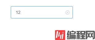
</script>通过clearable属性、Input的值是否为空以及是否鼠标是否移入来判断是否需要显示可清空图标。图标则使用组件库的Icon组件
<template>
  <div
    class="k-input"
    @mouseenter="isEnter = true"
    @mouseleave="isEnter = false"
    :class="styleClass"
  >
    <input
      class="k-input__inner"
      :disabled="inputProps.disabled"
      v-bind="attrs"
      :value="inputProps.modelValue"
      @input="changeInputVal"
    />
    <div
      @click="clearValue"
      v-if="inputProps.clearable && isClearAbled"
      v-show="isFoucs"
      class="k-input__suffix"
    >
      <Icon name="error" />
    </div>
  </div>
</template>
<script setup lang="ts">
//...
import Icon from "../icon/index";
//...
//双向数据绑定&接收属性
type InputProps = {
  modelValue?: string | number;
  disabled?: boolean;
  size?: string;
  clearable?: boolean;
};
//...
const isClearAbled = ref(false);
const changeInputVal = (event: Event) => {
  //可清除clearable
  (event.target as HTMLInputElement).value
    ? (isClearAbled.value = true)
    : (isClearAbled.value = false);

  inputEmits("update:modelValue", (event.target as HTMLInputElement).value);
};

//清除input value
const isEnter = ref(true);
const clearValue = () => {
  inputEmits("update:modelValue", "");
};
</script>
清除图标部分 CSS 样式
.k-input__suffix {
  position: absolute;
  right: 10px;
  height: 100%;
  top: 0;
  display: flex;
  align-items: center;
  cursor: pointer;
  color: #c0c4cc;
}
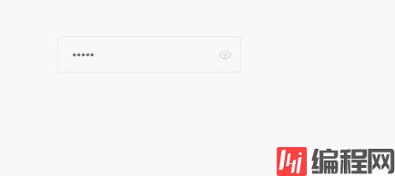
通过传入show-password属性可以得到一个可切换显示隐藏的密码框。这里要注意的是如果传了clearable则不会显示切换显示隐藏的图标
<template>
  <div
    class="k-input"
    @mouseenter="isEnter = true"
    @mouseleave="isEnter = false"
    :class="styleClass"
  >
    <input
      ref="ipt"
      class="k-input__inner"
      :disabled="inputProps.disabled"
      v-bind="attrs"
      :value="inputProps.modelValue"
      @input="changeInputVal"
    />
    <div class="k-input__suffix" v-show="isshowEye">
      <Icon @click="changeType" :name="eyeIcon" />
    </div>
  </div>
</template>
<script setup lang="ts">
//...
const attrs = useAttrs();

//...

//显示隐藏密码框 showPassword
const ipt = ref();
Promise.resolve().then(() => {
  if (inputProps.showPassword) {
    ipt.value.type = "password";
  }
});
const eyeIcon = ref("browse");
const isShowEye = computed(() => {
  return (
    inputProps.showPassword && inputProps.modelValue && !inputProps.clearable
  );
});
const changeType = () => {
  if (ipt.value.type === "password") {
    eyeIcon.value = "eye-close";
    ipt.value.type = attrs.type || "text";
    return;
  }
  ipt.value.type = "password";
  eyeIcon.value = "browse";
};
</script>这里是通过获取input元素,然后通过它的type属性进行切换,其中browse和eye-close分别是Icon组件中眼睛开与闭,效果如下
通过prefix-icon和suffix-icon 属性可以为Input组件添加首尾图标。
可以通过计算属性判断出是否显示首尾图标,防止和前面的clearable和show-password冲突.这里代码做了
<template>
  <div class="k-input">
    <input
      ref="ipt"
      class="k-input__inner"
      :class="{ ['k-input--prefix']: isShowPrefixIcon }"
      :disabled="inputProps.disabled"
      v-bind="attrs"
      :value="inputProps.modelValue"
      @input="changeInputVal"
    />

    <div class="k-input__prefix" v-if="isShowPrefixIcon">
      <Icon :name="inputProps.prefixIcon" />
    </div>
    <div class="k-input__suffix no-cursor" v-if="isShowSuffixIcon">
      <Icon :name="inputProps.suffixIcon" />
    </div>
  </div>
</template>
<script setup lang="ts">
//...
type InputProps = {
  prefixIcon?: string;
  suffixIcon?: string;
};

//...

//带Icon输入框
const isShowSuffixIcon = computed(() => {
  return (
    inputProps.suffixIcon && !inputProps.clearable && !inputProps.showPassword
  );
});
const isShowPrefixIcon = computed(() => {
  return inputProps.prefixIcon;
});
</script>
相关样式部分
.k-input__suffix,
.k-input__prefix {
  position: absolute;
  right: 10px;
  height: 100%;
  top: 0;
  display: flex;
  align-items: center;
  cursor: pointer;
  color: #c0c4cc;
  font-size: 15px;
}

.no-cursor {
  cursor: default;
}

.k-input--prefix.k-input__inner {
  padding-left: 30px;
}

.k-input__prefix {
  position: absolute;
  width: 20px;
  cursor: default;
  left: 10px;
}在app.vue中使用效果如下
<template>
  <div class="input-demo">
    <Input v-model="tel" suffixIcon="edit" placeholder="请输入内容" />

    <Input v-model="tel" prefixIcon="edit" placeholder="请输入内容" />
  </div>
</template>
<script lang="ts" setup>
import { Input } from "kitty-ui";
import { ref } from "vue";
const tel = ref("");
</script>
<style lang="less">
.input-demo {
  width: 200px;
}
</style>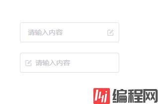
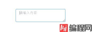
将type属性的值指定为textarea即可展示文本域模式。它绑定的事件以及属性和input基本一样
<template>
  <div class="k-textarea" v-if="attrs.type === 'textarea'">
    <textarea
      class="k-textarea__inner"
      :style="textareaStyle"
      v-bind="attrs"
      ref="textarea"
      :value="inputProps.modelValue"
      @input="changeInputVal"
    />
  </div>
  <div
    v-else
    class="k-input"
    @mouseenter="isEnter = true"
    @mouseleave="isEnter = false"
    :class="styleClass"
  >
    ...
  </div>
</template>样式基本也就是focus,hover改变 border 颜色
.k-textarea {
  width: 100%;

  .k-textarea__inner {
    display: block;
    padding: 5px 15px;
    line-height: 1.5;
    box-sizing: border-box;
    width: 100%;
    font-size: inherit;
    color: #606266;
    background-color: #fff;
    background-image: none;
    border: 1px solid #dcdfe6;
    border-radius: 4px;

    &::placeholder {
      color: #c2c2ca;
    }

    &:hover {
      border: 1px solid #c0c4cc;
    }

    &:focus {
      outline: none;
      border: 1px solid #409eff;
    }
  }
}
组件可以通过接收autosize属性来开启自适应高度,同时autosize也可以传对象形式来指定最小和最大行高
type AutosizeObj = {
    minRows?: number
    maxRows?: number
}
type InputProps = {
    autosize?: boolean | AutosizeObj
}具体实现原理是通过监听输入框值的变化来调整textarea的样式,其中用到了一些原生的方法譬如window.getComputedStyle(获取原生css对象),getPropertyValue(获取css属性值)等,所以原生js忘记的可以复习一下
...
const textareaStyle = ref<any>()
const textarea = shallowRef<HTMLTextAreaElement>()
watch(() => inputProps.modelValue, () => {
    if (attrs.type === 'textarea' && inputProps.autosize) {
        const minRows = isObject(inputProps.autosize) ? (inputProps.autosize as AutosizeObj).minRows : undefined
        const maxRows = isObject(inputProps.autosize) ? (inputProps.autosize as AutosizeObj).maxRows : undefined
        nextTick(() => {
            textareaStyle.value = calcTextareaHeight(textarea.value!, minRows, maxRows)
        })
    }

}, { immediate: true })其中calcTextareaHeight为
const isNumber = (val: any): boolean => {
    return typeof val === 'number'
}
//隐藏的元素
let hiddenTextarea: HTMLTextAreaElement | undefined = undefined

//隐藏元素样式
const HIDDEN_STYLE = `
  height:0 !important;
  visibility:hidden !important;
  overflow:hidden !important;
  position:absolute !important;
  z-index:-1000 !important;
  top:0 !important;
  right:0 !important;
`

const CONTEXT_STYLE = [
    'letter-spacing',
    'line-height',
    'padding-top',
    'padding-bottom',
    'font-family',
    'font-weight',
    'font-size',
    'text-rendering',
    'text-transfORM',
    'width',
    'text-indent',
    'padding-left',
    'padding-right',
    'border-width',
    'box-sizing',
]

type nodeStyle = {
    contextStyle: string
    boxSizing: string
    paddingSize: number
    borderSize: number
}

type TextAreaHeight = {
    height: string
    minHeight?: string
}

function calculateNodeStyling(targetElement: Element): NodeStyle {
  //获取实际textarea样式返回并赋值给隐藏的textarea
    const style = window.getComputedStyle(targetElement)

    const boxSizing = style.getPropertyValue('box-sizing')

    const paddingSize =
        Number.parseFloat(style.getPropertyValue('padding-bottom')) +
        Number.parseFloat(style.getPropertyValue('padding-top'))

    const borderSize =
        Number.parseFloat(style.getPropertyValue('border-bottom-width')) +
        Number.parseFloat(style.getPropertyValue('border-top-width'))

    const contextStyle = CONTEXT_STYLE.map(
        (name) => `${name}:${style.getPropertyValue(name)}`
    ).join(';')

    return { contextStyle, paddingSize, borderSize, boxSizing }
}

export function calcTextareaHeight(
    targetElement: HTMLTextAreaElement,
    minRows = 1,
    maxRows?: number
): TextAreaHeight {
    if (!hiddenTextarea) {
      //创建隐藏的textarea
        hiddenTextarea = document.createElement('textarea')
        document.body.appendChild(hiddenTextarea)
    }
    //给隐藏的teatarea赋予实际textarea的样式以及值(value)
    const { paddingSize, borderSize, boxSizing, contextStyle } =
        calculateNodeStyling(targetElement)
    hiddenTextarea.setAttribute('style', `${contextStyle};${HIDDEN_STYLE}`)
    hiddenTextarea.value = targetElement.value || targetElement.placeholder || ''
    //隐藏textarea整个高度,包括内边距padding,border
    let height = hiddenTextarea.scrollHeight
    const result = {} as TextAreaHeight
    //判断boxSizing,返回实际高度
    if (boxSizing === 'border-box') {
        height = height + borderSize
    } else if (boxSizing === 'content-box') {
        height = height - paddingSize
    }

    hiddenTextarea.value = ''
    //计算单行高度
    const singleRowHeight = hiddenTextarea.scrollHeight - paddingSize

    if (isNumber(minRows)) {
        let minHeight = singleRowHeight * minRows
        if (boxSizing === 'border-box') {
            minHeight = minHeight + paddingSize + borderSize
        }
        height = Math.max(minHeight, height)
        result.minHeight = `${minHeight}px`
    }
    if (isNumber(maxRows)) {
        let maxHeight = singleRowHeight * maxRows!
        if (boxSizing === 'border-box') {
            maxHeight = maxHeight + paddingSize + borderSize
        }
        height = Math.min(maxHeight, height)
    }
    result.height = `${height}px`
    hiddenTextarea.parentNode?.removeChild(hiddenTextarea)
    hiddenTextarea = undefined

    return result
}
这里的逻辑稍微复杂一点,大致就是创建一个隐藏的textarea,然后每次当输入框值发生变化时,将它的value赋值为组件的textarea的value,最后计算出这个隐藏的textarea的scrollHeight以及其它padding之类的值并作为高度返回赋值给组件中的textarea
最后在app.vue中使用
<template>
  <div class="input-demo">
    <Input
      v-model="tel"
      :autosize="{ minRows: 2 }"
      type="textarea"
      suffixIcon="edit"
      placeholder="请输入内容"
    />
  </div>
</template>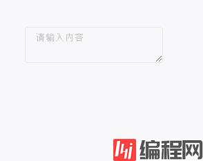
我们可以使用复合型输入框来前置或者后置我们的元素,如下所示

这里我们借助 vue3 中的slot进行实现,其中用到了useSlots来判断用户使用了哪个插槽,从而展示不同样式
import { useSlots } from "vue";

//复合输入框
const slots = useSlots();同时template中接收前后两个插槽
<template>
  <div
    class="k-input"
    @mouseenter="isEnter = true"
    @mouseleave="isEnter = false"
    :class="styleClass"
  >
    <div class="k-input__prepend" v-if="slots.prepend">
      <slot name="prepend"></slot>
    </div>
    <input
      ref="ipt"
      class="k-input__inner"
      :class="inputStyle"
      :disabled="inputProps.disabled"
      v-bind="attrs"
      :value="inputProps.modelValue"
      @input="changeInputVal"
    />
    <div class="k-input__append" v-if="slots.append">
      <slot name="append"></slot>
    </div>
  </div>
</template>
<script setup lang="ts">
import { useSlots } from "vue";
const styleClass = computed(() => {
  return {
    ["k-input-group k-input-prepend"]: slots.prepend,
    ["k-input-group k-input-append"]: slots.append,
  };
});
//复合输入框
const slots = useSlots();
</script>
最后给两个插槽写上样式就实现了复合型输入框啦
.k-input.k-input-group.k-input-append,
.k-input.k-input-group.k-input-prepend {
  line-height: normal;
  display: inline-table;
  width: 100%;
  border-collapse: separate;
  border-spacing: 0;

  .k-input__inner {
    border-radius: 0 4px 4px 0;
  }

  //复合输入框
  .k-input__prepend,
  .k-input__append {
    background-color: #f5f7fa;
    color: #909399;
    vertical-align: middle;
    display: table-cell;
    position: relative;
    border: 1px solid #dcdfe6;
    border-radius: 4 0px 0px 4px;
    padding: 0 20px;
    width: 1px;
    white-space: nowrap;
  }

  .k-input__append {
    border-radius: 0 4px 4px 0px;
  }
}

.k-input.k-input-group.k-input-append {
  .k-input__inner {
    border-top-right-radius: 0px;
    border-bottom-right-radius: 0px;
  }
}
在app.vue中使用
<template>
    <div class="input-demo">
        <Input v-model="tel" placeholder="请输入内容">
        <template #prepend>
            Http://
        </template>
        </Input>
        <Input v-model="tel" placeholder="请输入内容">
        <template #append>
            .com
        </template>
        </Input>
    </div>
</template>一个看似简单的Input组件其实包含的内容还是很多的,做完之后会发现对自己很多地方都有提升和帮助。
如果你对vue3组件库开发也感兴趣的话可以关注我,组件库的所有实现细节都在以往文章里,包括环境搭建,自动打包发布,文档搭建,vitest单元测试等等。
kitty-ui: 一个使用Vite+Ts搭建的Vue3组件库
到此这篇关于从0搭建vue3组件库: Input组件的文章就介绍到这了,更多相关vue3组件库Input组件内容请搜索编程网以前的文章或继续浏览下面的相关文章希望大家以后多多支持编程网!
--结束END--
本文标题: 从0搭建vue3组件库Input组件
本文链接: https://www.lsjlt.com/news/173046.html(转载时请注明来源链接)
有问题或投稿请发送至: 邮箱/279061341@qq.com QQ/279061341
下载Word文档到电脑,方便收藏和打印~
2024-01-12
2023-05-20
2023-05-20
2023-05-20
2023-05-20
2023-05-20
2023-05-20
2023-05-20
2023-05-20
2023-05-20
回答
回答
回答
回答
回答
回答
回答
回答
回答
回答


官方手机版

微信公众号

商务合作


0