自定义封装 banner 组件,供大家参考,具体内容如下1. 效果图预览 2.基本功能一个简单方便的轮播图组件,基于viewpager 基础上进行的封装。可设置 项目中图片,网络图片, View;支持循环自动播放,手势滑动切换,i
自定义封装 banner 组件,供大家参考,具体内容如下
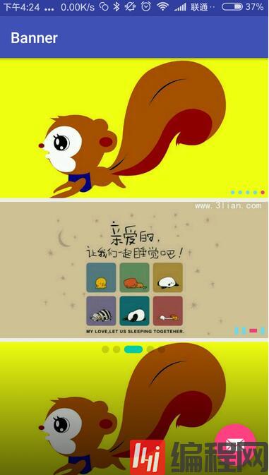
1. 效果图预览
2.基本功能
一个简单方便的轮播图组件,基于viewpager 基础上进行的封装。
可设置 项目中图片,网络图片, View;
支持循环自动播放,手势滑动切换,item点击事件,可设置 点点的样式宽高、颜色、大小、位置 ;
可设置蒙层;可设置 是否允许滑动;可设置 是否允许循环。
3.基本实现
1). 自定义属性
<declare-styleable name="BannerLayoutStyle"> <attr name="maskStartColor" fORMat="color|reference" /> <attr name="maskEndColor" format="color|reference" /> <attr name="selectedIndicatorColor" format="color|reference" /> <attr name="unSelectedIndicatorColor" format="color|reference" /> <attr name="indicatorShape" format="enum"> <enum name="rect" value="0" /> <enum name="oval" value="1" /> </attr> <attr name="selectedIndicatorHeight" format="dimension|reference" /> <attr name="selectedIndicatorWidth" format="dimension|reference" /> <attr name="unSelectedIndicatorHeight" format="dimension|reference" /> <attr name="unSelectedIndicatorWidth" format="dimension|reference" /> <attr name="indicatorPosition" format="enum"> <enum name="centerBottom" value="0" /> <enum name="rightBottom" value="1" /> <enum name="leftBottom" value="2" /> <enum name="centerTop" value="3" /> <enum name="rightTop" value="4" /> <enum name="leftTop" value="5" /> </attr> <attr name="indicatorSpace" format="dimension|reference" /> <attr name="indicatorMargin" format="dimension|reference" /> <attr name="autoPlayDuration" format="integer|reference" /> <attr name="scrollDuration" format="integer|reference" /> <attr name="isAutoPlay" format="boolean" /> <attr name="defaultImage" format="integer|reference" /> <attr name="isIndicatorVisible" format="boolean" /> <attr name="cornerRadii" format="dimension|reference" /> </declare-styleable>--结束END--
本文标题: Android自定义封装banner组件
本文链接: https://www.lsjlt.com/news/222478.html(转载时请注明来源链接)
有问题或投稿请发送至: 邮箱/279061341@qq.com QQ/279061341
下载Word文档到电脑,方便收藏和打印~
2024-05-04
2024-05-04
2024-05-04
2024-05-04
2024-05-04
2024-05-04
2024-05-04
2024-05-04
2024-05-04
2024-05-04
回答
回答
回答
回答
回答
回答
回答
回答
回答
回答


官方手机版

微信公众号

商务合作


0