小编给大家分享一下css3如何实现网站商品展示效果图,相信大部分人都还不怎么了解,因此分享这篇文章给大家参考一下,希望大家阅读完这篇文章后大有收获,下面让我们一起去了解一下吧!html代码<div class="p
小编给大家分享一下css3如何实现网站商品展示效果图,相信大部分人都还不怎么了解,因此分享这篇文章给大家参考一下,希望大家阅读完这篇文章后大有收获,下面让我们一起去了解一下吧!
html代码
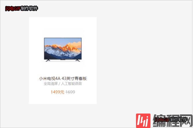
<div class="product"> <ul> <li> <div class="pro-img"> <a href="#"> <img src="images/pms_1524883847.49276938!220x220.jpg" alt=""> </a> </div> <h4><a href="#">小米电视4A 43英寸青春版</a></h4> <p class="desc">全高清屏 / 人工智能语音</p> <p class="price"> <span>1499</span>元 <del>1699</del> </p> <div class="review"> <a href="#"> <span class="msg">一如既往的好,小米情怀</span> <span class="auther"> 来自于 惊喜 的评价 </span> </a> </div> </li> </ul> </div>CSS3代码
* {margin: 0;padding: 0;}ul, ol {list-style: none;}input, button {outline: none;border: none;}a {text-decoration: none;}.clearfix::before,.clearfix::after {content: "";height: 0;line-height: 0;display: block;visibility: hidden;}.clearfix::after {clear: both;}body {padding: 100px;background-color: #f5f5f5;}.product li { float: left; width: 234px;height: 246px; padding: 34px 0 20px; z-index: 1; margin-left: 14px; margin-bottom: 14px; background: #fff; -WEBkit-transition: all .2s linear; transition: all .2s linear;position: relative;}.pro-img {width: 150px;height: 150px;margin: 0 auto 18px;}.pro-img a {width: 100%;height: 100%;}.pro-img img {display: block;width: 100%;height: 100%;}.product li h4 {margin: 0 10px; font-size: 14px; font-weight: 400; text-align: center;}.product li h4 a {color: #333;}.desc {margin: 0 10px 10px; height: 18px; font-size: 12px; text-align: center; text-overflow: ellipsis; white-space: nowrap; overflow: hidden; color: #b0b0b0;}.price {font-size: 14px;margin: 0 10px 10px; text-align: center; color: #ff6700;}.price del {color: #b0b0b0;}.review {position: absolute; bottom: 0; left: 0; z-index: 3; width: 234px; height: 0; overflow: hidden; font-size: 12px; background: #ff6700; opacity: 0; -webkit-transition: all .2s linear; transition: all .2s linear;}.review a {color: #757575;display: block; padding: 8px 30px; outline: 0;}.review a span {display: block;margin-bottom: 5px; color: #fff;}.product li:hover {-webkit-box-shadow: 0 15px 30px rgba(0,0,0,0.1); box-shadow: 0 15px 30px rgba(0,0,0,0.1); -webkit-transfORM: translate3D(0, -2px, 0); transform: translate3d(0, -2px, 0);}.product li:hover .review {opacity: 1;height: 76px;}运行效果图:
以上是“CSS3如何实现网站商品展示效果图”这篇文章的所有内容,感谢各位的阅读!相信大家都有了一定的了解,希望分享的内容对大家有所帮助,如果还想学习更多知识,欢迎关注编程网精选频道!
--结束END--
本文标题: CSS3如何实现网站商品展示效果图
本文链接: https://www.lsjlt.com/news/251873.html(转载时请注明来源链接)
有问题或投稿请发送至: 邮箱/279061341@qq.com QQ/279061341
下载Word文档到电脑,方便收藏和打印~
2024-05-15
2024-05-15
2024-05-15
2024-05-15
2024-05-15
2024-05-15
2024-05-15
2024-05-15
2024-05-15
2024-05-15
回答
回答
回答
回答
回答
回答
回答
回答
回答
回答


官方手机版

微信公众号

商务合作


0