E charts 官网有很多样式可以选 https://echarts.apache.org/examples/zh/index.html#chart-type-pie 但是我发现 数据 都是以 列表 或者 字典 的形式展现 现在想要实
![echarts绘制饼状图及属性设置 数据来自数据库
[数据库教程]](/upload/202205/01/4znvbbuwrol.jpg)
E charts 官网有很多样式可以选 https://echarts.apache.org/examples/zh/index.html#chart-type-pie
但是我发现 数据 都是以 列表 或者 字典 的形式展现
现在想要实现 :
用户WEB端输入筛选条件
sql语句筛选数据
然后使用E chart 展现在前端饼图(其余图只需要改变前端样式即可,传数据部分是一样的)
代码实现:
app.py
 1 @app.route(‘/test/‘, methods=[‘GET‘, ‘POST‘])
 2 def test():
 3 #传参
 4     min =request.args.get(‘min‘)
 5     max =request.args.get(‘max‘)
 6     year6 = request.args.get(‘year6‘)
 7     #重点是这一句,将列名当作参数传入,(常见数据不需要这一句的处理)
 8     #year7 = ‘"‘ + str(year6) + ‘"‘
 9     min1=int(min)*100000
10     max1=int(max)*100000
11 #sql语句取数据
12     sql = """
13     SELECT *
14     FROM TABLE where """+year7+"""  between ‘"""+str(min1)+"""‘ and ‘"""+str(max1)+"""‘ ;
15     """
16     result = ibm_db.exec_immediate(connect_db, sql)
17     dictionary = ibm_db.fetch_both(result)
18     userlist = []
19     while dictionary != False:
20         userlist.append(dictionary)
21         dictionary = ibm_db.fetch_both(result)
22 #数据处理
23     resultlist=[]
24     for i in userlist:
25         state=i["STATE"]
26         population = i[year6]
27
28         diclist={
29             "state":state,
30             "population":population
31         }
32         resultlist.append(diclist)
33     return render_template(‘index.html‘, data6=resultlist)
前端代码展现:
2 DOCTYPE html>
3 <html lang="en">
4 <head>
5 <meta charset="UTF-8">
6 <title>pie chart</title>
7 <script type="text/javascript" src="Https://cdn.jsdelivr.net/npm/echarts-gl/dist/echarts-gl.min.js">script>
8 <script type="text/javascript" src="https://cdn.jsdelivr.net/npm/echarts-stat/dist/ecStat.min.js">script>
9 <script type="text/javascript" src="https://cdn.jsdelivr.net/npm/echarts/dist/extension/dataTool.min.js">script>
10 <script type="text/javascript" src="https://cdn.jsdelivr.net/npm/echarts/map/js/china.js">script>
11 <script type="text/javascript" src="https://cdn.jsdelivr.net/npm/echarts/map/js/world.js">script>
12 <script type="text/javascript" src="https://cdn.jsdelivr.net/npm/echarts/dist/extension/bmap.min.js">script>
13 head>
14 <body>
15 <div>
16 <fORM method="GET" action="/test/">
17 <input type="text" placeholder="min" name="min">
18 <input type="text" placeholder="max" name="max">
19 <input type="text" placeholder="year" name="year6">
20 <button type="submit">searchbutton>
21 form>
22
23 div>
24 <div id="display" style="height: 500px; width: 500px">div>
25 <script type="text/javascript">
26 {% if data6 %}
27 var dom = document.getElementById("display");
28 var drawn_pieChart = echarts.init(dom);
29 var app = {};
30 var ldata = [];
31 var sdata = [];
32 {% for list in data6 %}
33 var name = ‘{{ list.state }}‘;
34 var value = {{ list.population }};
35 sdata.push({value: value, name: name});
36 ldata.push(name);
37 {% endfor %}
38 console.log(‘array:‘,ldata);
39 option = null;
40 option = {
41 title: {
42 text: ‘chart‘,
43 subtext: ‘pie chart‘,
44 left: ‘center‘,
45 backgroundColor: ‘#ee8f83‘,
46 // 主标题文本样式设置
47 textStyle: {
48 fontSize: 26,
49 fontWeight: ‘bolder‘,
50 color: ‘#80302e‘
51 },
52 // 副标题文本样式设置
53 subtextStyle: {
54 fontSize: 18,
55 color: ‘#498b7d‘}
56 },
57 tooltip: {
58 trigger: ‘item‘,
59 formatter: ‘{a}
{b} : {c} ({d}%)‘
60 },
61 legend: {
62 orient: ‘vertical‘,
63 left: ‘left‘,
64 backgroundColor: ‘#ebeeb5‘,
65 textStyle: {
66 color: ‘#511f66‘ // 图例文字颜色
67 },
68 data: ldata
69 },
70 series: [
71 {
72 name: ‘visit‘,
73 type: ‘pie‘,
74 radius: [‘30%‘, ‘60%‘], // 设置环形饼状图, 第一个百分数设置内圈大小,第二个百分数设置外圈大小
75 center: [‘50%‘, ‘50%‘],
76 data: sdata,
77 //设置饼图每部分的颜色都不一样
78 color: [‘#51CEC6‘,‘#FFB703‘,‘#5FA0FA‘,‘#ce392e‘,‘#511f66‘,‘#80302e‘],
79 emphasis: {
80 itemStyle: {
81 shadowBlur: 10,
82 shadowOffsetX: 0,
83 shadowColor: ‘rgba(30, 144, 255, 0.5)‘
84
85 }
86 }
87 }
88 ]
89 };
90 ;
91
92 if (option && typeof option === "object") {
93 drawn_pieChart.setOption(option, true);
94 }
95 {% endif %}
96 script>
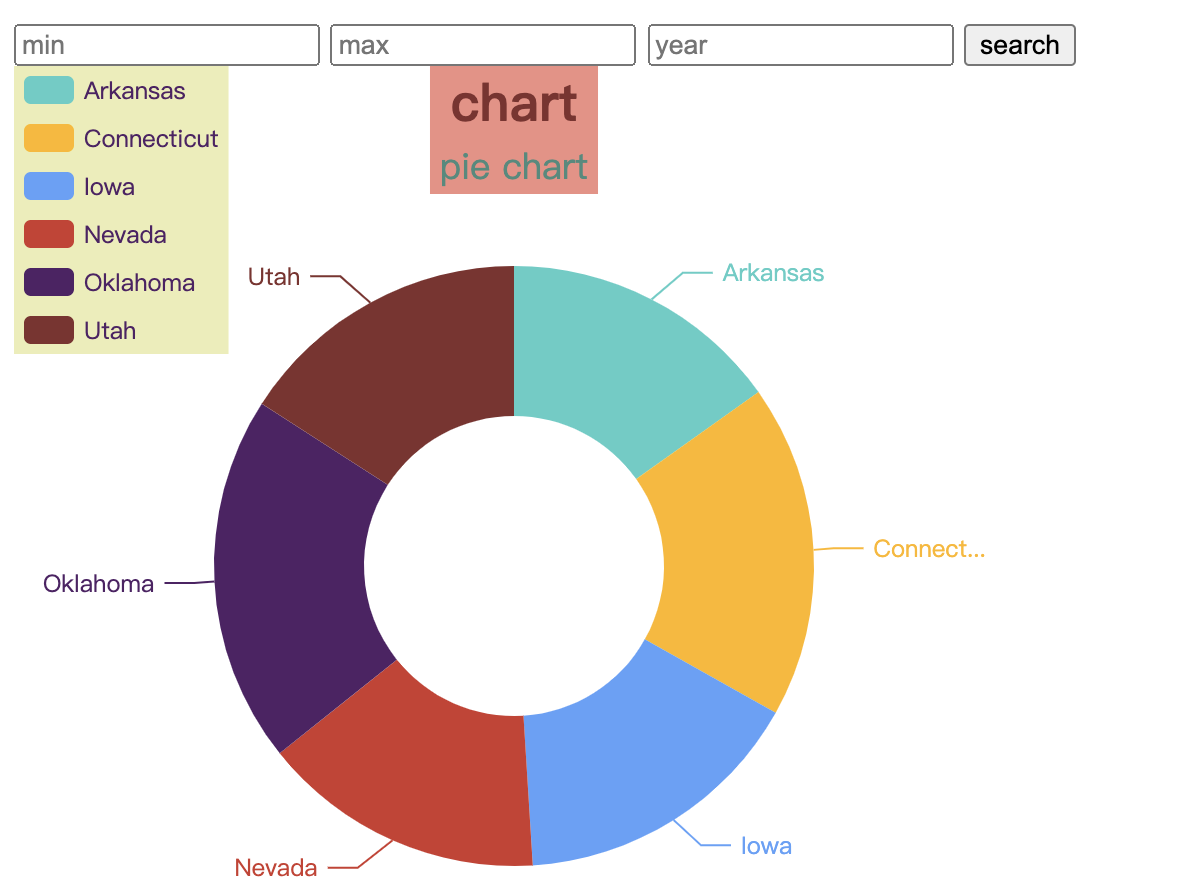
97 body>结果展示:
条形图是类似的:
只需要改变前端的样式,因此在这里展示前端代码了:
 1 option = {
 2     title: {
 3         text: ‘bar‘,
 4         subtext: ‘‘
 5     },
 6     tooltip: {
 7         trigger: ‘axis‘,
 8         axisPointer: {
 9             type: ‘shadow‘
10         }
11     },
12
13     grid: {
14         left: ‘3%‘,
15         right: ‘4%‘,
16         bottom: ‘3%‘,
17         containLabel: true
18     },
19     xAxis: {
20         type: ‘‘,
21         boundaryGap: [0, 0.01]
22     },
23     yAxis: {
24         type: ‘cateGory‘,
25         data:ldata
26     },
27     series: [
28         {
29             name: ‘pop‘,
30             type: ‘bar‘,
31             data: sdata,
32             color: [‘#51CEC6‘,‘#FFB703‘,‘#5FA0FA‘],
33
34         },
35
36     ]
37 };
38
39 if (option && typeof option === "object") {
40     drawn_barChart.setOption(option, true);
41 }
42     {% endif %}
散点图:
 1 option = {
 2     backgroundColor: new echarts.graphic.RadialGradient(0.3, 0.3, 0.8, [{
 3         offset: 0,
 4         color: ‘#f7f8fa‘
 5     }, {
 6         offset: 1,
 7         color: ‘#cdd0d5‘
 8     }]),
 9     title: {
10         text: ‘chart‘
11     },
12     legend: {
13         right: 10,
14         data: ldata
15     },
16     xAxis: {
17         max:2004,
18         min:2021,
19         splitLine: {
20             lineStyle: {
21                 type: ‘value‘
22             },
23
24         },
25     },
26     yAxis: {
27         splitLine: {
28             lineStyle: {
29                 type: ‘dashed‘
30             }
31         },
32         scale: true
33     },
34     series: [{
35         name: ‘‘,
36         data: sdata,
37         type: ‘scatter‘,
38
39         emphasis: {
40             label: {
41                 show: true,
42                 formatter: function (param) {
43                     return param.data[3];
44                 },
45                 position: ‘top‘
46             }
47         },
48         itemStyle: {
49             shadowBlur: 10,
50             shadowColor: ‘rgba(120, 36, 50, 0.5)‘,
51             shadowOffsetY: 5,
52             color: new echarts.graphic.RadialGradient(0.4, 0.3, 1, [{
53                 offset: 0,
54                 color: ‘rgb(251, 118, 123)‘
55             }, {
56                 offset: 1,
57                 color: ‘rgb(204, 46, 72)‘
58             }])
59         }
60
61
62     }]
63 };
64 if (option && typeof option === "object") {
65     drawn_pointChart.setOption(option, true);
66 }
67     {% endif %}
更多样式可到官网查询。
echarts绘制饼状图及属性设置 数据来自数据库
原文地址:https://www.cnblogs.com/bocaimao/p/13338626.html
--结束END--
本文标题: echarts绘制饼状图及属性设置 数据来自数据库
本文链接: https://www.lsjlt.com/news/7320.html(转载时请注明来源链接)
有问题或投稿请发送至: 邮箱/279061341@qq.com QQ/279061341
下载Word文档到电脑,方便收藏和打印~
2024-04-26
2024-04-26
2024-04-26
2024-04-26
2024-04-26
2024-04-26
2024-04-24
2024-04-24
2024-04-24
2024-04-24
回答
回答
回答
回答
回答
回答
回答
回答
回答
回答


官方手机版

微信公众号

商务合作


0