小编给大家分享一下Bootstrap前端框架怎么用,相信大部分人都还不怎么了解,因此分享这篇文章给大家参考一下,希望大家阅读完这篇文章后大有收获,下面让我们一起去了解一下吧!1、Bootstrap 基本模板
小编给大家分享一下Bootstrap前端框架怎么用,相信大部分人都还不怎么了解,因此分享这篇文章给大家参考一下,希望大家阅读完这篇文章后大有收获,下面让我们一起去了解一下吧!
1、Bootstrap 基本模板
<!DOCTYPE html>
<html lang="zh-CN">
 <head>
 <meta charset="utf-8">
 <!--让浏览器使用最新的IE内核进行渲染页面-->
 <meta Http-equiv="X-UA-Compatible" content="IE=edge">
 <!--设置视口宽度等于当前设备宽度,默认缩放比为1-->
 <meta name="viewport" content="width=device-width, initial-scale=1">
 <!-- 上述3个meta标签*必须*放在最前面,任何其他内容都*必须*跟随其后! -->
 <title>Bootstrap 101 Template</title>
 <!-- 导入Bootstrap核心CSS文件 -->
 <link href="css/bootstrap.css" rel="external nofollow" rel="stylesheet">
 <!-- HTML5 shim and Respond.js for IE8 support of HTML5 elements and media queries -->
 <!-- WARNING: Respond.js doesn't work if you view the page via file:// -->
 <!--
 ①<!--[if lt IE 9]>…… <![endif]- ->这一对标签用于检测当前浏览器的版本,lt表示小于,gt表示大写。所以这句话作用是,当浏览器版本低于IE9执行。
 ②html5shiv:解决ie9以下浏览器对html5新增标签的不识别,并导致CSS不起作用的问题。
 ③respond.min:让不支持css3 Media Query的浏览器包括IE6-IE8等其他浏览器支持查询。
 -->
 <!--[if lt IE 9]>
 <script src="https://cdn.bootcss.com/html5shiv/3.7.3/html5shiv.min.js"></script>
 <script src="https://cdn.bootcss.com/respond.js/1.4.2/respond.min.js"></script>
 <![endif]-->
 </head>
 <body>
 <h2>你好!</h2>
 <script src="js/Jquery-3.1.1.js"></script>
 <!-- 导入BootStrap的JS插件
 ①如果不使用BootStrap提供的JS插件,则这个JS文件无需导入;
 ②BootStrap的JS插件功能依赖JQuery,因此这个JS必须在JQuery之后导入;
 -->
 <script src="js/bootstrap.min.js"></script>
 </body>
</html>
拷贝并粘贴上面的 HTML 代码,这就是一个最简单的 Bootstrap 页面了。一定要注意,Bootstrap 的所有 javascript 插件都依赖 jQuery,因此 jQuery 必须在 Bootstrap 之前引入。
2、组件
Bootstrap中包含了丰富的WEB组件,根据这些组件,可以快速的搭建一个漂亮、功能完备的网站。其中包括以下组件:
下拉菜单、按钮组、按钮下拉菜单、导航、导航条、路径导航、分页、排版、缩略图、警告对话框、进度条、媒体对象等。
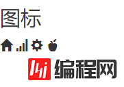
2.1字体图标
bootstrap默认提供了二百多个图标。我们可以通过span标签来使用这些图标:
<h4>图标</h4>
 <span class="glyphicon glyphicon-home"></span>
 <span class="glyphicon glyphicon-signal"></span>
 <span class="glyphicon glyphicon-cog"></span>
 <span class="glyphicon glyphicon-apple"></span>
让我们来看一下效果:
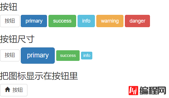
2.2按钮
<button></button>标签用于创建按钮,bootstrap提供了丰富的按钮样式。按钮除了有默认的大小外,bootstrap还提供三个参数来调整按钮的大小,分别是:btn-lg、btn-sm和btn-xs。
<h4>按钮</h4>
<button type="button" class="btn btn-default">按钮</button>
<button type="button" class="btn btn-primary">primary</button>
<button type="button" class="btn btn-success">success</button>
<button type="button" class="btn btn-info">info</button>
<button type="button" class="btn btn-warning">warning</button>
<button type="button" class="btn btn-danger">danger</button>
<h4>按钮尺寸</h4>
<button type="button" class="btn btn-default">按钮</button>
<button type="button" class="btn btn-primary btn-lg">primary</button>
<button type="button" class="btn btn-success btn-sm">success</button>
<button type="button" class="btn btn-info btn-xs">info</button>
<h4>把图标显示在按钮里</h4>
<button type="button" class="btn btn-default"><span class="glyphicon glyphicon-home"></span> 按钮</button>效果:
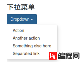
2.3下拉菜单
下拉菜单是最常见的交互之一,bootstrap为我们提供了漂亮的样式。
 <h4>下拉菜单</h4>
 <div class="dropdown">
 <button class="btn btn-primary dropdown-toggle" type="button" id="dropdownMenu1" data-toggle="dropdown" aria-expanded="true">
 Dropdown
 <span class="caret"></span>
 </button>
 <ul class="dropdown-menu" role="menu" aria-labelledby="dropdownMenu1">
 <li role="presentation"><a role="menuitem" tabindex="-1" href="#" rel="external nofollow" rel="external nofollow" rel="external nofollow" rel="external nofollow" rel="external nofollow" rel="external nofollow" rel="external nofollow" rel="external nofollow" rel="external nofollow" rel="external nofollow" rel="external nofollow" rel="external nofollow" rel="external nofollow" >Action</a></li>
 <li role="presentation"><a role="menuitem" tabindex="-1" href="#" rel="external nofollow" rel="external nofollow" rel="external nofollow" rel="external nofollow" rel="external nofollow" rel="external nofollow" rel="external nofollow" rel="external nofollow" rel="external nofollow" rel="external nofollow" rel="external nofollow" rel="external nofollow" rel="external nofollow" >Another action</a></li>
 <li role="presentation"><a role="menuitem" tabindex="-1" href="#" rel="external nofollow" rel="external nofollow" rel="external nofollow" rel="external nofollow" rel="external nofollow" rel="external nofollow" rel="external nofollow" rel="external nofollow" rel="external nofollow" rel="external nofollow" rel="external nofollow" rel="external nofollow" rel="external nofollow" >Something else here</a></li>
 <li role="presentation"><a role="menuitem" tabindex="-1" href="#" rel="external nofollow" rel="external nofollow" rel="external nofollow" rel="external nofollow" rel="external nofollow" rel="external nofollow" rel="external nofollow" rel="external nofollow" rel="external nofollow" rel="external nofollow" rel="external nofollow" rel="external nofollow" rel="external nofollow" >Separated link</a></li>
 </ul>
 </div>
看一下效果:
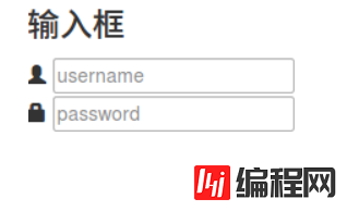
2.4输入框
通过<input></input>标签去创建输入框。
 <h4>输入框</h4>
 <div class="input-group">
 <span class="glyphicon glyphicon-user"></span>
 <input type="text" placeholder="username">
 </div>
 <div class="input-group">
 <span class="glyphicon glyphicon-lock"></span>
 <input type="passWord" placeholder="password">
 </div>
效果图:
2.5导航栏
导航栏作为整个网站的指引必不可少。
 <h4>导航栏</h4>
 <nav class="navbar navbar-inverse navbar-fixed-top">
 <div id="navbar" class="navbar-collapse collapse">
 <ul class="nav navbar-nav">
 <li class="active"><a href="#" rel="external nofollow" rel="external nofollow" rel="external nofollow" rel="external nofollow" rel="external nofollow" rel="external nofollow" rel="external nofollow" rel="external nofollow" rel="external nofollow" rel="external nofollow" rel="external nofollow" rel="external nofollow" rel="external nofollow" >Home</a></li>
 <li><a href="#about" rel="external nofollow" >About</a></li>
 <li><a href="#contact" rel="external nofollow" >Contact</a></li>
 <li class="dropdown">
 <a href="#" rel="external nofollow" rel="external nofollow" rel="external nofollow" rel="external nofollow" rel="external nofollow" rel="external nofollow" rel="external nofollow" rel="external nofollow" rel="external nofollow" rel="external nofollow" rel="external nofollow" rel="external nofollow" rel="external nofollow" class="dropdown-toggle" data-toggle="dropdown" role="button" aria-expanded="false">Dropdown <span class="caret"></span></a>
 <ul class="dropdown-menu" role="menu">
 <li><a href="#" rel="external nofollow" rel="external nofollow" rel="external nofollow" rel="external nofollow" rel="external nofollow" rel="external nofollow" rel="external nofollow" rel="external nofollow" rel="external nofollow" rel="external nofollow" rel="external nofollow" rel="external nofollow" rel="external nofollow" >Action</a></li>
 <li><a href="#" rel="external nofollow" rel="external nofollow" rel="external nofollow" rel="external nofollow" rel="external nofollow" rel="external nofollow" rel="external nofollow" rel="external nofollow" rel="external nofollow" rel="external nofollow" rel="external nofollow" rel="external nofollow" rel="external nofollow" >Another action</a></li>
 <li class="divider"></li>
 <li class="dropdown-header">Nav header</li>
 <li><a href="#" rel="external nofollow" rel="external nofollow" rel="external nofollow" rel="external nofollow" rel="external nofollow" rel="external nofollow" rel="external nofollow" rel="external nofollow" rel="external nofollow" rel="external nofollow" rel="external nofollow" rel="external nofollow" rel="external nofollow" >Separated link</a></li>
 </ul>
 </li>
 </ul>
 </div><!--/.nav-collapse -->
 </div>
 </nav>
效果呢↓

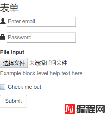
2.6表单
人与系统之间数据的传递都需要依靠表单来完成。比如注册/登录信息的提交,查询条件的提交等。用<fORM></form>标签来创建表单。
<h4>表单</h4>
 <form>
 <div class="form-group">
 <span class="glyphicon glyphicon-user"></span>
 <input type="email" id="exampleInputEmail1" placeholder="Enter email">
 </div>
 <div class="form-group">
 <span class="glyphicon glyphicon-lock"></span>
 <input type="password" id="exampleInputPassword1" placeholder="Password">
 </div>
 <div class="form-group">
 <label for="exampleInputFile">File input</label>
 <input type="file" id="exampleInputFile">
 <p class="help-block">Example block-level help text here.</p>
 </div>
 <div class="checkbox">
 <label>
 <input type="checkbox"> Check me out
 </label>
 </div>
 <button type="submit" class="btn btn-default">Submit</button>
 </form>
效果如下:
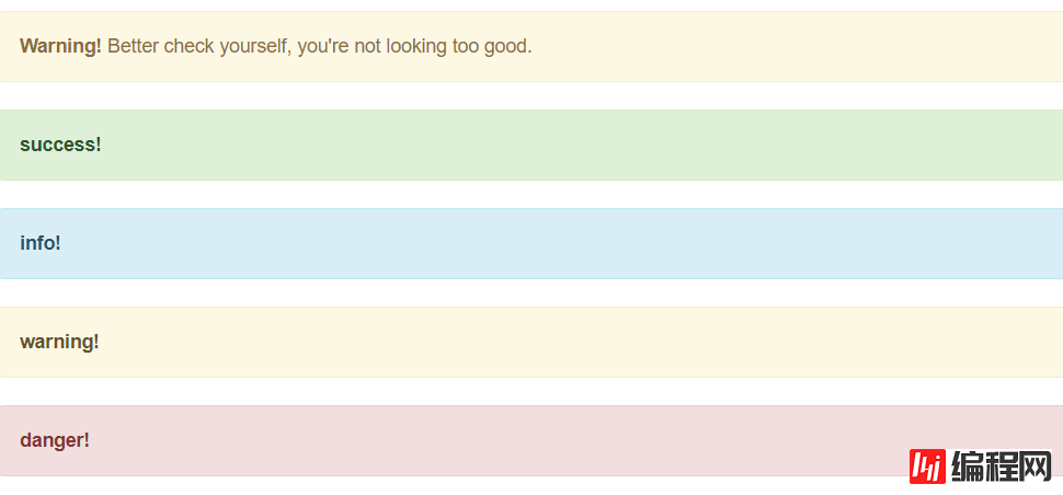
2.7警告框
警告框是系统向用户传达信息和提供指引的重要手段。没有针对警告框的标签,通过bootstrap所提供的样式可以瞬间制作出漂亮的警告框。
<h4>警告框</h4>
<div class="alert alert-warning alert-dismissible" role="alert">
<button type="button" class="close" data-dismiss="alert" aria-label="Close"><span aria-hidden="true">×</span></button>
<strong>Warning!</strong> Better check yourself, you're not looking too Good.
</div>
<div class="alert alert-success" role="alert">
<a href="#" rel="external nofollow" rel="external nofollow" rel="external nofollow" rel="external nofollow" rel="external nofollow" rel="external nofollow" rel="external nofollow" rel="external nofollow" rel="external nofollow" rel="external nofollow" rel="external nofollow" rel="external nofollow" rel="external nofollow" class="alert-link">success!</a>
</div>
<div class="alert alert-info" role="alert">
<a href="#" rel="external nofollow" rel="external nofollow" rel="external nofollow" rel="external nofollow" rel="external nofollow" rel="external nofollow" rel="external nofollow" rel="external nofollow" rel="external nofollow" rel="external nofollow" rel="external nofollow" rel="external nofollow" rel="external nofollow" class="alert-link">info!</a>
</div>
<div class="alert alert-warning" role="alert">
<a href="#" rel="external nofollow" rel="external nofollow" rel="external nofollow" rel="external nofollow" rel="external nofollow" rel="external nofollow" rel="external nofollow" rel="external nofollow" rel="external nofollow" rel="external nofollow" rel="external nofollow" rel="external nofollow" rel="external nofollow" class="alert-link">warning!</a>
</div>
<div class="alert alert-danger" role="alert">
<a href="#" rel="external nofollow" rel="external nofollow" rel="external nofollow" rel="external nofollow" rel="external nofollow" rel="external nofollow" rel="external nofollow" rel="external nofollow" rel="external nofollow" rel="external nofollow" rel="external nofollow" rel="external nofollow" rel="external nofollow" class="alert-link">danger!</a>
</div>效果图:
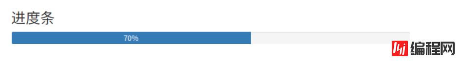
2.8进度条
系统的处理过程往往需要用户等待,进度条可以让用户感知到系统的处理过程,从而增加容忍度。
 <h4>进度条</h4>
 <div class="progress">
 <div class="progress-bar" role="progressbar" aria-valuenow="70" aria-valuemin="0" aria-valuemax="100" >
 70%
 </div>
 </div>
3、Bootstrap栅格系统
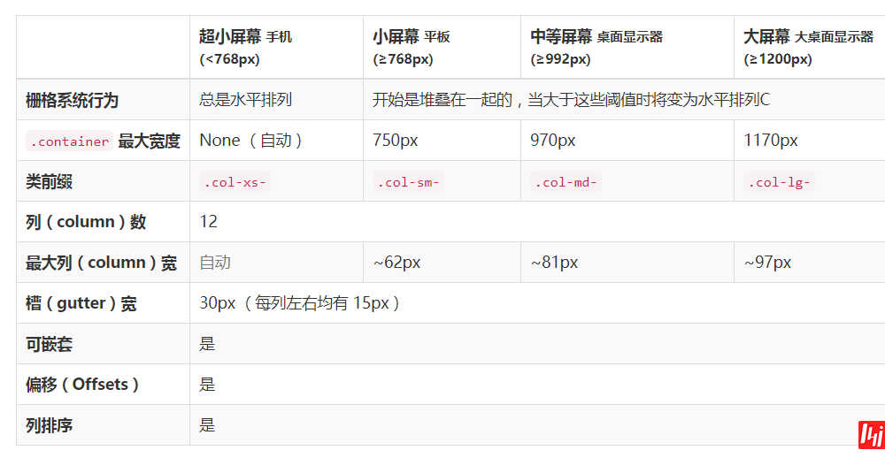
首先,我们先要了解什么是栅格系统!往下看 ↓
Bootstrap 提供了一套响应式、移动设备优先的流式栅格系统,随着屏幕或视口(viewport)尺寸的增加,系统会自动分为最多12列。它包含了易于使用的预定义类,还有强大的mixin用于生成更具语义的布局。
栅格系统用于通过一系列的行(row)与列(column)的组合来创建页面布局,我们的内容就可以放入这些创建好的布局中。下面就介绍一下 Bootstrap 栅格系统的工作原理:
“行(row)”必须包含在 .container (固定宽度)或 .container-fluid (100% 宽度)中,以便为其赋予合适的排列(aligment)和内补(padding)。
通过“行(row)”在水平方向创建一组“列(column)”。
你的内容应当放置于“列(column)”内,并且,只有“列(column)”可以作为行(row)”的直接子元素。
类似 .row 和 .col-xs-4 这种预定义的类,可以用来快速创建栅格布局。Bootstrap 源码中定义的 mixin 也可以用来创建语义化的布局。
通过为“列(column)”设置 padding 属性,从而创建列与列之间的间隔(gutter)。通过为 .row 元素设置负值 margin 从而抵消掉为 .container 元素设置的 padding,也就间接为“行(row)”所包含的“列(column)”抵消掉了padding。
栅格系统中的列是通过指定1到12的值来表示其跨越的范围。例如,三个等宽的列可以使用三个 .col-xs-4 来创建。
如果一“行(row)”中包含了的“列(column)”大于 12,多余的“列(column)”所在的元素将被作为一个整体另起一行排列。
栅格类适用于与屏幕宽度大于或等于分界点大小的设备 , 并且针对小屏幕设备覆盖栅格类。 因此,在元素上应用任何 .col-md-*栅格类适用于与屏幕宽度大于或等于分界点大小的设备 , 并且针对小屏幕设备覆盖栅格类。 因此,在元素上应用任何 .col-lg-*不存在, 也影响大屏幕设备。
3.1媒体查询
在栅格系统中,我们在 Less 文件中使用以下媒体查询(media query)来创建关键的分界点阈值。
@media (min-width: @screen-sm-min) { ... }

@media (min-width: @screen-md-min) { ... }

@media (min-width: @screen-lg-min) { ... }
3.2栅格参数
<div class="row">
 <div class="col-md-1">.col-md-1</div>
 <div class="col-md-1">.col-md-1</div>
 <div class="col-md-1">.col-md-1</div>
 <div class="col-md-1">.col-md-1</div>
 <div class="col-md-1">.col-md-1</div>
 <div class="col-md-1">.col-md-1</div>
 <div class="col-md-1">.col-md-1</div>
 <div class="col-md-1">.col-md-1</div>
 <div class="col-md-1">.col-md-1</div>
 <div class="col-md-1">.col-md-1</div>
 <div class="col-md-1">.col-md-1</div>
 <div class="col-md-1">.col-md-1</div>
</div>
<div class="row">
 <div class="col-md-8">.col-md-8</div>
 <div class="col-md-4">.col-md-4</div>
</div>
<div class="row">
 <div class="col-md-4">.col-md-4</div>
 <div class="col-md-4">.col-md-4</div>
 <div class="col-md-4">.col-md-4</div>
</div>
<div class="row">
 <div class="col-md-6">.col-md-6</div>
 <div class="col-md-6">.col-md-6</div>
</div>
输入上面的代码就可以实现上图的样式,是不是已经对栅格系统有所了解了,我们继续往下看↓
3.3响应式列重置
即便有给出的栅格class,你也不免会碰到一些问题,例如,在某些阈值时,某些列可能会出现比别的列高的情况。为了克服这一问题,建议联合使用 .clearfix 和响应式工具类。
<div class="row">
 <div class="col-xs-6 col-sm-3">.col-xs-6 .col-sm-3</div>
 <div class="col-xs-6 col-sm-3">.col-xs-6 .col-sm-3</div>
 <div class="clearfix visible-xs-block"></div>
 <div class="col-xs-6 col-sm-3">.col-xs-6 .col-sm-3</div>
 <div class="col-xs-6 col-sm-3">.col-xs-6 .col-sm-3</div>
</div>
除了列在分界点清除响应, 您可能需要 重置偏移, 后推或前拉某个列。
<div class="row">
 <div class="col-sm-5 col-md-6">.col-sm-5 .col-md-6</div>
 <div class="col-sm-5 col-sm-offset-2 col-md-6 col-md-offset-0">.col-sm-5 .col-sm-offset-2 .col-md-6 .col-md-offset-0</div>
</div>
<div class="row">
 <div class="col-sm-6 col-md-5 col-lg-6">.col-sm-6 .col-md-5 .col-lg-6</div>
 <div class="col-sm-6 col-md-5 col-md-offset-2 col-lg-6 col-lg-offset-0">.col-sm-6 .col-md-5 .col-md-offset-2 .col-lg-6 .col-lg-offset-0</div>
</div>
<h3 ><span ><span class="autonum"  title="" data-original-title="">3.2.1</span><span ><strong class="135brush"  data-brushtype="text">内部类作为事件监听器</strong></span></span></h3>
3.4列偏移
使用 .col-md-offset-* 类可以将列向右侧偏移。这些类实际是通过使用 * 选择器为当前元素增加了左侧的边距(margin)。例如,.col-md-offset-4 类将 .col-md-4 元素向右侧偏移了4个列(column)的宽度。
<div class="row">
 <div class="col-md-4">.col-md-4</div>
 <div class="col-md-4 col-md-offset-4">.col-md-4 .col-md-offset-4</div>
</div>
<div class="row">
 <div class="col-md-3 col-md-offset-3">.col-md-3 .col-md-offset-3</div>
 <div class="col-md-3 col-md-offset-3">.col-md-3 .col-md-offset-3</div>
</div>
<div class="row">
 <div class="col-md-6 col-md-offset-3">.col-md-6 .col-md-offset-3</div>
</div>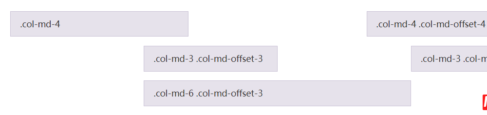
3.5嵌套列
为了使用内置的栅格系统将内容再次嵌套,可以通过添加一个新的 .row 元素和一系列 .col-sm-* 元素到已经存在的 .col-sm-* 元素内。被嵌套的行(row)所包含的列(column)的个数不能超过12(其实,没有要求你必须占满12列)。
<div class="row">
 <div class="col-sm-9">
 Level 1: .col-sm-9
 <div class="row">
 <div class="col-xs-8 col-sm-6">
 Level 2: .col-xs-8 .col-sm-6
 </div>
 <div class="col-xs-4 col-sm-6">
 Level 2: .col-xs-4 .col-sm-6
 </div>
 </div>
 </div>
</div>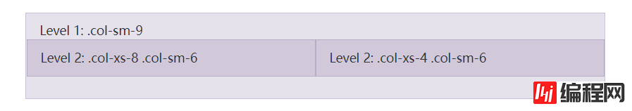
3.6列排序
通过使用 .col-md-push-* 和 .col-md-pull-* 类就可以很容易的改变列(column)的顺序。
<div class="row">
 <div class="col-md-9 col-md-push-3">.col-md-9 .col-md-push-3</div>
 <div class="col-md-3 col-md-pull-9">.col-md-3 .col-md-pull-9</div>
</div>
以上是“Bootstrap前端框架怎么用”这篇文章的所有内容,感谢各位的阅读!相信大家都有了一定的了解,希望分享的内容对大家有所帮助,如果还想学习更多知识,欢迎关注编程网node.js频道!
--结束END--
本文标题: Bootstrap前端框架怎么用
本文链接: https://www.lsjlt.com/news/78424.html(转载时请注明来源链接)
有问题或投稿请发送至: 邮箱/279061341@qq.com QQ/279061341
下载Word文档到电脑,方便收藏和打印~
2022-06-04
2022-06-04
2022-06-04
2022-06-04
2022-06-04
2022-06-04
2022-06-04
2022-06-04
2022-06-04
2022-06-04
回答
回答
回答
回答
回答
回答
回答
回答
回答
回答


官方手机版

微信公众号

商务合作


0