Python 官方文档:入门教程 => 点击学习
目录前言首先搭建环境实例代码例子1: 例子2: 例子3: 例子4: 例子5: 例子6:总结前言 前面写过一篇用python制作PPT
前面写过一篇用python制作PPT的博客,感兴趣的可以参考
用Python制作PPT
这篇是关于用Python进行数据可视化的,准备作为一个长贴,随时更新有价值的Python可视化用例,都是网上搜集来的,与君共享,本文所有测试均基于python3.
$pip install pyecharts -U
$pip install echarts-themes-pypkg
$pip install snapshot_selenium
$pip install echarts-countries-pypkg
$pip install echarts-cities-pypkg
$pip install echarts-china-provinces-pypkg
$pip install echarts-china-cities-pypkg
$pip install echarts-china-counties-pypkg
$pip install echarts-china-misc-pypkg
$pip install echarts-united-kingdom-pypkg
$pip install -i https://pypi.tuna.tsinghua.edu.cn/simple pyecharts
$git clone Https://GitHub.com/pyecharts/pyecharts.git
$cd pyecharts/
$pip install -r requirements.txt
$python setup.py install
一顿操作下来,该装的不该装的都装上了,多装一些包没坏处,说不定哪天就用上了呢
from pyecharts.charts import Bar
from pyecharts import options as opts

bar = (
    Bar()
    .add_xaxis(["chenshan", "maoyi", "longdai", "kuzi", "fengyi", "gaogenxie", "wazi"])
    .add_yaxis("storeA", [114, 55, 27, 101, 125, 27, 105])
    .add_yaxis("storeB", [57, 134, 137, 129, 145, 60, 49])
    .set_global_opts(title_opts=opts.TitleOpts(title="sales"))
)
#bar.render_notebook()
bar.render()
render():默认将会在根目录下生成一个 render.html 的文件,支持 path 参数,设置文件保存位置,如 render("./xx/xxx.html").
结果是以网页的形式输出的,执行后,在当前目录下生成render.html,用浏览器打开,最好事先安装chrome浏览器.

from pyecharts import options as opts
from pyecharts.charts import Pie
from pyecharts.faker import Faker

pie = (
    Pie()
    .add("", [list(z) for z in zip(Faker.choose(), Faker.values())])
    .set_colors(["blue", "green", "yellow", "red", "pink", "orange", "purple"])
    .set_global_opts(title_opts=opts.TitleOpts(title="Pie-设置颜色"))
    .set_series_opts(label_opts=opts.LabelOpts(fORMatter="{b}: {c}"))
)

pie.render()
import pyecharts.options as opts
from pyecharts.charts import Line
from pyecharts.faker import Faker

c = (
    Line()
    .add_xaxis(Faker.choose())
    .add_yaxis("storeA", Faker.values(), is_smooth=True)
    .add_yaxis("storeB", Faker.values(), is_smooth=True)
    .set_global_opts(title_opts=opts.TitleOpts(title="Line-smooth"))
)
c.render()
from pyecharts import options as opts
from pyecharts.charts import Kline

data = [
    [2320.26, 2320.26, 2287.3, 2362.94],
    [2300, 2291.3, 2288.26, 2308.38],
    [2295.35, 2346.5, 2295.35, 2345.92],
    [2347.22, 2358.98, 2337.35, 2363.8],
    [2360.75, 2382.48, 2347.89, 2383.76],
    [2383.43, 2385.42, 2371.23, 2391.82],
    [2377.41, 2419.02, 2369.57, 2421.15],
    [2425.92, 2428.15, 2417.58, 2440.38],
    [2411, 2433.13, 2403.3, 2437.42],
    [2432.68, 2334.48, 2427.7, 2441.73],
    [2430.69, 2418.53, 2394.22, 2433.89],
    [2416.62, 2432.4, 2414.4, 2443.03],
    [2441.91, 2421.56, 2418.43, 2444.8],
    [2420.26, 2382.91, 2373.53, 2427.07],
    [2383.49, 2397.18, 2370.61, 2397.94],
    [2378.82, 2325.95, 2309.17, 2378.82],
    [2322.94, 2314.16, 2308.76, 2330.88],
    [2320.62, 2325.82, 2315.01, 2338.78],
    [2313.74, 2293.34, 2289.89, 2340.71],
    [2297.77, 2313.22, 2292.03, 2324.63],
    [2322.32, 2365.59, 2308.92, 2366.16],
    [2364.54, 2359.51, 2330.86, 2369.65],
    [2332.08, 2273.4, 2259.25, 2333.54],
    [2274.81, 2326.31, 2270.1, 2328.14],
    [2333.61, 2347.18, 2321.6, 2351.44],
    [2340.44, 2324.29, 2304.27, 2352.02],
    [2326.42, 2318.61, 2314.59, 2333.67],
    [2314.68, 2310.59, 2296.58, 2320.96],
    [2309.16, 2286.6, 2264.83, 2333.29],
    [2282.17, 2263.97, 2253.25, 2286.33],
    [2255.77, 2270.28, 2253.31, 2276.22],
]


k = (
    Kline()
    .add_xaxis(["2017/7/{}".format(i + 1) for i in range(31)])
    .add_yaxis("k-line", data)
    .set_global_opts(
        yaxis_opts=opts.AxisOpts(is_scale=True),
        xaxis_opts=opts.AxisOpts(is_scale=True),
        title_opts=opts.TitleOpts(title="Kline-examples"),
    )

)
k.render()
from pyecharts import options as opts
from pyecharts.charts import Gauge

g = (
    Gauge()
    .add("", [("complete", 66.6)])
    .set_global_opts(title_opts=opts.TitleOpts(title="Gauge-basic examples"))
)

g.render()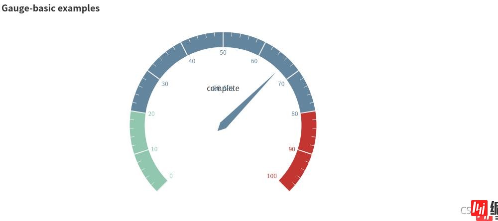
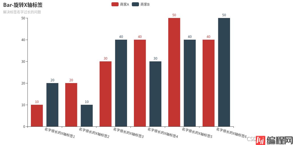
from pyecharts import options as opts
from pyecharts.charts import Bar

(
    Bar()
    .add_xaxis(
        [
            "名字很长的X轴标签1",
            "名字很长的X轴标签2",
            "名字很长的X轴标签3",
            "名字很长的X轴标签4",
            "名字很长的X轴标签5",
            "名字很长的X轴标签6",
        ]
    )
    .add_yaxis("商家A", [10, 20, 30, 40, 50, 40])
    .add_yaxis("商家B", [20, 10, 40, 30, 40, 50])
    .set_global_opts(
        xaxis_opts=opts.AxisOpts(axislabel_opts=opts.LabelOpts(rotate=-15)),
        title_opts=opts.TitleOpts(title="Bar-旋转X轴标签", subtitle="解决标签名字过长的问题"),
    )
    .render()
)
from pyecharts import options as opts
from pyecharts.faker import Faker
from pyecharts.charts import Page, Pie
l1 = ['aa','bb','cc','dd','ee']
num =[10,20,15,25,30]
c = (
        Pie()
        .add(
            "",
            [list(z) for z in zip(l1, num)],
            radius=["40%", "75%"],   # 圆环的粗细和大小
        )
        .set_global_opts(
            title_opts=opts.TitleOpts(title="Pie-Radius"),
            legend_opts=opts.LegendOpts(
                orient="vertical", pos_top="5%", pos_left="2%"  # 左面比例尺
            ),
        )
        .set_series_opts(label_opts=opts.LabelOpts(formatter="{b}: {c}"))
    )
c.render()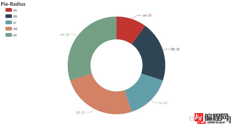
from pyecharts.faker import Faker
from pyecharts import options as opts
from pyecharts.charts import Page, Pie
l1 = ['aa','bb','cc','dd','ee']
num =[10,20,15,25,30]
c = (
        Pie()
        .add(
            "",
            [list(z) for z in zip(l1, num)],
            radius=["40%", "55%"],
            label_opts=opts.LabelOpts(
                position="outside",
                formatter="{a|{a}}{abg|} {hr|} {b|{b}: }{c}  {per|{d}%}  ",
                background_color="#eee",
                border_color="#aaa",
                border_width=1,
                border_radius=4,
                rich={
                    "a": {"color": "#999", "lineHeight": 22, "align": "center"},
                    "abg": {
                        "backgroundColor": "#e3e3e3",
                        "width": "100%",
                        "align": "right",
                        "height": 22,
                        "borderRadius": [4, 4, 0, 0],
                    },
                    "hr": {
                        "borderColor": "#aaa",
                        "width": "100%",
                        "borderWidth": 0.5,
                        "height": 0,
                    },
                    "b": {"fontSize": 16, "lineHeight": 33},
                    "per": {
                        "color": "#eee",
                        "backgroundColor": "#334455",
                        "padding": [2, 4],
                        "borderRadius": 2,
                    },
                },
            ),
        )
        .set_global_opts(title_opts=opts.TitleOpts(title="Pie-富文本示例"))
    )
c.render()
from pyecharts import options as opts
from pyecharts.charts import Line, Bar, Grid
bar = (
    Bar()
    .add_xaxis(["衬衫", "毛衣", "领带", "裤子", "风衣", "高跟鞋", "袜子"])
    .add_yaxis("商家A", [114, 55, 27, 101, 125, 27, 105])
    .add_yaxis("商家B", [57, 134, 137, 129, 145, 60, 49])
    .set_global_opts(title_opts=opts.TitleOpts(title="运维之路"),)
)
week_name_list = ["周一", "周二", "周三", "周四", "周五", "周六", "周日"]
high_temperature = [11, 11, 15, 13, 12, 13, 10]
low_temperature = [1, -2, 2, 5, 3, 2, 0]
line2 = (
    Line(init_opts=opts.InitOpts(width="1600px", height="800px"))
    .add_xaxis(xaxis_data=week_name_list)
    .add_yaxis(
        series_name="最高气温",
        y_axis=high_temperature,
        markpoint_opts=opts.MarkPointOpts(
            data=[
                opts.MarkPointItem(type_="max", name="最大值"),
                opts.MarkPointItem(type_="min", name="最小值"),
            ]
        ),
        markline_opts=opts.MarkLineOpts(
            data=[opts.MarkLineItem(type_="average", name="平均值")]
        ),
    )
    .add_yaxis(
        series_name="最低气温",
        y_axis=low_temperature,
        markpoint_opts=opts.MarkPointOpts(
            data=[opts.MarkPointItem(value=-2, name="周最低", x=1, y=-1.5)]
        ),
        markline_opts=opts.MarkLineOpts(
            data=[
                opts.MarkLineItem(type_="average", name="平均值"),
                opts.MarkLineItem(symbol="none", x="90%", y="max"),
                opts.MarkLineItem(symbol="circle", type_="max", name="最高点"),
            ]
        ),
    )
    .set_global_opts(
        #title_opts=opts.TitleOpts(title="气温变化", subtitle="纯属虚构"),
        tooltip_opts=opts.TooltipOpts(trigger="axis"),
        toolbox_opts=opts.ToolboxOpts(is_show=True),
        xaxis_opts=opts.AxisOpts(type_="cateGory", boundary_gap=False),
        #legend_opts=opts.LegendOpts(pos_left="right"),
    )
    #.render("temperature_change_line_chart.html")
)
# 最后的 Grid
#grid_chart = Grid(init_opts=opts.InitOpts(width="1400px", height="800px"))
grid_chart = Grid()
grid_chart.add(
    bar,
    grid_opts=opts.GridOpts(
        pos_left="3%", pos_right="1%", height="20%"
    ),
)
# wr
grid_chart.add(
    line2,
    grid_opts=opts.GridOpts(
        pos_left="3%", pos_right="1%", pos_top="40%", height="35%"
    ),
)
#grid_chart.render("professional_kline_chart.html")
grid_chart.render()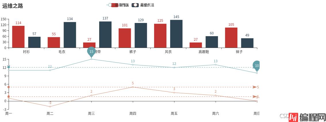
from pyecharts import options as opts
from pyecharts.charts import Radar
v1=[[83, 92, 87, 49, 89, 86]]  # 数据必须为二维数组,否则会集中一个指示器显示
v2=[[88, 95, 66, 43, 86, 96]]
v3=[[80, 92, 87, 58, 78, 81]]
radar1=(
    Radar()
    .add_schema(# 添加schema架构
        schema=[
            opts.RadarIndicatorItem(name='传球',max_=100),# 设置指示器名称和最大值
            opts.RadarIndicatorItem(name='射门',max_=100),
            opts.RadarIndicatorItem(name='身体',max_=100),
            opts.RadarIndicatorItem(name='防守',max_=100),
            opts.RadarIndicatorItem(name='速度',max_=100),
            opts.RadarIndicatorItem(name='盘带',max_=100),
        ]
    )
    .add('罗纳尔多',v1,color="#f9713c") # 添加一条数据,参数1为数据名,参数2为数据,参数3为颜色
    .add('梅西',v2,color="#4169E1")
    .add('苏亚雷斯',v3,color="#00BFFF")
    .set_global_opts(title_opts=opts.TitleOpts(title='雷达图'),)
)
radar1.render()
import math
import random
from pyecharts.faker import Faker
from pyecharts import options as opts
from pyecharts.charts import Page, Polar
c = (
        Polar()
        .add_schema(
            angleaxis_opts=opts.AngleAxisOpts(data=Faker.week, type_="category")
        )
        .add("A", [1, 2, 3, 4, 3, 5, 1], type_="bar", stack="stack0")
        .add("B", [2, 4, 6, 1, 2, 3, 1], type_="bar", stack="stack0")
        .add("C", [1, 2, 3, 4, 1, 2, 5], type_="bar", stack="stack0")
        .set_global_opts(title_opts=opts.TitleOpts(title="Polar-AngleAxis"))
    )
c.render()
import math
import random
from pyecharts.faker import Faker
from pyecharts import options as opts
from pyecharts.charts import Page, Polar
data = [(i, random.randint(1, 100)) for i in range(10)]
c = (
        Polar()
        .add("", data, type_="effectScatter",
             effect_opts=opts.EffectOpts(scale=10, period=5),
             label_opts=opts.LabelOpts(is_show=False))
        #  type默认为"line",
        #  "effectScatter",scatter,bar
        .set_global_opts(title_opts=opts.TitleOpts(title="Polar-Scatter0"))
)
c.render()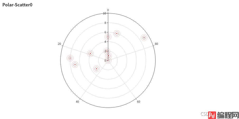
import math
import random
from pyecharts.faker import Faker
from pyecharts import options as opts
from pyecharts.charts import Page, Polar
c = (
        Polar()
        .add_schema(
            radiusaxis_opts=opts.RadiusAxisOpts(data=Faker.week, type_="category")
        )
        .add("A", [1, 2, 3, 4, 3, 5, 1], type_="bar", stack="stack0")
        .add("B", [2, 4, 6, 1, 2, 3, 1], type_="bar", stack="stack0")
        .add("C", [1, 2, 3, 4, 1, 2, 5], type_="bar", stack="stack0")
        .set_global_opts(title_opts=opts.TitleOpts(title="Polar-RadiusAxis"))
)
c.render()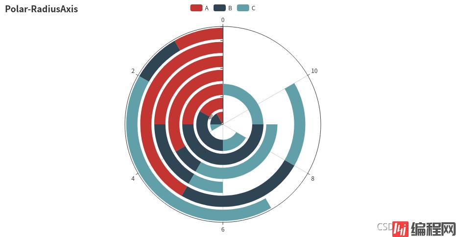
from pyecharts import options as opts
from pyecharts.charts import Liquid, Page
from pyecharts.globals import SymbolType

c = (
        Liquid()
        .add("lq", [0.61, 0.7],shape='rect',is_outline_show=False)
        # 水球外形,有' circle', 'rect', 'roundRect', 'triangle', 'diamond', 'pin', 'arrow' 可选。
        # 默认 'circle'。也可以为自定义的 SVG 路径。
        #is_outline_show设置边框
        .set_global_opts(title_opts=opts.TitleOpts(title="Liquid-基本示例"))
)
c.render()
散点图:
from pyecharts.charts import Scatter
import pyecharts.options as opts

female_height = [161.2,167.5,159.5,157,155.8,170,159.1,166,176.2,160.2,172.5,170.9,172.9,153.4,160,147.2,168.2,175,157,167.6,159.5,175,166.8,176.5,170.2,]
female_weight = [51.6,59,49.2,63,53.6,59,47.6,69.8,66.8,75.2,55.2,54.2,62.5,42,50,49.8,49.2,73.2,47.8,68.8,50.6,82.5,57.2,87.8,72.8,54.5,]

male_height = [174 ,175.3 ,193.5 ,186.5 ,187.2 ,181.5 ,184 ,184.5 ,175 ,184 ,180 ,177.8 ,192 ,176 ,174 ,184 ,192.7 ,171.5 ,173 ,176 ,176 ,180.5 ,172.7 ,176 ,173.5 ,178 ,]
male_weight = [65.6 ,71.8 ,80.7 ,72.6 ,78.8 ,74.8 ,86.4 ,78.4 ,62 ,81.6 ,76.6 ,83.6 ,90 ,74.6 ,71 ,79.6 ,93.8 ,70 ,72.4 ,85.9 ,78.8 ,77.8 ,66.2 ,86.4 ,81.8 ,89.6 ,]

scatter = Scatter()
scatter.add_xaxis(female_height)
scatter.add_xaxis(male_height)
scatter.add_yaxis("female", female_weight, symbol_size=15) #散点大小
scatter.add_yaxis("male", male_weight, symbol_size=15) #散点大小
scatter.set_global_opts(title_opts=opts.TitleOpts(title="身高体重分布"),
                        xaxis_opts=opts.AxisOpts(
                            type_ = "value", # 设置x轴为数值轴
                            splitline_opts=opts.SplitLineOpts(is_show = True)), # x轴分割线
                        yaxis_opts=opts.AxisOpts(splitline_opts=opts.SplitLineOpts(is_show=True))# y轴分割线
                        )
scatter.set_series_opts(label_opts=opts.LabelOpts(is_show=False))
scatter.render("./html/scatter_base.html")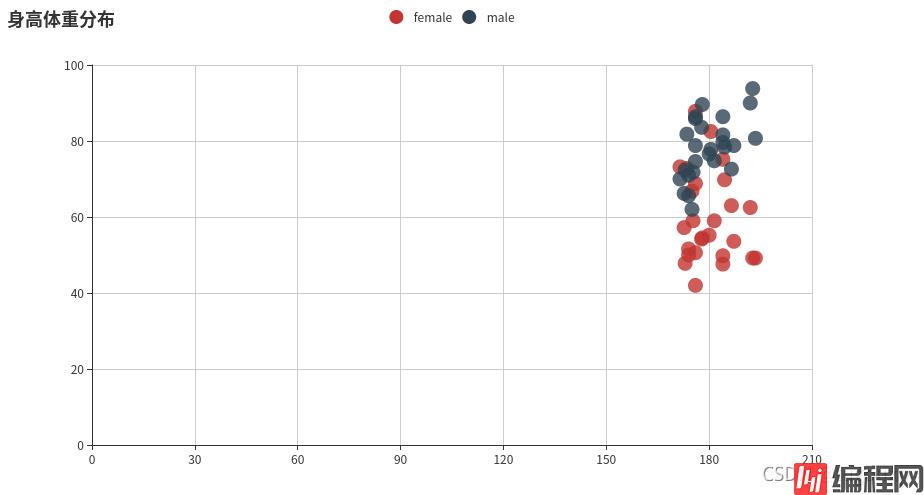
到此这篇关于利用Python进行数据可视化的文章就介绍到这了,更多相关Python数据可视化内容请搜索编程网以前的文章或继续浏览下面的相关文章希望大家以后多多支持编程网!
--结束END--
本文标题: 利用Python进行数据可视化的实例代码
本文链接: https://www.lsjlt.com/news/134742.html(转载时请注明来源链接)
有问题或投稿请发送至: 邮箱/279061341@qq.com QQ/279061341
下载Word文档到电脑,方便收藏和打印~
2024-03-01
2024-03-01
2024-03-01
2024-02-29
2024-02-29
2024-02-29
2024-02-29
2024-02-29
2024-02-29
2024-02-29
回答
回答
回答
回答
回答
回答
回答
回答
回答
回答


官方手机版

微信公众号

商务合作


0