目录效果展示实现代码代码调用效果展示 CHeckbox多选版 Flutter封装点击菜单工具栏组件 本文是单选版 效果如图所示,点击选项回调选中的index,可以自定义横向
CHeckbox多选版 Flutter封装点击菜单工具栏组件
本文是单选版
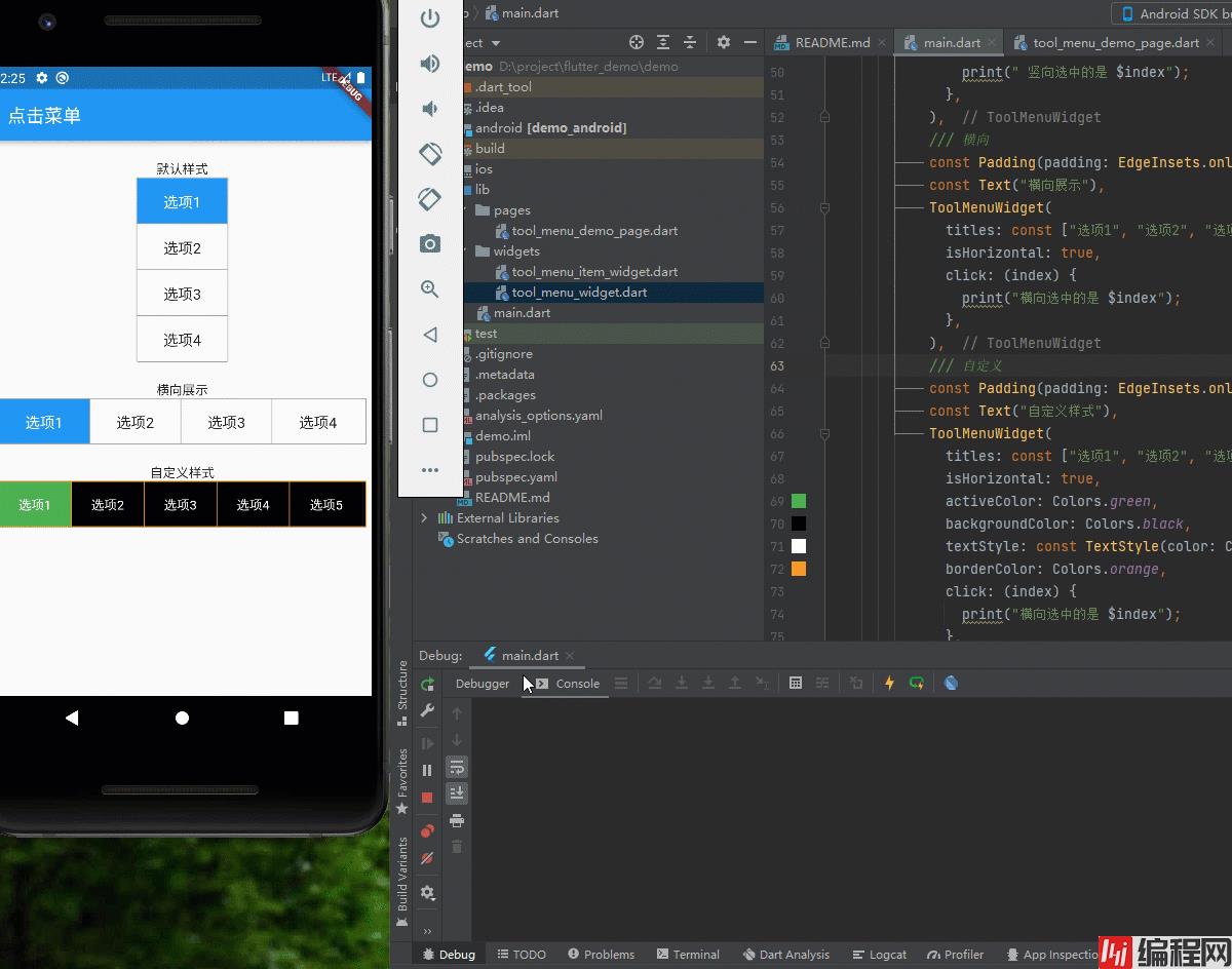
效果如图所示,点击选项回调选中的index,可以自定义横向纵向,传递宽高后自动计算子项宽高,自定义边框、背景、选中的样式
第一部分是封装子项组件, ToolMenuItemWidget组件如下:
import 'dart:core';
import 'package:flutter/material.dart';
/// @author 编程小龙
/// @创建时间:2022/3/8
/// 工具菜单子项
class ToolMenuItemWidget extends StatelessWidget {
  /// 显示的title
  final String title;
  /// 当前选中
  final int index;
  /// 点击回调
  final ValueChanged<int> click;
  final double width;
  final double height;
  final bool isActive;
  final bool isHorizontal; // 是否横向
  final bool isEnd; // 是否为末尾
  final Color? activeColor; // 点击后的颜色
  final Color? backgroundColor; // 背景色
  final Color? borderColor; // 边框色
  final TextStyle? textStyle; // 文字样式
  final TextStyle? activeTextStyle; //  选中的文字样式
  const ToolMenuItemWidget({
    Key? key,
    this.isActive = false,
    required this.title,
    required this.index,
    required this.click,
    this.activeColor,
    this.backgroundColor,
    this.borderColor,
    this.textStyle,
    this.activeTextStyle,
    this.isHorizontal = false,
    this.width = 100,
    this.isEnd = false,
    this.height = 40,
  }) : super(key: key);
  @override
  Widget build(BuildContext context) {
    var defaultTextStyle = TextStyle(
        fontSize: 16, color: isActive ? Colors.white : Colors.black87);
    return Material(
      child: Ink( // 点击右波纹效果
        width: width,
        height: height,
        decoration: BoxDecoration(
            color: isActive
                ? activeColor ?? Theme.of(context).primaryColor
                : backgroundColor ?? Colors.white30,
            border: isHorizontal
                ? isEnd
                    ? const Border()
                    : Border(
                        right: BorderSide(
                            width: 1, color: borderColor ?? Colors.grey))
                : Border(
                    bottom: BorderSide(
                        width: 1, color: borderColor ?? Colors.grey))),
        child: InkWell(
            onTap: () {
              click(index);
            },
            child: Center(
              child: Text(title,
                  style: isActive
                      ? activeTextStyle ?? defaultTextStyle
                      : textStyle ?? defaultTextStyle),
            )),
      ),
    );
  }
}
第二部分是封装工具栏部分, ToolMenuItemWidget组件如下:
import 'package:demo/widgets/tool_menu_item_widget.dart';
import 'package:flutter/material.dart';
/// @author 编程小龙
/// @创建时间:2022/3/8
/// 工具菜单
class ToolMenuWidget extends StatefulWidget {
  final List<String> titles;
  final ValueChanged<int> click; // 点击回调
  final double? width;
  final double? height;
  final int currentIndex; // 当前选中
  final bool isHorizontal; // 横向
  final Color? activeColor; // 点击后的颜色 没传取主题色
  final Color? backgroundColor; // 背景色
  final Color? borderColor; // 边框色
  final TextStyle? textStyle; // 文字样式
  final TextStyle? activeTextStyle; //  选中的文字样式
  const ToolMenuWidget(
      {Key? key,
      this.currentIndex = 0,
      required this.titles,
      required this.click,
      this.width,
      this.height,
      this.isHorizontal = false,
      this.activeColor,
      this.backgroundColor,
      this.borderColor,
      this.textStyle,
      this.activeTextStyle,
      })
      : super(key: key);
  @override
  State<ToolMenuWidget> createState() => _ToolMenuWidgetState();
}
class _ToolMenuWidgetState extends State<ToolMenuWidget> {
  int currentIndex = 0; // 当前选中
  bool isHorizontal = false; // 是否横向
  @override
  void initState() {
    // 初始化当前选中
    currentIndex = widget.currentIndex;
    isHorizontal = widget.isHorizontal;
    super.initState();
  }
  @override
  Widget build(BuildContext context) {
    int index = 0; // 用于遍历计数
    int size = widget.titles.length;
    double height = widget.height ?? (isHorizontal ? 50 : 200); //设置水平和竖直时的默认值
    double width = widget.width ?? (isHorizontal ? 400 : 100);
    return Container(
      height: height,
      width: width,
      decoration: BoxDecoration(
        color: widget.backgroundColor ?? Colors.white30,
        border: Border.all(color: widget.borderColor ?? Colors.grey, width: 1),
      ),
      child: Wrap(
        children: widget.titles.map((title) {
          return ToolMenuItemWidget(
            title: title,
            index: index,
            isHorizontal: widget.isHorizontal,
            click: (index) {
              setState(() {
                currentIndex = index;
              });
              widget.click(index);
            },
            activeColor: widget.activeColor,
            backgroundColor: widget.backgroundColor,
            borderColor: widget.borderColor,
            textStyle: widget.textStyle,
            height: widget.isHorizontal ? height - 2 : height / size,
            // 竖直状态-2 是去掉边框所占像素
            isActive: index == currentIndex,
            width: widget.isHorizontal ? width / size - 1 : width,
            isEnd: index++ == size - 1,
          );
        }).toList(),
      ),
    );
  }
}
最简单案例只需传入titles即可,选中颜色默认取主题颜色,后续再弄一个chekbox版的,可多选菜单
/// 竖向,默认样式
ToolMenuWidget(
   titles: const ["选项1", "选项2", "选项3", "选项4"],
   click: (index) {
     print(" 竖向选中的是 $index");
   },
 ),
/// 自定义样式横向
ToolMenuWidget(
  titles: const ["选项1", "选项2", "选项3", "选项4","选项5"],
   isHorizontal: true,
   activeColor: Colors.green,
   backgroundColor: Colors.black,
   textStyle: const TextStyle(color: Colors.white),
   activeTextStyle: const TextStyle(color: Colors.white,fontSize: 18),
   borderColor: Colors.orange,
   click: (index) {
     print("横向选中的是 $index");
   },
 )
以上就是flutter封装单选点击菜单工具栏组件的详细内容,更多关于flutter封装点击菜单工具栏组件的资料请关注编程网其它相关文章!
--结束END--
本文标题: flutter封装单选点击菜单工具栏组件
本文链接: https://www.lsjlt.com/news/148925.html(转载时请注明来源链接)
有问题或投稿请发送至: 邮箱/279061341@qq.com QQ/279061341
下载Word文档到电脑,方便收藏和打印~
2024-01-21
2023-10-28
2023-10-28
2023-10-27
2023-10-27
2023-10-27
2023-10-27
回答
回答
回答
回答
回答
回答
回答
回答
回答
回答


官方手机版

微信公众号

商务合作


0