这篇“Flutter怎么封装单选点击菜单工具栏组件”文章的知识点大部分人都不太理解,所以小编给大家总结了以下内容,内容详细,步骤清晰,具有一定的借鉴价值,希望大家阅读完这篇文章能有所收获,下面我们一起来看看这篇“flutter怎么封装单选点
这篇“Flutter怎么封装单选点击菜单工具栏组件”文章的知识点大部分人都不太理解,所以小编给大家总结了以下内容,内容详细,步骤清晰,具有一定的借鉴价值,希望大家阅读完这篇文章能有所收获,下面我们一起来看看这篇“flutter怎么封装单选点击菜单工具栏组件”文章吧。
CHeckbox多选版 flutter封装点击菜单工具栏组件
本文是单选版
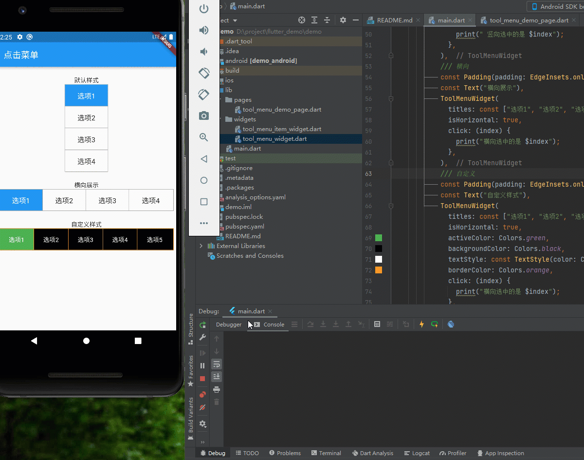
效果如图所示,点击选项回调选中的index,可以自定义横向纵向,传递宽高后自动计算子项宽高,自定义边框、背景、选中的样式
第一部分是封装子项组件, ToolMenuItemWidget组件如下:
import 'dart:core';import 'package:flutter/material.dart';/// @author 编程小龙/// @创建时间:2022/3/8/// 工具菜单子项class ToolMenuItemWidget extends StatelessWidget { /// 显示的title final String title; /// 当前选中 final int index; /// 点击回调 final ValueChanged<int> click; final double width; final double height; final bool isActive; final bool isHorizontal; // 是否横向 final bool isEnd; // 是否为末尾 final Color? activeColor; // 点击后的颜色 final Color? backgroundColor; // 背景色 final Color? borderColor; // 边框色 final TextStyle? textStyle; // 文字样式 final TextStyle? activeTextStyle; // 选中的文字样式 const ToolMenuItemWidget({ Key? key, this.isActive = false, required this.title, required this.index, required this.click, this.activeColor, this.backgroundColor, this.borderColor, this.textStyle, this.activeTextStyle, this.isHorizontal = false, this.width = 100, this.isEnd = false, this.height = 40, }) : super(key: key); @override Widget build(BuildContext context) { var defaultTextStyle = TextStyle( fontSize: 16, color: isActive ? Colors.white : Colors.black87); return Material( child: Ink( // 点击右波纹效果 width: width, height: height, decoration: BoxDecoration( color: isActive ? activeColor ?? Theme.of(context).primaryColor : backgroundColor ?? Colors.white30, border: isHorizontal ? isEnd ? const Border() : Border( right: BorderSide( width: 1, color: borderColor ?? Colors.grey)) : Border( bottom: BorderSide( width: 1, color: borderColor ?? Colors.grey))), child: InkWell( onTap: () { click(index); }, child: Center( child: Text(title, style: isActive ? activeTextStyle ?? defaultTextStyle : textStyle ?? defaultTextStyle), )), ), ); }}第二部分是封装工具栏部分, ToolMenuItemWidget组件如下:
import 'package:demo/widgets/tool_menu_item_widget.dart';import 'package:flutter/material.dart';/// @author 编程小龙/// @创建时间:2022/3/8/// 工具菜单class ToolMenuWidget extends StatefulWidget { final List<String> titles; final ValueChanged<int> click; // 点击回调 final double? width; final double? height; final int currentIndex; // 当前选中 final bool isHorizontal; // 横向 final Color? activeColor; // 点击后的颜色 没传取主题色 final Color? backgroundColor; // 背景色 final Color? borderColor; // 边框色 final TextStyle? textStyle; // 文字样式 final TextStyle? activeTextStyle; // 选中的文字样式 const ToolMenuWidget( {Key? key, this.currentIndex = 0, required this.titles, required this.click, this.width, this.height, this.isHorizontal = false, this.activeColor, this.backgroundColor, this.borderColor, this.textStyle, this.activeTextStyle, }) : super(key: key); @override State<ToolMenuWidget> createState() => _ToolMenuWidgetState();}class _ToolMenuWidgetState extends State<ToolMenuWidget> { int currentIndex = 0; // 当前选中 bool isHorizontal = false; // 是否横向 @override void initState() { // 初始化当前选中 currentIndex = widget.currentIndex; isHorizontal = widget.isHorizontal; super.initState(); } @override Widget build(BuildContext context) { int index = 0; // 用于遍历计数 int size = widget.titles.length; double height = widget.height ?? (isHorizontal ? 50 : 200); //设置水平和竖直时的默认值 double width = widget.width ?? (isHorizontal ? 400 : 100); return Container( height: height, width: width, decoration: BoxDecoration( color: widget.backgroundColor ?? Colors.white30, border: Border.all(color: widget.borderColor ?? Colors.grey, width: 1), ), child: Wrap( children: widget.titles.map((title) { return ToolMenuItemWidget( title: title, index: index, isHorizontal: widget.isHorizontal, click: (index) { setState(() { currentIndex = index; }); widget.click(index); }, activeColor: widget.activeColor, backgroundColor: widget.backgroundColor, borderColor: widget.borderColor, textStyle: widget.textStyle, height: widget.isHorizontal ? height - 2 : height / size, // 竖直状态-2 是去掉边框所占像素 isActive: index == currentIndex, width: widget.isHorizontal ? width / size - 1 : width, isEnd: index++ == size - 1, ); }).toList(), ), ); }}最简单案例只需传入titles即可,选中颜色默认取主题颜色,后续再弄一个chekbox版的,可多选菜单
/// 竖向,默认样式ToolMenuWidget( titles: const ["选项1", "选项2", "选项3", "选项4"], click: (index) { print(" 竖向选中的是 $index"); }, ),/// 自定义样式横向ToolMenuWidget( titles: const ["选项1", "选项2", "选项3", "选项4","选项5"], isHorizontal: true, activeColor: Colors.green, backgroundColor: Colors.black, textStyle: const TextStyle(color: Colors.white), activeTextStyle: const TextStyle(color: Colors.white,fontSize: 18), borderColor: Colors.orange, click: (index) { print("横向选中的是 $index"); }, )以上就是关于“flutter怎么封装单选点击菜单工具栏组件”这篇文章的内容,相信大家都有了一定的了解,希望小编分享的内容对大家有帮助,若想了解更多相关的知识内容,请关注编程网精选频道。
--结束END--
本文标题: flutter怎么封装单选点击菜单工具栏组件
本文链接: https://www.lsjlt.com/news/329489.html(转载时请注明来源链接)
有问题或投稿请发送至: 邮箱/279061341@qq.com QQ/279061341
下载Word文档到电脑,方便收藏和打印~
2024-05-16
2024-05-16
2024-05-16
2024-05-16
2024-05-16
2024-05-16
2024-05-16
2024-05-16
2024-05-16
2024-05-16
回答
回答
回答
回答
回答
回答
回答
回答
回答
回答


官方手机版

微信公众号

商务合作


0