目录介绍课程目标自定义SwitchButton的Thumb和Track自定义Thumb自定义TrackSwitchButton交互事件发生时的代码运行效果开关off时开关on时介绍
SwitchButton是个什么样的东西呢?其实它就是一个开关。我们在手机应用中经常使用到的。我突然想到2012年我开发Android时,竟然使用了RadioButton来做开关这个梗。
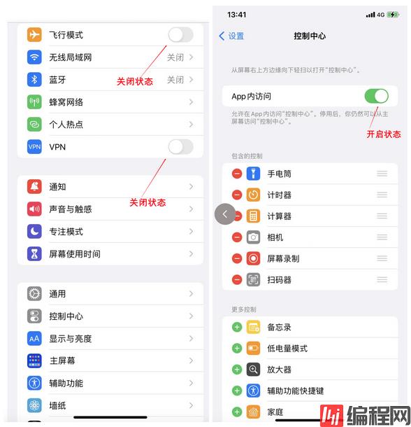
其实SwitchButton文如其名,它就是一个“开”和“关”两个状态事件存在时使用的,最典型的SwitchButton长下面这么个样子。
制作一个类似于iOS里的SwitchButton效果的按钮。并且打印出它当前的状态。
Android Studio自带的SwitchButton样式非常的难看,达不到我们要的效果,它如果直接拖到我们的Android Studio里是一个灰白色的按钮。我们这次把这个按钮美化一下。
其实美化不用太精致,必竟我们不是专业UI,因此开发者们一定不要一开始沉醉于界面样式的太Beautiful,我们主要核心就是把Android开发全给掌握了,并且它是为我们本身的JAVA中台、大数据、ai开发能力来服务的。因为你开发的很多后台功能,如果对于一些大领导或者是业务型领导,他们是看不到你的“真实能力的”,他们更多关注的是“功能长什么样”,因此如果直接可以让他们看到在手机里运行起来这个人脸、这个物品识别、这个用手机设蓝牙锁开锁等过程你可以省却很多无用的BLA BLA。同时还能为自己将来进一步通往IOT领域打下坚实的基础。因此在我的教程里不会太多讲如何的专业UI。
为了满足我们基本的UI,我们需要知道SwitchButton的外观受以下几个事件的影响,它们是:
我们自定义这两个UI部分即可实现。
它需要两个xml文件:
然后把这两个xml文件合到一个selector的xml文件内申明成on时用哪个文件、off时用哪个文件就能起到switch button的这个圆点点样式的自定了。
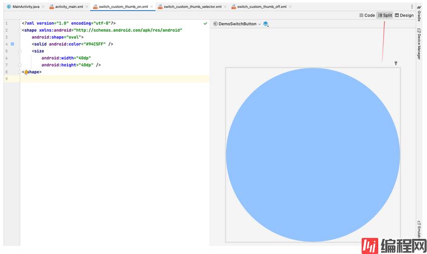
在此,我们不会使用外部图片.png等资源,而只用android里提供的简单的shape来作这个图形的绘制,它相当的简单
switch_custom_thumb_on.xml
<?xml version="1.0" encoding="utf-8"?>
<shape xmlns:android="Http://schemas.android.com/apk/res/android"
    android:shape="oval">
    <solid android:color="#94C5FF" />
    <size
        android:width="40dp"
        android:height="40dp" />
</shape>
switch_custom_thumb_off.xml
<?xml version="1.0" encoding="utf-8"?>
<shape xmlns:android="http://schemas.android.com/apk/res/android"
    android:shape="oval">
    <solid android:color="#AAA" />
    <size
        android:width="40dp"
        android:height="40dp" />
</shape>
switch_custom_thumb_selector.xml文件
<?xml version="1.0" encoding="utf-8"?>
<selector xmlns:android="http://schemas.android.com/apk/res/android">
    <item android:drawable="@drawable/switch_custom_thumb_on" android:state_checked="true" />
    <item android:drawable="@drawable/switch_custom_thumb_off" android:state_checked="false" />
</selector>
开发这一块代码时我们使用Android Studio里的Split代码与样式预览集成可以动态看到我们在改代码时右边图形发生的变化。
这边的thumb就是给你的“手指”按的圆点点我们使用的是android:shape="oval",蓝色。
导轨我们也使用蓝色,它同样也是分成:
然后同样也在一个selector xml文件内申明成on时用哪个文件、off时用哪个文件。
switch_custom_track_on.xml
<?xml version="1.0" encoding="utf-8"?>
<shape xmlns:android="http://schemas.android.com/apk/res/android"
    android:shape="rectangle">
    <solid android:color="#B6D6FE" />
    <stroke
        android:width="5dp"
        android:color="#00000000" />
    <corners android:radius="20dp" />
</shape>
switch_custom_track_off.xml
<?xml version="1.0" encoding="utf-8"?>
<shape xmlns:android="http://schemas.android.com/apk/res/android"
    android:shape="rectangle">
    <solid android:color="#E3E3E3" />
    <stroke
        android:width="5dp"
        android:color="#00000000" />
    <corners android:radius="20dp" />
</shape>
switch_custom_track_selector.xml
<?xml version="1.0" encoding="utf-8"?>
<selector xmlns:android="http://schemas.android.com/apk/res/android">
<item android:drawable="@drawable/switch_custom_track_on" android:state_checked="true" />
<item android:drawable="@drawable/switch_custom_track_off" android:state_checked="false" />
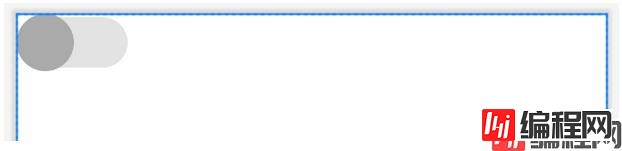
</selector>好,我们以上把按钮和导轨都定义好了,我们来看主UI界面。
主UI界面activity_main.xml
<?xml version="1.0" encoding="utf-8"?>
<androidx.constraintlayout.widget.ConstraintLayout xmlns:android="http://schemas.android.com/apk/res/android"
    xmlns:app="http://schemas.android.com/apk/res-auto"
    xmlns:tools="http://schemas.android.com/tools"
    android:layout_width="match_parent"
    android:layout_height="match_parent"
    tools:context=".MainActivity">

    <LinearLayout
        android:layout_width="match_parent"
        android:layout_height="match_parent"
        android:orientation="horizontal">
        <Switch android:id="@+id/switchBtn"
            android:layout_width="wrap_content"
            android:layout_height="wrap_content"
            android:thumb="@drawable/switch_custom_thumb_selector"
            android:track="@drawable/switch_custom_track_selector" />
    </LinearLayout>

</androidx.constraintlayout.widget.ConstraintLayout>
看,以上代码里我们对android:thumb和android:track使用了这两个自定义on/off样式的xml文件。
它在界面上会长成这么个样。
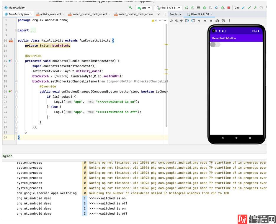
我们来看这个按钮的事件是如何响应的。
MainActivity.java
package org.mk.android.demo;
import androidx.appcompat.app.AppCompatActivity;
import android.os.Bundle;
import android.util.Log;
import android.widget.CompoundButton;
import android.widget.Switch;
public class MainActivity extends AppCompatActivity {
private Switch btnSwitch;
@Override
protected void onCreate(Bundle savedInstanceState) {
super.onCreate(savedInstanceState);
setContentView(R.layout.activity_main);
btnSwitch = (Switch) findViewById(R.id.switchBtn);
btnSwitch.setOnCheckedChangeListener(new CompoundButton.OnCheckedChangeListener() {
@Override
public void onCheckedChanged(CompoundButton buttonView, boolean isChecked) {
if (isChecked) {
Log.i("app", ">>>>>>switched is on");
} else {
Log.i("app", ">>>>>>switched is off");
}
}
});
}
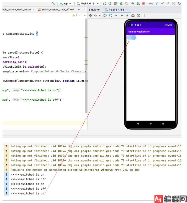
}我们对SwitchButton的onCheckedChanged进行了自定义,它运行起来会是这样的一个效果。
到此这篇关于Android入门之SwitchButton的使用教程的文章就介绍到这了,更多相关Android SwitchButton内容请搜索编程网以前的文章或继续浏览下面的相关文章希望大家以后多多支持编程网!
--结束END--
本文标题: Android入门之SwitchButton的使用教程
本文链接: https://www.lsjlt.com/news/171115.html(转载时请注明来源链接)
有问题或投稿请发送至: 邮箱/279061341@qq.com QQ/279061341
下载Word文档到电脑,方便收藏和打印~
2024-01-21
2023-10-28
2023-10-28
2023-10-27
2023-10-27
2023-10-27
2023-10-27
回答
回答
回答
回答
回答
回答
回答
回答
回答
回答


官方手机版

微信公众号

商务合作


0