这篇文章给大家分享的是有关css3中input框如何实现类似Google登录的动画效果的内容。小编觉得挺实用的,因此分享给大家做个参考,一起跟随小编过来看看吧。 用CSS3将input框写出类似Google登录页面的动画效果效果一
这篇文章给大家分享的是有关css3中input框如何实现类似Google登录的动画效果的内容。小编觉得挺实用的,因此分享给大家做个参考,一起跟随小编过来看看吧。
用CSS3将input框写出类似Google登录页面的动画效果
效果一
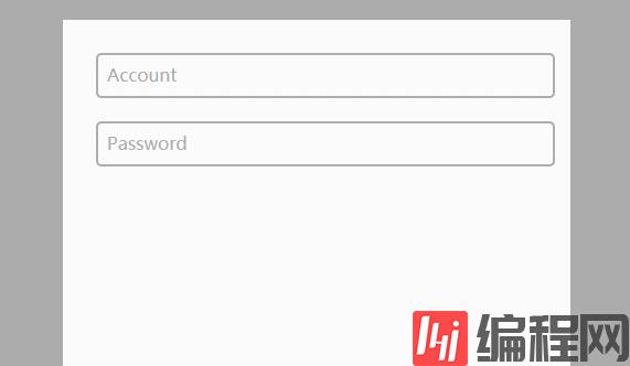
代码如下
CSS
body{ background-color:#acacac; } .fORM-container{ display: block; position: relative; width: 400px; height: 400px; background: #fff; margin: 50px auto; padding: 30px; } input{ display: block; position: relative; background: none; border: 2px solid #acacac; border-radius:5px; width: 100%; font-weight: bold; padding-left:10px; font-size: 16px; height:35px; z-index: 1; } label{ display: inline-block; position: relative; top: -32px; left: 10px; color: #acacac; font-size: 16px; z-index: 2; transition: all 0.2s ease-out; } input:focus, input:valid{ outline: none; border: 2px solid #00aced; } input:focus + label, input:valid + label{ top: -50px; font-size: 16px; color: #00aced; background-color:#fff; }HTML
<div class="main"> <div class="form-container"> <input type="text" name="input1" required> <label for="input1">Account</label> <input type="text" name="input2" required> <label for="input2">PassWord</label> </div> </div>效果二
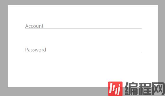
代码如下:
CSS
body{ background-color:#acacac; } .form-container{ display: block; position: relative; width: 400px; background: #fff; margin: 50px auto; padding: 60px; } input{ display: block; position: relative; background: none; border: none; border-bottom: 1px solid #DDD; width: 100%; font-weight: bold; font-size: 16px; z-index: 2; } label{ display: block; position: relative; top: -20px; left: 0px; color: #999; font-size: 16px; z-index: 1; transition: all 0.3s ease-out; margin-bottom:40px; } input:focus, input:valid{ outline: none; border-bottom: 1px solid #00aced; } input:focus + label, input:valid + label{ top: -50px; font-size: 16px; color: #00aced; background-color:#fff; }HTML
<div class="main"> <div class="form-container"> <input type="text" name="input1" required> <label for="input1">Account</label> <input type="text" name="input2" required> <label for="input2">Password</label> </div> </div>感谢各位的阅读!关于“CSS3中input框如何实现类似Google登录的动画效果”这篇文章就分享到这里了,希望以上内容可以对大家有一定的帮助,让大家可以学到更多知识,如果觉得文章不错,可以把它分享出去让更多的人看到吧!
--结束END--
本文标题: CSS3中input框如何实现类似Google登录的动画效果
本文链接: https://www.lsjlt.com/news/251250.html(转载时请注明来源链接)
有问题或投稿请发送至: 邮箱/279061341@qq.com QQ/279061341
下载Word文档到电脑,方便收藏和打印~
2024-05-24
2024-05-24
2024-05-24
2024-05-24
2024-05-24
2024-05-24
2024-05-24
2024-05-24
2024-05-24
2024-05-24
回答
回答
回答
回答
回答
回答
回答
回答
回答
回答


官方手机版

微信公众号

商务合作


0