小编给大家分享一下纯css3如何实现input输入框动画样式库,希望大家阅读完这篇文章之后都有所收获,下面让我们一起去探讨吧!分享一个用纯 CSS3 实现的,漂亮的 input 输入框动画样式库-Text input love。点击每个输入
小编给大家分享一下纯css3如何实现input输入框动画样式库,希望大家阅读完这篇文章之后都有所收获,下面让我们一起去探讨吧!
分享一个用纯 CSS3 实现的,漂亮的 input 输入框动画样式库-Text input love。
点击每个输入框都用不同的动画效果,始终显示标签label,并显示 placeholder(占位符)文本。
html 代码:
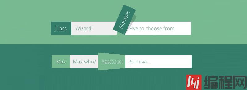
<div class="row"> <p>Click every input.</p></div><div class="row"> <span> <input class="basic-slide" id="name" type="text" placeholder="Your best name" /><label for="name">Name</label> </span> <span> <input class="basic-slide" id="email" type="text" placeholder="Your favorite email" /><label for="email">Email</label> </span> <span> <input class="basic-slide" id="phone" type="text" placeholder="You can trust us" /><label for="phone">Phone</label> </span></div><div class="row"> <span> <input class="clean-slide" id="age" type="text" placeholder="Go for the high score!" /><label for="age">Age</label> </span> <span> <input class="clean-slide" id="height" type="text" placeholder="Heels count" /><label for="height">Height</label> </span> <span> <input class="clean-slide" id="weight" type="text" placeholder="Go ahead and lie" /><label for="weight">Weight</label> </span></div><div class="row"> <span> <input class="gate" id="class" type="text" placeholder="Wizard!" /><label for="class">Class</label> </span> <span> <input class="gate" id="element" type="text" placeholder="Five to choose from" /><label for="element">Element</label> </span> <span> <input class="gate" id="move" type="text" placeholder="Secret book attack!" /><label for="move">Move</label> </span></div><div class="row"> <span> <input class="skinny" id="english" type="text" placeholder="Do you speak it?" /><label for="english">English</label> </span> <span> <input class="skinny" id="burger" type="text" placeholder="A Royale with cheese?" /><label for="burger">Burger</label> </span> <span> <input class="skinny" id="wallet" type="text" placeholder="Bad Mother****er" /><label for="wallet">Wallet</label> </span></div><div class="row"> <span> <input class="slide-up" id="card" type="text" placeholder="Fund me!" /><label for="card">Credit Card</label> </span> <span> <input class="slide-up" id="expires" type="text" placeholder="Month Day, Year" /><label for="expires">Expires</label> </span> <span> <input class="slide-up" id="security" type="text" placeholder="Public" /><label for="security">Security Code</label> </span></div><div class="row"> <span> <input class="card-slide" id="knock" type="text" placeholder="Who's there?" /><label for="knock">Knock knock</label> </span> <span> <input class="card-slide" id="max" type="text" placeholder="Max who?" /><label for="max">Max</label> </span> <span> <input class="card-slide" id="out" type="text" placeholder="Sunuva..." /><label for="out">Maxed out card ;)</label> </span></div><div class="row"> <span> <input class="swing" id="artist" type="text" placeholder="BO$$" /><label for="artist">Artist</label> </span> <span> <input class="swing" id="song" type="text" placeholder="I don't give a ****" /><label for="song">Song</label> </span> <span> <input class="swing" id="eyes" type="text" placeholder="Crazy" /><label for="eyes">Eyes</label> </span></div><div class="row"> <span> <input class="balloon" id="state" type="text" placeholder="Liquid, solid, gaseous..." /><label for="state">State</label> </span> <span> <input class="balloon" id="planet" type="text" placeholder="Probably Earth" /><label for="planet">Planet</label> </span> <span> <input class="balloon" id="galaxy" type="text" placeholder="Milky Way?" /><label for="galaxy">Galaxy</label> </span></div>SCSS 代码:
Sass 代码:
@import "compass/css3"; @import url(https://fonts.googleapis.com/css?family=Open+Sans:400,700,600,300,800); * { box-sizing: border-box;}html,body { overflow-x: hidden; font-family: "Open Sans", sans-serif; font-weight: 300; color: #fff; background: #efefef;}@mixin epic-sides() { // Https://codepen.io/MichaelArestad/pen/qltuk position: relative; z-index: 1; &:before { position: absolute; content: ""; display: block; top: 0; left: -5000px; height: 100%; width: 15000px; z-index: -1; @content; }}.row { max-width: 800px; margin: 0 auto; padding: 60px 30px; background: #032429; @include epic-sides() {background: inherit;} text-align: center; &:first-child { padding: 40px 30px; } &:nth-child(2), &:nth-child(8), &:nth-child(10){ background: #134A46; } &:nth-child(3), &:nth-child(7) { background: #377D6A; } &:nth-child(4), &:nth-child(6) { background: #7AB893; } &:nth-child(5) { background: #B2E3AF; } span { position: relative; display: inline-block; margin: 30px 10px; }}.basic-slide { display: inline-block; width: 215px; padding: 10px 0 10px 15px; font-family: "Open Sans", sans; font-weight: 400; color: #377D6A; background: #efefef; border: 0; border-radius: 3px; outline: 0; text-indent: 70px; // Arbitrary. transition: all .3s ease-in-out; &::-WEBkit-input-placeholder { color: #efefef; text-indent: 0; font-weight: 300; } + label { display: inline-block; position: absolute; top: 0; left: 0; padding: 10px 15px; text-shadow: 0 1px 0 rgba(19,74,70,.4); background: #7AB893; transition: all .3s ease-in-out; border-top-left-radius: 3px; border-bottom-left-radius: 3px; }}.basic-slide:focus,.basic-slide:active { color: #377D6A; text-indent: 0; background: #fff; border-top-left-radius: 0; border-bottom-left-radius: 0; &::-webkit-input-placeholder { color: #aaa; } + label { transfORM: translateX(-100%); }}.clean-slide { position: relative; display: inline-block; width: 215px; padding: 10px 0 10px 15px; font-family: "Open Sans", sans; font-weight: 400; color: #377D6A; background: #efefef; border: 0; border-radius: 3px; outline: 0; text-indent: 60px; // Arbitrary. transition: all .3s ease-in-out; &::-webkit-input-placeholder { color: #efefef; text-indent: 0; font-weight: 300; } + label { display: inline-block; position: absolute; transform: translateX(0); top: 0; left: 0; bottom: 0; padding: 13px 15px; font-size: 11px; font-weight: 700; text-transform: uppercase; color: #032429; text-align: left; text-shadow: 0 1px 0 rgba(255,255,255,.4); transition: all .3s ease-in-out, color .3s ease-out; border-top-left-radius: 3px; border-bottom-left-radius: 3px; overflow: hidden; &:after { content: ""; position: absolute; top: 0; right: 100%; bottom: 0; width: 100%; background: #7AB893; z-index: -1; transform: translate(0); transition: all .3s ease-in-out; border-top-left-radius: 3px; border-bottom-left-radius: 3px; } }}.clean-slide:focus,.clean-slide:active { color: #377D6A; text-indent: 0; background: #fff; border-top-left-radius: 0; border-bottom-left-radius: 0; &::-webkit-input-placeholder { color: #aaa; } + label { color: #fff; text-shadow: 0 1px 0 rgba(19,74,70,.4); transform: translateX(-100%); &:after { transform: translate(100%); } }}.gate { display: inline-block; width: 215px; padding: 10px 0 10px 15px; font-family: "Open Sans", sans; font-weight: 400; color: #377D6A; background: #efefef; border: 0; border-radius: 3px; outline: 0; text-indent: 65px; // Arbitrary. transition: all .3s ease-in-out; &::-webkit-input-placeholder { color: #efefef; text-indent: 0; font-weight: 300; } + label { display: inline-block; position: absolute; top: 0; left: 0; padding: 10px 15px; text-shadow: 0 1px 0 rgba(19,74,70,.4); background: #7AB893; transition: all .4s ease-in-out; border-top-left-radius: 3px; border-bottom-left-radius: 3px; transform-origin: left bottom; z-index: 99; &:before, &:after { content: ""; position: absolute; top: 0; right: 0; bottom: 0; left: 0; border-radius: 3px; background: #377D6A; transform-origin: left bottom; transition: all .4s ease-in-out; pointer-events: none; z-index: -1; } &:before { background: rgba(3,36,41,.2); z-index: -2; right: 20%; } }}span:nth-child(2) .gate { text-indent: 85px;}span:nth-child(2) .gate:focus,span:nth-child(2) .gate:active{ text-indent: 0;}.gate:focus,.gate:active { color: #377D6A; text-indent: 0; background: #fff; border-top-right-radius: 3px; border-bottom-right-radius: 3px; &::-webkit-input-placeholder { color: #aaa; } + label { transform: rotate(-66deg); border-radius: 3px; &:before { transform: rotate(10deg); } }}.skinny { display: inline-block; width: 215px; padding: 10px 0 10px 15px; font-family: "Open Sans", sans; font-weight: 400; color: #377D6A; background: #efefef; border: 0; border-radius: 3px; outline: 0; text-indent: 75px; // Arbitrary. transition: all .3s ease-in-out; &::-webkit-input-placeholder { color: #efefef; text-indent: 0; font-weight: 300; } + label { display: inline-block; position: absolute; transform: translateX(0); top: 0; left: 0; padding: 10px 15px; text-shadow: 0 1px 0 rgba(19,74,70,.4); transition: all .3s ease-in-out; border-top-left-radius: 3px; border-bottom-left-radius: 3px; overflow: hidden; &:before, &:after { content: ""; position: absolute; right: 0; left: 0; z-index: -1; transition: all .3s ease-in-out; } &:before { // Skinny bit here top: 5px; bottom: 5px; background: #377D6A; // change this to #134A46 border-top-left-radius: 3px; border-bottom-left-radius: 3px; } &:after { top: 0; bottom: 0; background: #377D6A; } }}.skinny:focus,.skinny:active { color: #377D6A; text-indent: 0; background: #fff; &::-webkit-input-placeholder { color: #aaa; } + label { transform: translateX(-100%); &:after { transform: translateX(100%); } }}.slide-up { display: inline-block; width: 215px; padding: 10px 0 10px 15px; font-family: "Open Sans", sans; font-weight: 400; color: #377D6A; background: #efefef; border: 0; border-radius: 3px; outline: 0; text-indent: 80px; // Arbitrary. transition: all .3s ease-in-out; &::-webkit-input-placeholder { color: #efefef; text-indent: 0; font-weight: 300; } + label { display: inline-block; position: absolute; transform: translateX(0); top: 0; left: 0; padding: 10px 15px; text-shadow: 0 1px 0 rgba(19,74,70,.4); transition: all .3s ease-in-out; border-top-left-radius: 3px; border-bottom-left-radius: 3px; overflow: hidden; &:before, &:after { content: ""; position: absolute; right: 0; left: 0; z-index: -1; transition: all .3s ease-in-out; } &:before { // Skinny bit here top: 6px; left: 5px; right: 5px; bottom: 6px; background: #377D6A; // change this to #134A46 } &:after { top: 0; bottom: 0; background: #377D6A; } }}span:nth-child(1) .slide-up { text-indent: 105px;}span:nth-child(3) .slide-up { text-indent: 125px;}span:nth-child(1) .slide-up:focus,span:nth-child(1) .slide-up:active,span:nth-child(3) .slide-up:focus,span:nth-child(3) .slide-up:active { text-indent: 0;}.slide-up:focus,.slide-up:active { color: #377D6A; text-indent: 0; background: #fff; &::-webkit-input-placeholder { color: #aaa; } + label { transform: translateY(-100%); &:before { border-radius: 5px; } &:after { transform: translateY(100%); } }}.card-slide { display: inline-block; width: 215px; padding: 10px 0 10px 15px; font-family: "Open Sans", sans; font-weight: 400; color: #377D6A; background: #efefef; border: 0; border-radius: 3px; outline: 0; text-indent: 115px; // Arbitrary. transition: all .3s ease-in-out; &::-webkit-input-placeholder { color: #efefef; text-indent: 0; font-weight: 300; } + label { display: block; position: absolute; top: 0; left: 0; padding: 10px 15px; text-shadow: 0 1px 0 rgba(19,74,70,.4); background: #7AB893; transition: all .3s ease-in-out; border-top-left-radius: 3px; border-bottom-left-radius: 3px; transform-origin: right center; transform: perspective(300px) scaleX(1) rotateY(0deg); }}span:nth-child(2) .card-slide { text-indent: 55px;}span:nth-child(3) .card-slide { text-indent: 150px;}span:nth-child(2) .card-slide:focus,span:nth-child(2) .card-slide:active,span:nth-child(3) .card-slide:focus,span:nth-child(3) .card-slide:active { text-indent: 0;}.card-slide:focus,.card-slide:active { color: #377D6A; text-indent: 0; background: #fff; border-top-left-radius: 0; border-bottom-left-radius: 0; &::-webkit-input-placeholder { color: #aaa; } + label { transform: perspective(600px) translateX(-100%) rotateY(80deg); }}.swing { display: inline-block; width: 215px; padding: 10px 0 10px 15px; font-family: "Open Sans", sans; font-weight: 400; color: #377D6A; background: #efefef; border: 0; border-radius: 3px; outline: 0; text-indent: 60px; // Arbitrary. transition: all .3s ease-in-out; &::-webkit-input-placeholder { color: #efefef; text-indent: 0; font-weight: 300; } + label { display: inline-block; position: absolute; top: 0; left: 0; padding: 10px 15px; text-shadow: 0 1px 0 rgba(19,74,70,.4); background: #7AB893; border-top-left-radius: 3px; border-bottom-left-radius: 3px; transform-origin: 2px 2px; transform: rotate(0); // There should be a better way animation: swing-back .4s 1 ease-in-out; }}@keyframes swing { 0% { transform: rotate(0); } 20% { transform: rotate(116deg); } 40% { transform: rotate(60deg); } 60% { transform: rotate(98deg); } 80% { transform: rotate(76deg); } 100% { transform: rotate(82deg); }}@keyframes swing-back { 0% { transform: rotate(82deg); } 100% { transform: rotate(0); }}.swing:focus,.swing:active { color: #377D6A; text-indent: 0; background: #fff; border-top-left-radius: 0; border-bottom-left-radius: 0; &::-webkit-input-placeholder { color: #aaa; } + label { animation: swing 1.4s 1 ease-in-out; transform: rotate(82deg); }}.balloon { // As suggested by https://twitter.com/dbox/status/365888496486985728 display: inline-block; width: 215px; padding: 10px 0 10px 15px; font-family: "Open Sans", sans; font-weight: 400; color: #377D6A; background: #efefef; border: 0; border-radius: 3px; outline: 0; text-indent: 60px; // Arbitrary. transition: all .3s ease-in-out; &::-webkit-input-placeholder { color: #efefef; text-indent: 0; font-weight: 300; } + label { display: inline-block; position: absolute; top: 8px; left: 0; bottom: 8px; padding: 5px 15px; color: #032429; font-size: 11px; font-weight: 700; text-transform: uppercase; text-shadow: 0 1px 0 rgba(19,74,70,0); transition: all .3s ease-in-out; border-radius: 3px; background: rgba(122,184,147,0); &:after { position: absolute; content: ""; width: 0; height: 0; top: 100%; left: 50%; margin-left: -3px; border-left: 3px solid transparent; border-right: 3px solid transparent; border-top: 3px solid rgba(122,184,147,0); transition: all .3s ease-in-out; } }}.balloon:focus,.balloon:active { color: #377D6A; text-indent: 0; background: #fff; &::-webkit-input-placeholder { color: #aaa; } + label { color: #fff; text-shadow: 0 1px 0 rgba(19,74,70,.4); background: rgba(122,184,147,1); transform: translateY(-40px); &:after { border-top: 4px solid rgba(122,184,147,1); } }}看完了这篇文章,相信你对“纯CSS3如何实现input输入框动画样式库”有了一定的了解,如果想了解更多相关知识,欢迎关注编程网精选频道,感谢各位的阅读!
--结束END--
本文标题: 纯CSS3如何实现input输入框动画样式库
本文链接: https://www.lsjlt.com/news/252590.html(转载时请注明来源链接)
有问题或投稿请发送至: 邮箱/279061341@qq.com QQ/279061341
下载Word文档到电脑,方便收藏和打印~
2024-05-16
2024-05-16
2024-05-16
2024-05-16
2024-05-16
2024-05-16
2024-05-16
2024-05-16
2024-05-16
2024-05-16
回答
回答
回答
回答
回答
回答
回答
回答
回答
回答


官方手机版

微信公众号

商务合作


0