这篇文章主要介绍“如何用css3实现鼠标悬停动画按钮”,在日常操作中,相信很多人在如何用CSS3实现鼠标悬停动画按钮问题上存在疑惑,小编查阅了各式资料,整理出简单好用的操作方法,希望对大家解答”如何用css
这篇文章主要介绍“如何用css3实现鼠标悬停动画按钮”,在日常操作中,相信很多人在如何用CSS3实现鼠标悬停动画按钮问题上存在疑惑,小编查阅了各式资料,整理出简单好用的操作方法,希望对大家解答”如何用css3实现鼠标悬停动画按钮”的疑惑有所帮助!接下来,请跟着小编一起来学习吧!
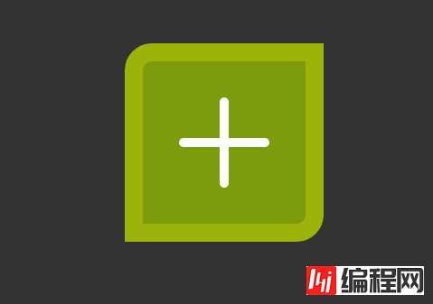
今天给大家带来一款纯css3实现的鼠标悬停动画按钮。这款按钮鼠标经过前以正方形的形式,当鼠标经过的时候以动画的形式变成圆形。效果图如下:
实现的代码。
html代码:
复制内容到剪贴板
<div>
<span></span>
</div>
css3代码:
CSS Code复制内容到剪贴板
body
{
background-color: #333;
}
div
{
width: 200px;
height: 200px;
margin: 0 auto;
}
span
{
position: relative;
width: 180px;
height: 180px;
display: block;
margin: auto;
top: 25px;
border: 20px solid rgba(255, 255, 0, .25);
background-color: rgba(124,155,13,1);
-WEBkit-transition: .5s;
-moz-transition: .5s;
-ms-transition: .5s;
transition: .5s;
border-radius: 30px 0px 30px 0px;
}
span:before, span:after
{
position: absolute;
display: block;
background-color: #fff;
border-radius: 10px;
margin: auto;
top: 0px;
bottombottom: 0px;
left: 0px;
rightright: 0px;
}
span:before
{
width: 100px;
height: 10px;
content: "";
}
span:after
{
width: 10px;
height: 100px;
content: "";
}
div:hover span
{
-webkit-transfORM: scale(.5) rotate(45deg);
-moz-transform: scale(.5) rotate(45deg);
-ms-transform: scale(.5) rotate(45deg);
transform: scale(.5) rotate(45deg);
border-radius: 110px;
background-color: rgba(112,18,255,1);
}
到此,关于“如何用css3实现鼠标悬停动画按钮”的学习就结束了,希望能够解决大家的疑惑。理论与实践的搭配能更好的帮助大家学习,快去试试吧!若想继续学习更多相关知识,请继续关注编程网网站,小编会继续努力为大家带来更多实用的文章!
--结束END--
本文标题: 如何用css3实现鼠标悬停动画按钮
本文链接: https://www.lsjlt.com/news/76166.html(转载时请注明来源链接)
有问题或投稿请发送至: 邮箱/279061341@qq.com QQ/279061341
下载Word文档到电脑,方便收藏和打印~
回答
回答
回答
回答
回答
回答
回答
回答
回答
回答


官方手机版

微信公众号

商务合作


0