小编给大家分享一下如何使用css3+js实现简单的时钟特效,相信大部分人都还不怎么了解,因此分享这篇文章给大家参考一下,希望大家阅读完这篇文章后大有收获,下面让我们一起去了解一下吧!html代码如下:<
小编给大家分享一下如何使用css3+js实现简单的时钟特效,相信大部分人都还不怎么了解,因此分享这篇文章给大家参考一下,希望大家阅读完这篇文章后大有收获,下面让我们一起去了解一下吧!
html代码如下:
<div class="main">
<div id="timeLabel"></div>
<div id="hour"></div>
<div id="minute"></div>
<div id="second"></div>
</div>
CSS 代码如下:
<style>
* {
margin: 0;
padding: 0;
}
.main {
position: relative;
margin: 100px auto;
width: 300px;
height: 300px;
border-radius: 300px;
border: 1px solid #000;
box-shadow:2px 5px;
}
#timeLabel {
position: absolute;
background-color:pink;
width:100px;
height:30px;
left:100px;
top:180px;
}
#hour {
width: 100px;
height: 10px;
background-color: red;
position:absolute;
left:150px;
top:145px;
}
#minute {
width:120px;
height:8px;
background-color:blue;
position:absolute;
left:150px;
top:146px;
}
#second {
width: 140px;
height: 4px;
background-color: green;
position: absolute;
left: 150px;
top: 148px;
}
</style>
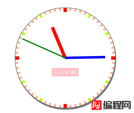
2. 初始化默认时间,和表盘刻度 :
更改后的css代码:
<style>
* {
margin: 0;
padding: 0;
}
.main {
position: relative;
margin: 100px auto;
width: 300px;
height: 300px;
border-radius: 300px;
border: 1px solid #000;
box-shadow: 2px 5px #808080;
}
#timeLabel {
position: absolute;
background-color: pink;
width: 80px;
height: 25px;
left: 110px;
top: 180px;
color: #fff;
line-height: 25px;
text-align: center;
}
#hour {
width: 100px;
height: 10px;
background-color: red;
position: absolute;
left: 150px;
top: 145px;
transfORM-origin: 0 50%;
}
#minute {
width: 120px;
height: 8px;
background-color: blue;
position: absolute;
left: 150px;
top: 146px;
transform-origin: 0 50%;
}
#second {
width: 140px;
height: 4px;
background-color: green;
position: absolute;
left: 150px;
top: 148px;
transform-origin: 0 50%;
}
.hourPointer, .minuterPointer, .secondPointer {
position: absolute;
transform-origin: 0 50%;
}
.hourPointer {
height: 10px;
width: 12px;
left: 150px;
top: 145px;
background-color: #f00;
z-index:3;
}
.minuterPointer {
height: 8px;
width: 10px;
left: 150px;
top: 146px;
background-color: #b6ff00;
z-index: 2;
}
.secondPointer {
height: 6px;
width: 8px;
left: 150px;
top: 147px;
background-color: #fa8;
z-index: 1;
}
</style>
初始化 js代码:
复制代码
代码如下:
window.onload = function () {
initClock();
}
var timer = null;
function $(id) {
return document.getElementById(id)
}
function CreateKeDu(pElement, className, deg, translateWidth) {
var Pointer = document.createElement("div");
Pointer.className = className
Pointer.style.transform = "rotate(" + deg + "deg) translate(" + translateWidth + "px)";
pElement.appendChild(Pointer);
}
function initClock() {
var main = $("biaopan");
var timeLabel = $("timeLabel");
var hour = $("hour");
var minute = $("minute");
var second = $("second");
var now = new Date();
var nowHour = now.getHours();
var nowMinute = now.getMinutes();
var nowSecond = now.getSeconds();
//初始化timeLabel
timeLabel.innerHTML = nowHour + ":" + nowMinute + ":" + nowSecond;
//初始化表盘
for (var index = 0; index < 4; index++) {
CreateKeDu(main, "hourPointer", index * 90, 138);
}
for (var index = 0; index < 12; index++) {
CreateKeDu(main, "minuterPointer",index*30, 140);
}
for (var index = 0; index < 60; index++) {
CreateKeDu(main, "secondPointer", index * 6, 142);
}
//初始化时分秒针
second.style.transform = "rotate(" + (nowSecond * 6 - 90) + "deg)";
minute.style.transform = "rotate(" + (nowMinute * 6 + 1 / 10 * nowSecond - 90) + "deg)";
hour.style.transform = "rotate(" + (nowHour * 30 + 1 / 2 * nowMinute + 1 / 120 * nowSecond - 90) + "deg)";
}
3.添加定时器:
js代码如下:
复制代码
代码如下:
//定时器
function startMove() {
clearInterval(timer);
timer = setInterval(function () {
var now = new Date();
var nowSecond = now.getSeconds();
var nowMinute = now.getMinutes();
var nowHour = now.getHours();
second.style.transform = "rotate(" + (nowSecond * 6 - 90) + "deg)";
minute.style.transform = "rotate(" + (nowMinute * 6 + 1 / 10 * nowSecond - 90) + "deg)";
hour.style.transform = "rotate(" + (nowHour * 30 + 1 / 2 * nowMinute + 1 / 120 * nowSecond - 90) + "deg)";
timeLabel.innerHTML = nowHour + ":" + nowMinute + ":" + nowSecond;
}, 1000);
}
4.使用OOP方式更改:
修改后的js代码如下:
复制代码
代码如下:
function Clock() {
//定义属性
this.main = this.$("biaopan");
this.timeLabel = this.$("timeLabel");
this.hour = this.$("hour");
this.minute = this.$("minute");
this.second = this.$("second");
this.nowHour = null;
this.nowMinute = null;
this.nowSecond = null;
this.timer = null;
var _this = this;
//初始化函数
var init = function () {
_this.getNowTime();
_this.initClock();
_this.InterVal();
}
init();
}
Clock.prototype.$ = function (id) {
return document.getElementById(id)
}
Clock.prototype.CreateKeDu = function (className, deg, translateWidth) {
var Pointer = document.createElement("div");
Pointer.className = className
Pointer.style.transform = "rotate(" + deg + "deg) translate(" + translateWidth + "px)";
this.main.appendChild(Pointer);
}
Clock.prototype.getNowTime = function () {
var now = new Date();
this.nowHour = now.getHours();
this.nowMinute = now.getMinutes();
this.nowSecond = now.getSeconds();
}
Clock.prototype.setPosition = function () {
this.second.style.transform = "rotate(" + (this.nowSecond * 6 - 90) + "deg)";
this.minute.style.transform = "rotate(" + (this.nowMinute * 6 + 1 / 10 * this.nowSecond - 90) + "deg)";
this.hour.style.transform = "rotate(" + (this.nowHour * 30 + 1 / 2 * this.nowMinute + 1 / 120 * this.nowSecond - 90) + "deg)";
}
Clock.prototype.initClock = function () {
//初始化timeLabel
this.timeLabel.innerHTML = this.nowHour + ":" + this.nowMinute + ":" + this.nowSecond;
//初始化表盘
for (var index = 0; index < 4; index++) {
this.CreateKeDu("hourPointer", index * 90, 138);
}
for (var index = 0; index < 12; index++) {
this.CreateKeDu("minuterPointer", index * 30, 140);
}
for (var index = 0; index < 60; index++) {
this.CreateKeDu("secondPointer", index * 6, 142);
}
this.setPosition();
}
Clock.prototype.InterVal = function () {
clearInterval(this.timer);
var _this = this;
this.timer = setInterval(function () {
_this.getNowTime();
_this.second.style.transform = "rotate(" + (_this.nowSecond * 6 - 90) + "deg)";
_this.minute.style.transform = "rotate(" + (_this.nowMinute * 6 + 1 / 10 * _this.nowSecond - 90) + "deg)";
_this.hour.style.transform = "rotate(" + (_this.nowHour * 30 + 1 / 2 * _this.nowMinute + 1 / 120 * _this.nowSecond - 90) + "deg)";
_this.timeLabel.innerHTML = _this.nowHour + ":" + _this.nowMinute + ":" + _this.nowSecond;
}, 1000);
}
最后调用如下:
复制代码
代码如下:
window.onload = function () {
new Clock();
}
最终页面代码:
复制代码
代码如下:
<!DOCTYPE html>
<html xmlns="<a href="Http://www.w3.org/1999/xhtml">http://www.w3.org/1999/xhtml</a>">
<head>
<meta http-equiv="Content-Type" content="text/html; charset=utf-8" />
<title></title>
<style>
* {
margin: 0;
padding: 0;
}
.main {
position: relative;
margin: 100px auto;
width: 300px;
height: 300px;
border-radius: 300px;
border: 1px solid #000;
box-shadow: 2px 5px #808080;
}
#timeLabel {
position: absolute;
background-color: pink;
width: 80px;
height: 25px;
left: 110px;
top: 180px;
color: #fff;
line-height: 25px;
text-align: center;
}
#hour {
width: 100px;
height: 10px;
background-color: red;
position: absolute;
left: 150px;
top: 145px;
transform-origin: 0 50%;
}
#minute {
width: 120px;
height: 8px;
background-color: blue;
position: absolute;
left: 150px;
top: 146px;
transform-origin: 0 50%;
}
#second {
width: 140px;
height: 4px;
background-color: green;
position: absolute;
left: 150px;
top: 148px;
transform-origin: 0 50%;
}
.hourPointer, .minuterPointer, .secondPointer {
position: absolute;
transform-origin: 0 50%;
}
.hourPointer {
height: 10px;
width: 12px;
left: 150px;
top: 145px;
background-color: #f00;
z-index: 3;
}
.minuterPointer {
height: 8px;
width: 10px;
left: 150px;
top: 146px;
background-color: #b6ff00;
z-index: 2;
}
.secondPointer {
height: 6px;
width: 8px;
left: 150px;
top: 147px;
background-color: #fa8;
z-index: 1;
}
</style>
<script>
function Clock() {
//定义属性
this.main = this.$("biaopan");
this.timeLabel = this.$("timeLabel");
this.hour = this.$("hour");
this.minute = this.$("minute");
this.second = this.$("second");
this.nowHour = null;
this.nowMinute = null;
this.nowSecond = null;
this.timer = null;
var _this = this;
//初始化函数
var init = function () {
_this.getNowTime();
_this.initClock();
_this.InterVal();
}
init();
}
Clock.prototype.$ = function (id) {
return document.getElementById(id)
}
Clock.prototype.CreateKeDu = function (className, deg, translateWidth) {
var Pointer = document.createElement("div");
Pointer.className = className
Pointer.style.transform = "rotate(" + deg + "deg) translate(" + translateWidth + "px)";
this.main.appendChild(Pointer);
}
Clock.prototype.getNowTime = function () {
var now = new Date();
this.nowHour = now.getHours();
this.nowMinute = now.getMinutes();
this.nowSecond = now.getSeconds();
}
Clock.prototype.setPosition = function () {
this.second.style.transform = "rotate(" + (this.nowSecond * 6 - 90) + "deg)";
this.minute.style.transform = "rotate(" + (this.nowMinute * 6 + 1 / 10 * this.nowSecond - 90) + "deg)";
this.hour.style.transform = "rotate(" + (this.nowHour * 30 + 1 / 2 * this.nowMinute + 1 / 120 * this.nowSecond - 90) + "deg)";
}
Clock.prototype.initClock = function () {
//初始化timeLabel
this.timeLabel.innerHTML = this.nowHour + ":" + this.nowMinute + ":" + this.nowSecond;
//初始化表盘
for (var index = 0; index < 4; index++) {
this.CreateKeDu("hourPointer", index * 90, 138);
}
for (var index = 0; index < 12; index++) {
this.CreateKeDu("minuterPointer", index * 30, 140);
}
for (var index = 0; index < 60; index++) {
this.CreateKeDu("secondPointer", index * 6, 142);
}
this.setPosition();
}
Clock.prototype.InterVal = function () {
clearInterval(this.timer);
var _this = this;
this.timer = setInterval(function () {
_this.getNowTime();
_this.second.style.transform = "rotate(" + (_this.nowSecond * 6 - 90) + "deg)";
_this.minute.style.transform = "rotate(" + (_this.nowMinute * 6 + 1 / 10 * _this.nowSecond - 90) + "deg)";
_this.hour.style.transform = "rotate(" + (_this.nowHour * 30 + 1 / 2 * _this.nowMinute + 1 / 120 * _this.nowSecond - 90) + "deg)";
_this.timeLabel.innerHTML = _this.nowHour + ":" + _this.nowMinute + ":" + _this.nowSecond;
}, 1000);
}
window.onload = function () {
new Clock();
}
</script>
</head>
<body>
<div class="main" id="biaopan">
<div id="timeLabel"></div>
<div id="hour"></div>
<div id="minute"></div>
<div id="second"></div>
</div>
</body>
</html>
以上是“如何使用CSS3+js实现简单的时钟特效”这篇文章的所有内容,感谢各位的阅读!相信大家都有了一定的了解,希望分享的内容对大家有所帮助,如果还想学习更多知识,欢迎关注编程网VUE频道!
--结束END--
本文标题: 如何使用CSS3+js实现简单的时钟特效
本文链接: https://www.lsjlt.com/news/89814.html(转载时请注明来源链接)
有问题或投稿请发送至: 邮箱/279061341@qq.com QQ/279061341
下载Word文档到电脑,方便收藏和打印~
回答
回答
回答
回答
回答
回答
回答
回答
回答
回答


官方手机版

微信公众号

商务合作


0