Java 基于 Apache ECharts 实现:柱状图、折线图、环形图等案例 柱状图 效果图 源代码 #container{width: 800px;height: 600px;}//04 实例

<!DOCTYPE html><html><head><meta charset="utf-8"><meta Http-equiv="X-UA-Compatible" content="IE=edge" /><meta name="viewport" content="width=device-width,initial-scale=1.0" /><title></title><!-- 01 导入js --><!-- <script src="js/echarts.min.js"></script> --><script src="https://cdn.bootCSS.com/echarts/4.1.0.rc2/echarts.js" type="text/javascript" charset="utf-8"></script><!-- 03 设置容器的样式 --><style>#container{width: 800px;height: 600px;}</style></head><body><!-- 02 创建个容器 --><div id="container"></div></body><script>//04 实例化echarts// 4.1 创建一个实例var echart = echarts.init(document.getElementById("container"), 'light');// 4.2 定义配置项var option = {// 图表的标题title:{text:"统方记录"},// 图表的提示tooltip:{},// 图例// legend:{data:["统方记录"]},// x轴线xAxis:{data:["2022-11","2022-12","2023-01","2023-02","2023-03","2023-04"]},// y轴线yAxis:{},// 设置数据series:[{// 数据名称name:"统方记录",// 类型为柱状图type:"bar",color:['rgb(58 160 255 / 91%)'],// 数据datadata:["8","10","4","5","9","4"]}]}// 4.3 更新配置echart.setOption(option);// chart图表,set设置 Option选项 data数据 type类型 bar条(柱状条),series系列(数据) Axis轴线 xAxis水平轴线 // legend传奇(图例) tooltip 提示 init初始化 document文档 </script></html>如果想复用上面的代码,只需要把xAxis和series的data改下就行。
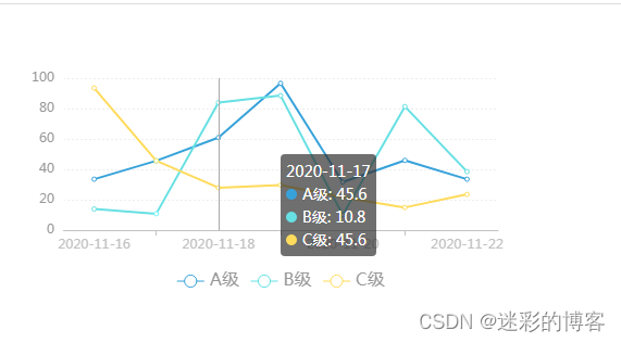
<!DOCTYPE html><html><head><meta charset="utf-8"><title></title><script src="https://cdn.bootcss.com/echarts/4.1.0.rc2/echarts.js" type="text/javascript" charset="utf-8"></script><style> #container{ width: 500px; height: 260px; }</style></head><body><div id="container"></div><script>var echart = echarts.init(document.getElementById("container"),'light');var option = { legend:{ data: ["A级", "B级", "C级"], bottom: 0, textStyle: { fontSize: 16, color:'#999' } }, // 图表的提示tooltip:{trigger: 'axis'}, xAxis: { type: 'cateGory', axisLine: { // 坐标轴线 lineStyle: { color: '#C2C2C2' } }, // axisLabel: { // 坐标轴刻度标签 // color: '#999', // //fontWeight: 'bold', // // fontSize: 14 // }, data: ["2020-11-16", "2020-11-17", "2020-11-18", "2020-11-19", "2020-11-20", "2020-11-21", "2020-11-22"] }, yAxis: { type: 'value', axisLine: { // 坐标轴线 lineStyle: { color: '#FFFFFF' } }, axisLabel: { // 坐标轴刻度标签 color: '#999', //fontWeight: 'bold', // fontSize: 14 }, splitLine: { // 分隔线 lineStyle: { type: 'dotted', color: '#eee', // show: false } }, }, series: [ { data: [33.5,45.6,60.9,96.6,31.6,45.9,33.5], name: "A级", // smooth: true, // color:['rgb(58 160 255 / 91%)'], type: "line" }, { data: [13.9,10.8,83.9,88.5,10,81.3,38.5], name: "B级", // smooth: true, // color:['rgb(64 199 104)'], type: "line" }, { data: [93.5,45.6,27.9,29.6,21.6,14.9,23.5], name: "C级", // smooth: true, // color:['rgb(250 211 52)'], type: "line" } ]}echart.setOption(option);</script></body></html>如果想复用上面的代码,只需要把xAxis和series改下就行。

<!DOCTYPE html><html><head><meta charset="utf-8"><title></title><script src="https://cdn.bootcss.com/echarts/4.1.0.rc2/echarts.js" type="text/javascript" charset="utf-8"></script><style> #container{ width: 800px; height: 600px; }</style></head><body><div id="container"></div><script>var echart = echarts.init(document.getElementById("container"),'light')var option = {title:{text:"工作动态"},// legend:{data:["发布量"]},// tooltip提示 trigger触发器 axis轴线触发,item 当前项触发tooltip:{trigger:"axis"},yAxis:{axisLine: { // 坐标轴线 lineStyle: { color: '#C2C2C2' } },data:["2022-10","2022-11","2022-12","2023-01","2023-02","2023-03"]},xAxis:{axisLine: { // 坐标轴线 lineStyle: { color: '#FFFFFF' } }, axisLabel: { // 坐标轴刻度标签 color: '#999', //fontWeight: 'bold', // fontSize: 14 }, splitLine: { // 分隔线 lineStyle: { type: 'dotted', color: '#eee', // show: false } },},series:[{name:"发布量",type:"bar",color:"#3aa0ff",data:[20,40,90,80,60,75],stack:true,// stack堆叠,label 标签,position位置,inside内部,right右侧,fORMmater格式// \n 代表换行,{a}系列名 "陈康" {b}数值名 "Vue" {c}数值 80 label:{show:false,position:"insideRight",formatter:"{a}\n{c}分"}}]}echart.setOption(option);</script></body></html>如果想复用上面的代码,只需要把tooltip的data和series的data改下就行。
<!DOCTYPE html><html><head><meta charset="utf-8"><title></title><script src="https://cdn.bootcss.com/echarts/4.1.0.rc2/echarts.js" type="text/javascript" charset="utf-8"></script><style>  #container{ width: 603px; height: 180px; padding-bottom:50px; }</style></head><body><div id="container"></div><script>var echart = echarts.init(document.getElementById("container"), 'light')var option = {    // title: {     //     text: '各商品销量占比',     //     subtext: 'A商场情况分析',     //     left: 'center'     // },    tooltip: {         trigger: 'item',         // formatter: '{a}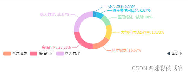
{b} : {c} ({d}%)' // formatter: '{b}: {c} ({d}%)' formatter: '{b}: ({d}%)' }, label: { show: true, formatter: '{b}: {d}%' }, legend: { // type: 'scroll', // orient: 'horizontal', // 水平布局 // align: 'left', // 图例组件在容器中水平对齐方式 // left: 10, // 图例组件离容器左侧的距离 // top: 10, // 图例组件离容器顶部的距离 // itemWidth: 14, // itemHeight: 5, // formatter: function (name) { // // 如果需要,这里可以自定义图例文本的格式 // return name; // }, type: 'scroll', align: 'left', // 图例组件在容器中水平对齐方式 // left: 10, // 图例组件离容器左侧的距离 // top: 160, bottom: 0, // 图例组件离容器顶部的距离 // left: 'center',// bottom: 'center',// selectedMode: false,// bottom: -30,orient: 'horizontal', data: ["处方点评", "抗生素使用情况", "医用耗材、试剂", "大型医疗设备检查", "医疗收费", "廉洁行医", "统方管理"] }, series: [ { // name: '所售商品', type: 'pie', radius: ['50%', '70%'], data: [ { "value" : 10, "name" : "处方点评" }, { "value" : 20, "name" : "抗生素使用情况" }, { "value" : 30, "name" : "医用耗材、试剂" }, { "value" : 40, "name" : "大型医疗设备检查" }, { "value" : 50, "name" : "医疗收费" }, { "value" : 70, "name" : "廉洁行医" }, { "value" : 80, "name" : "统方管理" } ], } ] };echart.setOption(option);</script></body></html>如果想复用上面的代码,只需要把legend的data和series的data改下就行。
https://echarts.apache.org/zh/index.html
来源地址:https://blog.csdn.net/sxdtzhaoxinguo/article/details/131191628
--结束END--
本文标题: Java 基于 Apache ECharts 实现:柱状图、折线图、环形图等案例
本文链接: https://www.lsjlt.com/news/392157.html(转载时请注明来源链接)
有问题或投稿请发送至: 邮箱/279061341@qq.com QQ/279061341
下载Word文档到电脑,方便收藏和打印~
2024-04-01
2024-04-03
2024-04-03
2024-01-21
2024-01-21
2024-01-21
2024-01-21
2023-12-23
回答
回答
回答
回答
回答
回答
回答
回答
回答
回答


官方手机版

微信公众号

商务合作


0